PROJECT
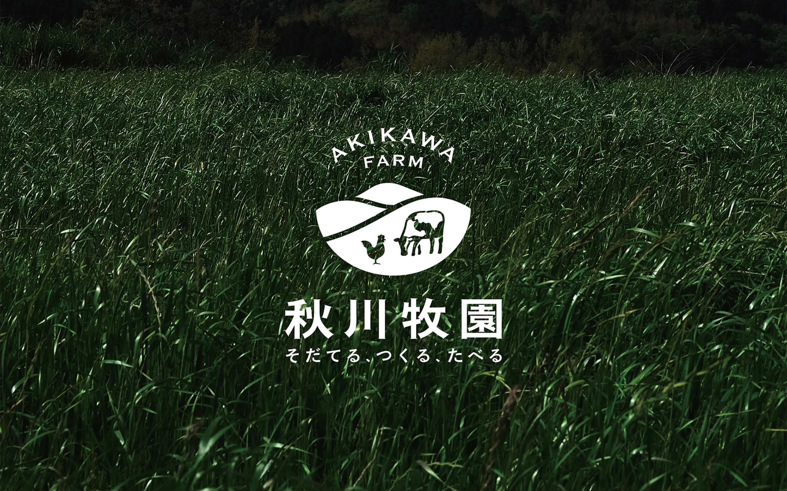
Akikawa Farm
Rebranded a natural farming food company. Rebuilt communication strategy around food safety, more than doubling the stock price within six months of announcement.
WHY
Sustainable food
for the future.
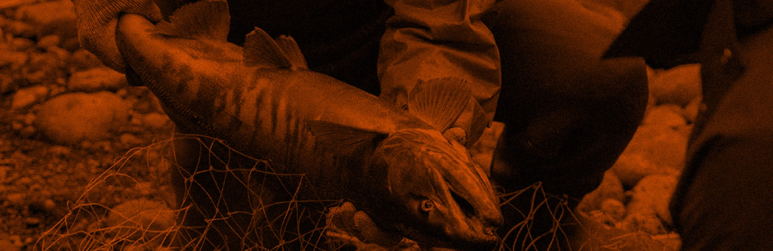
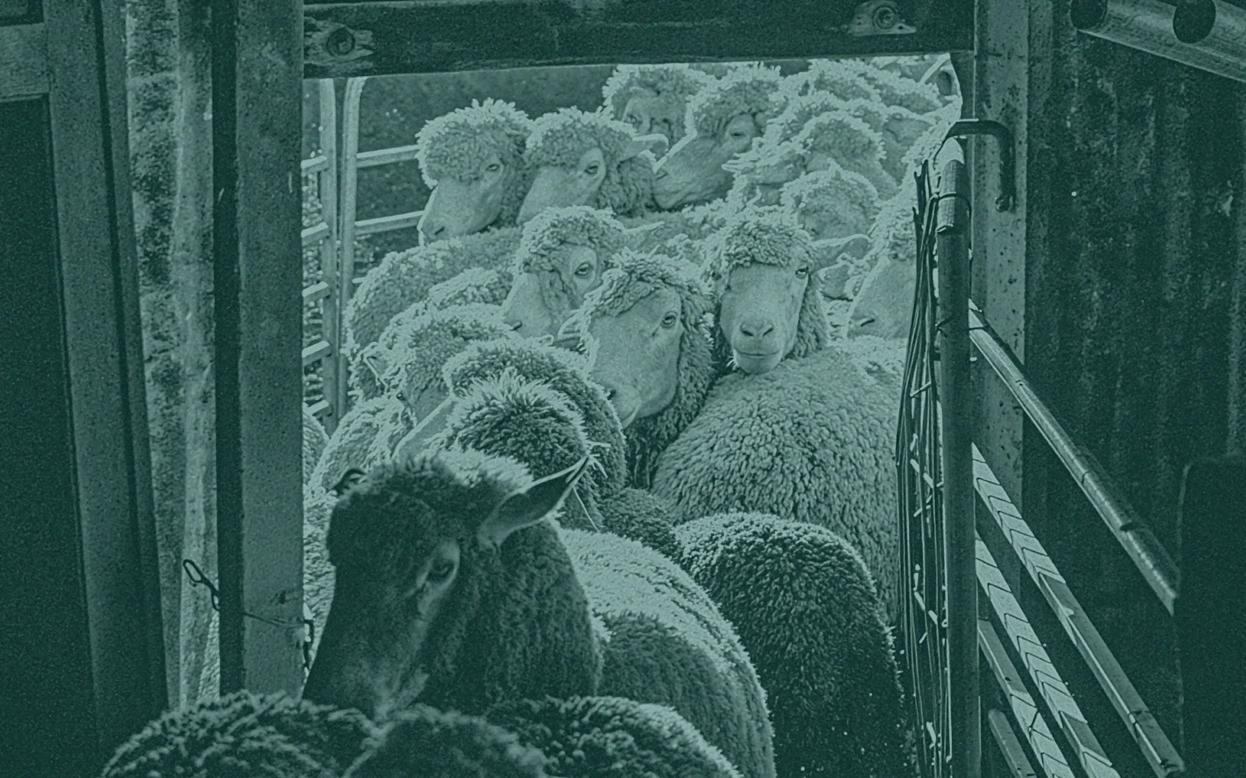
From ancient hunter-gatherer to agricultural society, we humans have been able to procure our own food. With the rise of free-market economy, however, people began to rely on industry to provide food such as vegetables, meat, and fish. From there, efficiency and standardization of primary food industries accelerated for the benefit of rationality. Mass production of a single variety of vegetables and overexploitation of fishery resources have made it difficult for species to maintain their symbiotic relationship with each other. Lots of discussions are also ongoing about the negative impact of pesticides and genetically modified crops on our health. Our planet is now facing numerous threats of its fragile ecosystem,
In the midst of this spreading insecurities about the food industry, local recycling models with low environmental impact are becoming a necessity. They will help to insure sustainable food in the future and support businesses taking on the challenge of providing safe food.
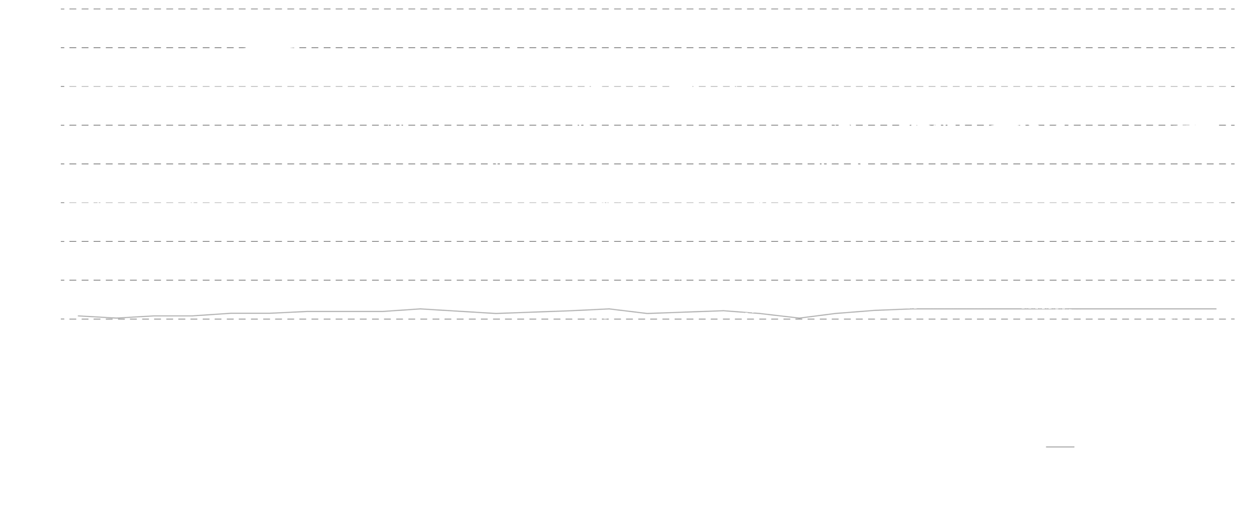
Changes in pesticide usage in major countries
When choosing food, which factors do you prioritize?
From ancient hunter-gatherer to agricultural society, we humans have been able to procure our own food. With the rise of free-market economy, however, people began to rely on industry to provide food such as vegetables, meat, and fish. From there, efficiency and standardization of primary food industries accelerated for the benefit of rationality. Mass production of a single variety of vegetables and overexploitation of fishery resources have made it difficult for species to maintain their symbiotic relationship with each other. Lots of discussions are also ongoing about the negative impact of pesticides and genetically modified crops on our health. Our planet is now facing numerous threats of its fragile ecosystem,
In the midst of this spreading insecurities about the food industry, local recycling models with low environmental impact are becoming a necessity. They will help to insure sustainable food in the future and support businesses taking on the challenge of providing safe food.


HOW
An organic farm brand
that intuitively conveys
the safety of its product.
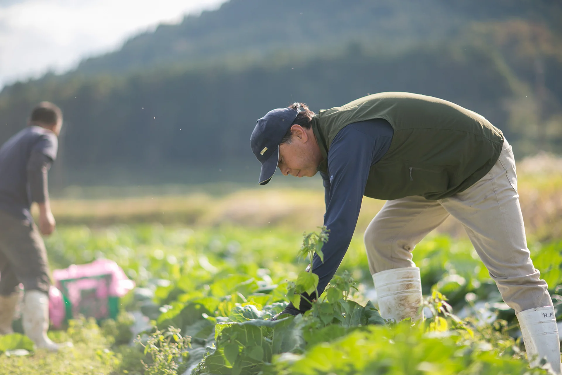
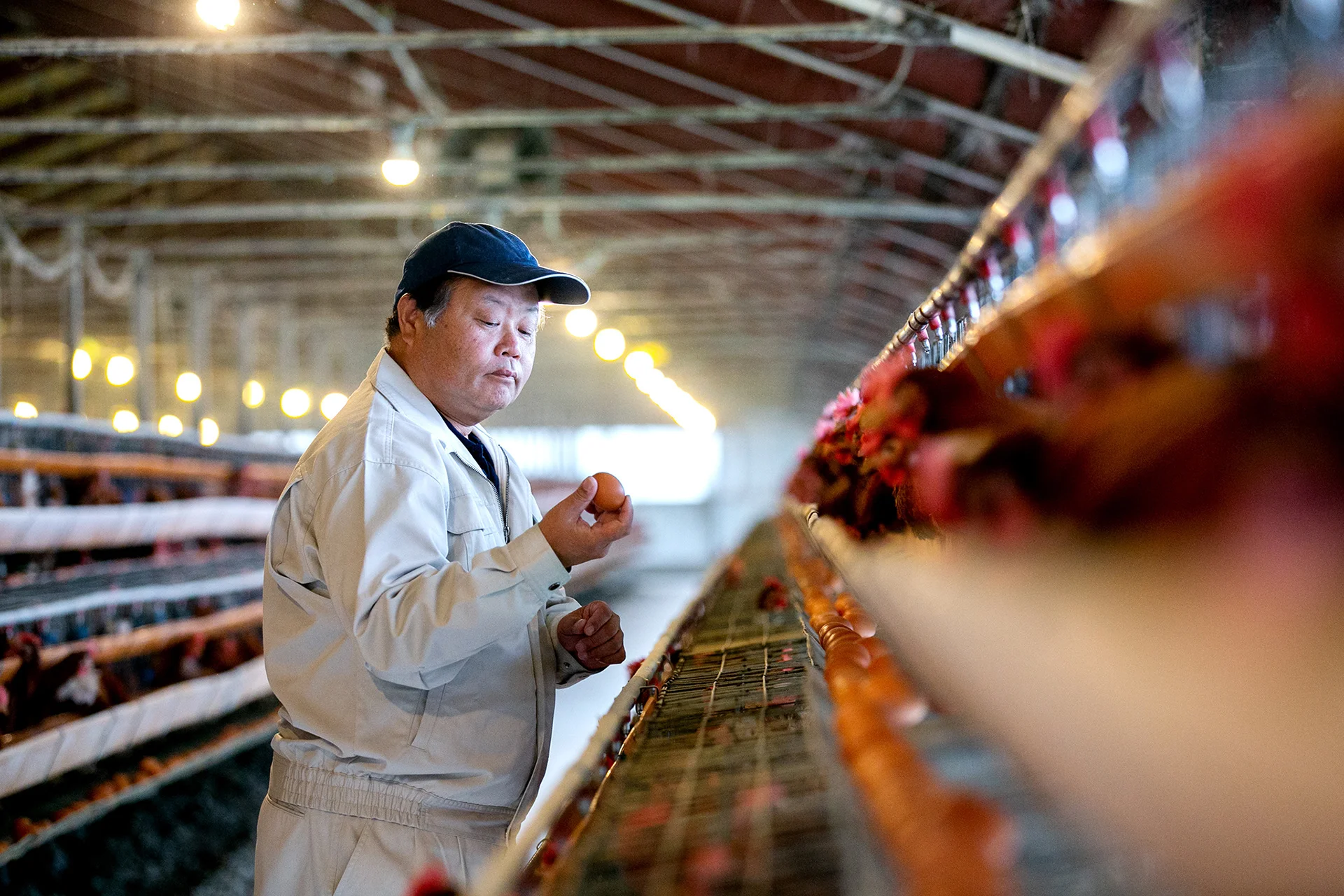
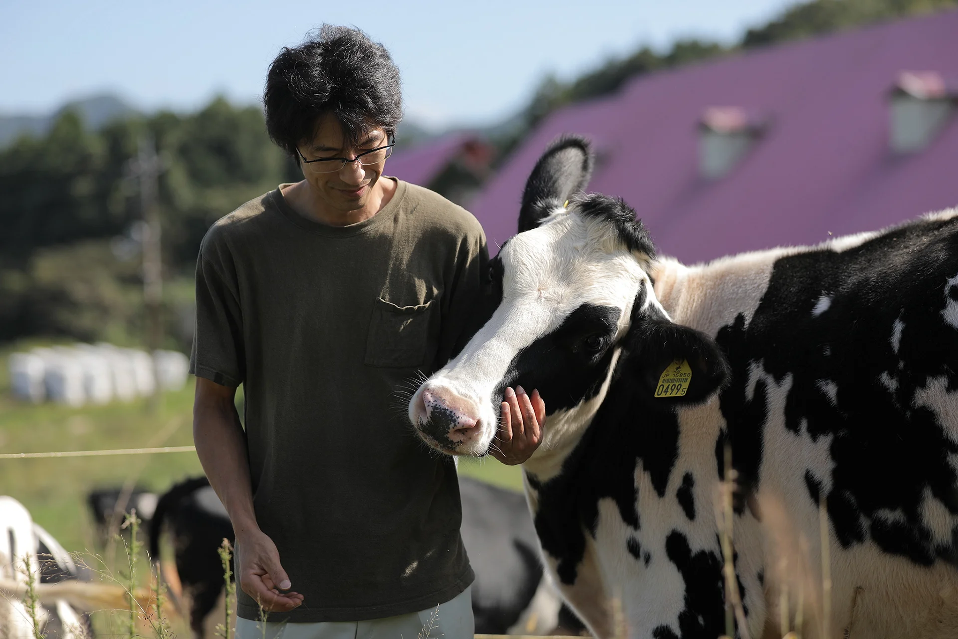
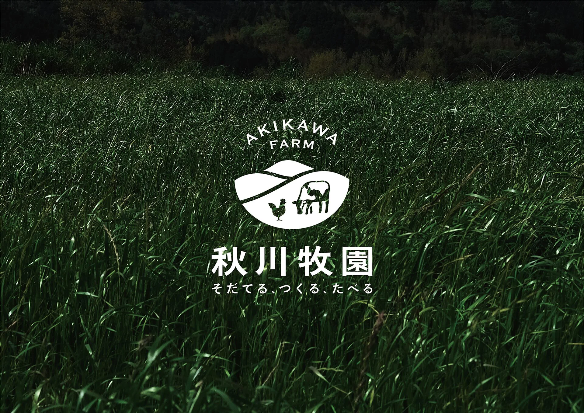
Akikawa Farm, based in Yamaguchi Prefecture, is one of the largest organic farms in Japan. Since Fusataro Akikawa established his ideal farm in Dalian, China, in 1927, they have continuously pursued their goal of producing safe and reliable food. Today they provide a one-stop shop for production, processing, and delivery of chicken, eggs, milk, and vegetables. We were tasked to rebrand Akikawa Farm, to connect the company’s consistent philosophy and initiatives with today’s customers. This branding also aimed at preserving their authentic pastoral image.
What sets the company apart is that it has built a food recycling model that is friendly to both people and the planet. In order to showcase this, we created a very straightforward tagline: “Grow, Produce, Eat”.

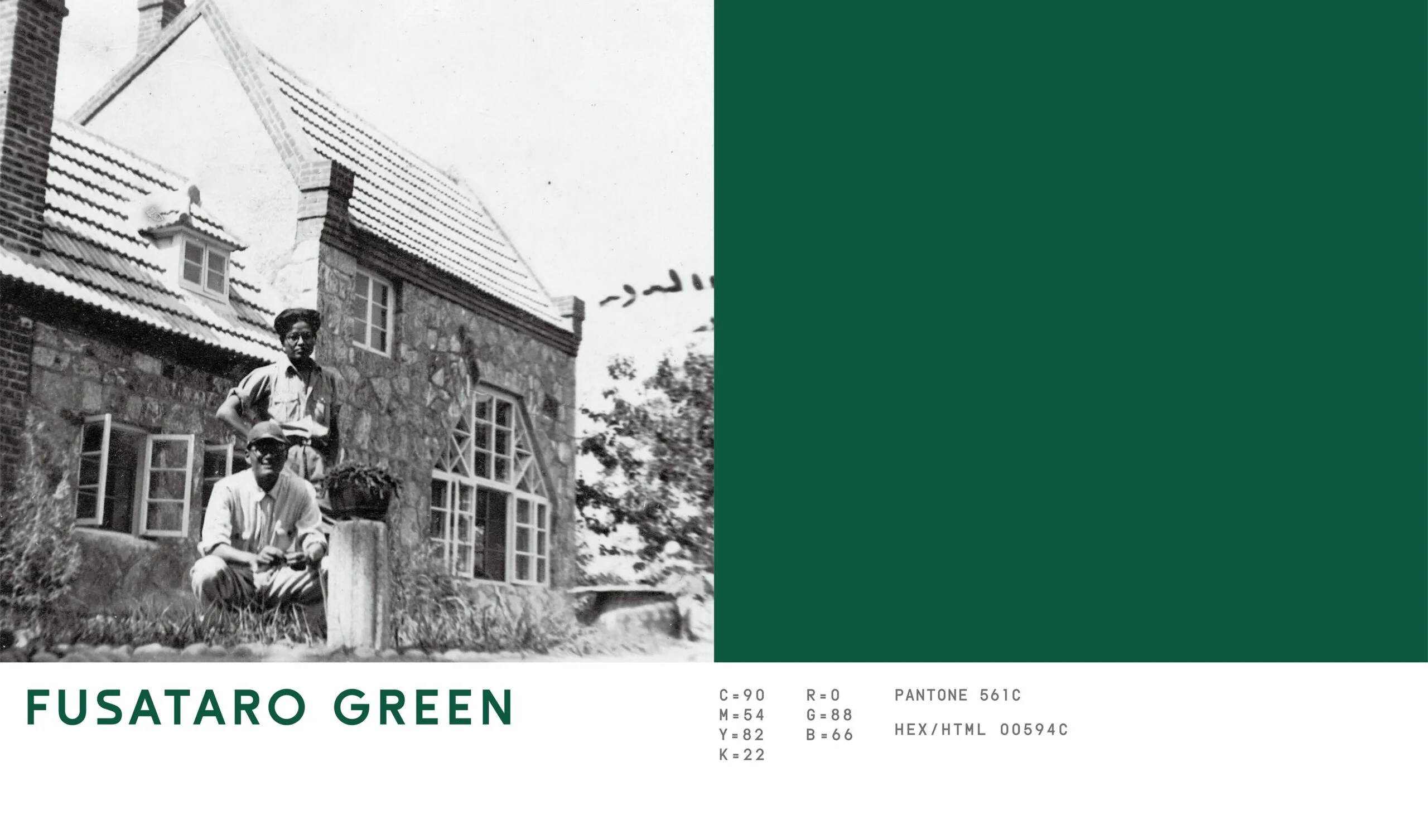
“What goes into your mouth must not be wrong.” These are the words of Mr. Fusataro Akikawa, the founder of Akikawa Farm and the company has been true to them since its foundation.
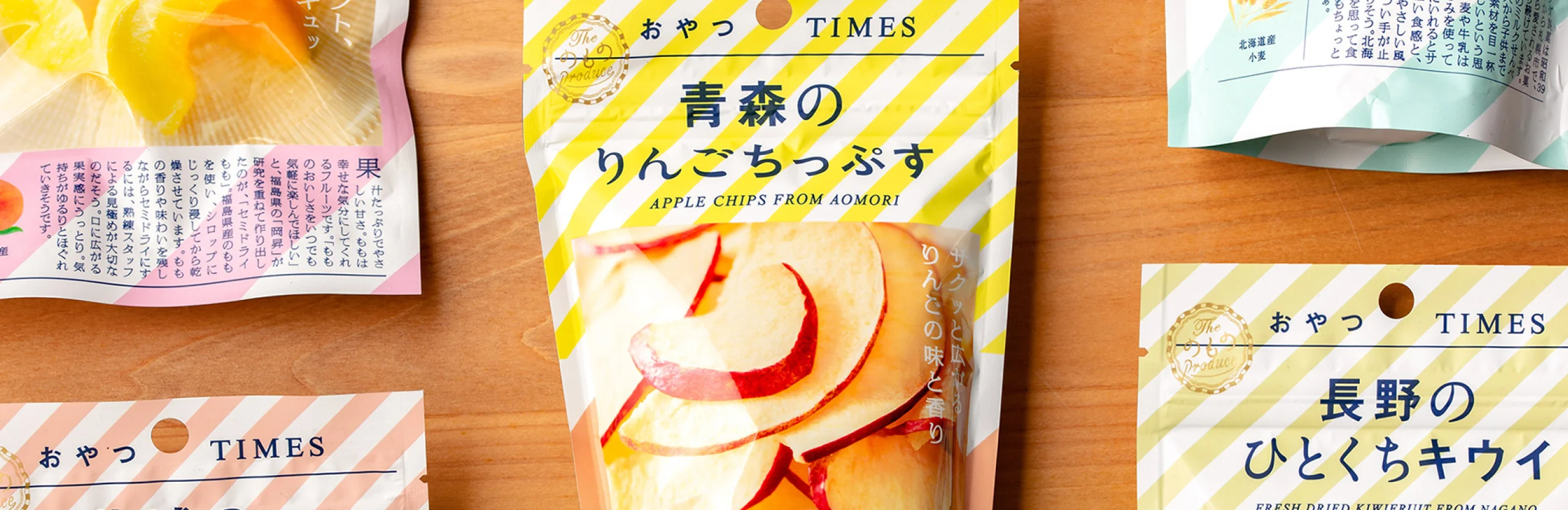
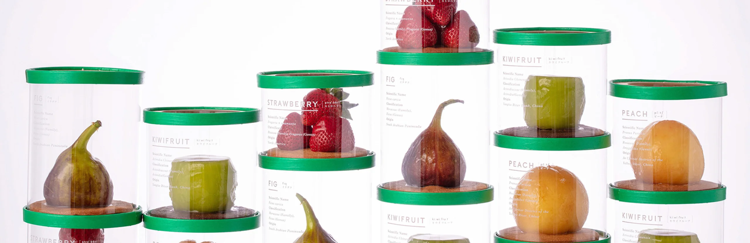
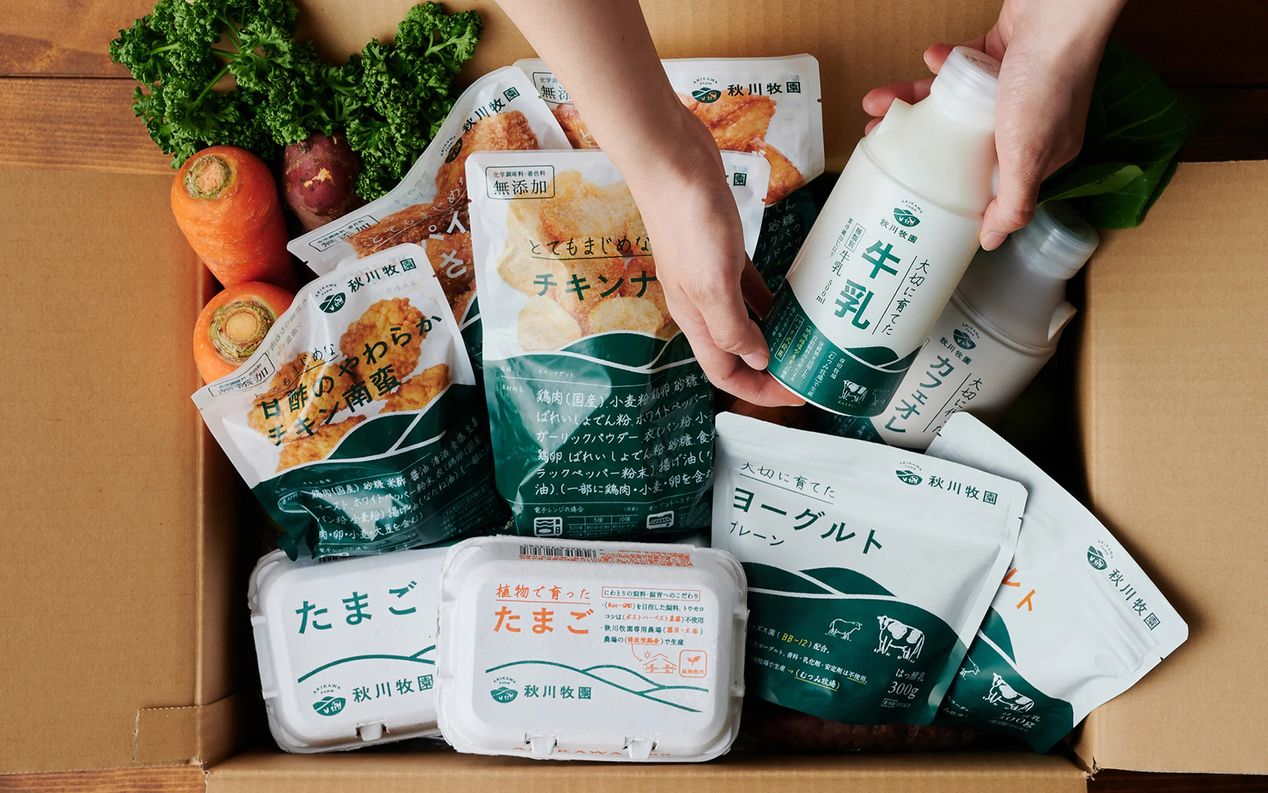
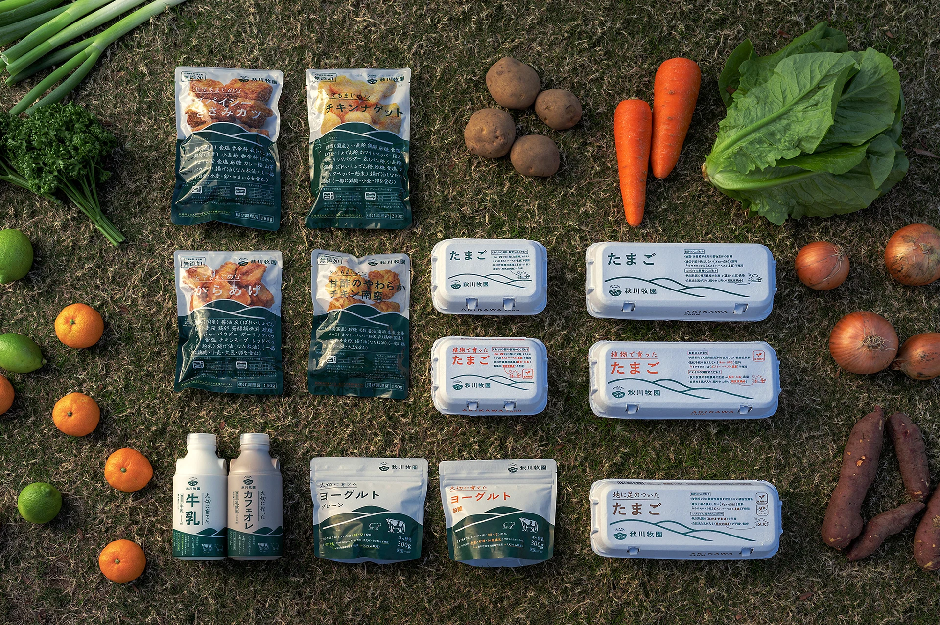
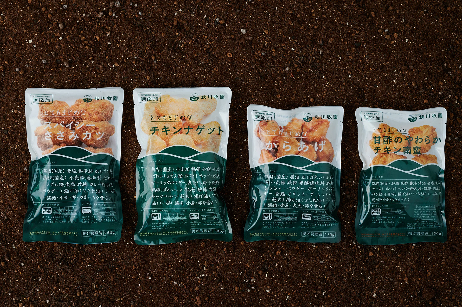
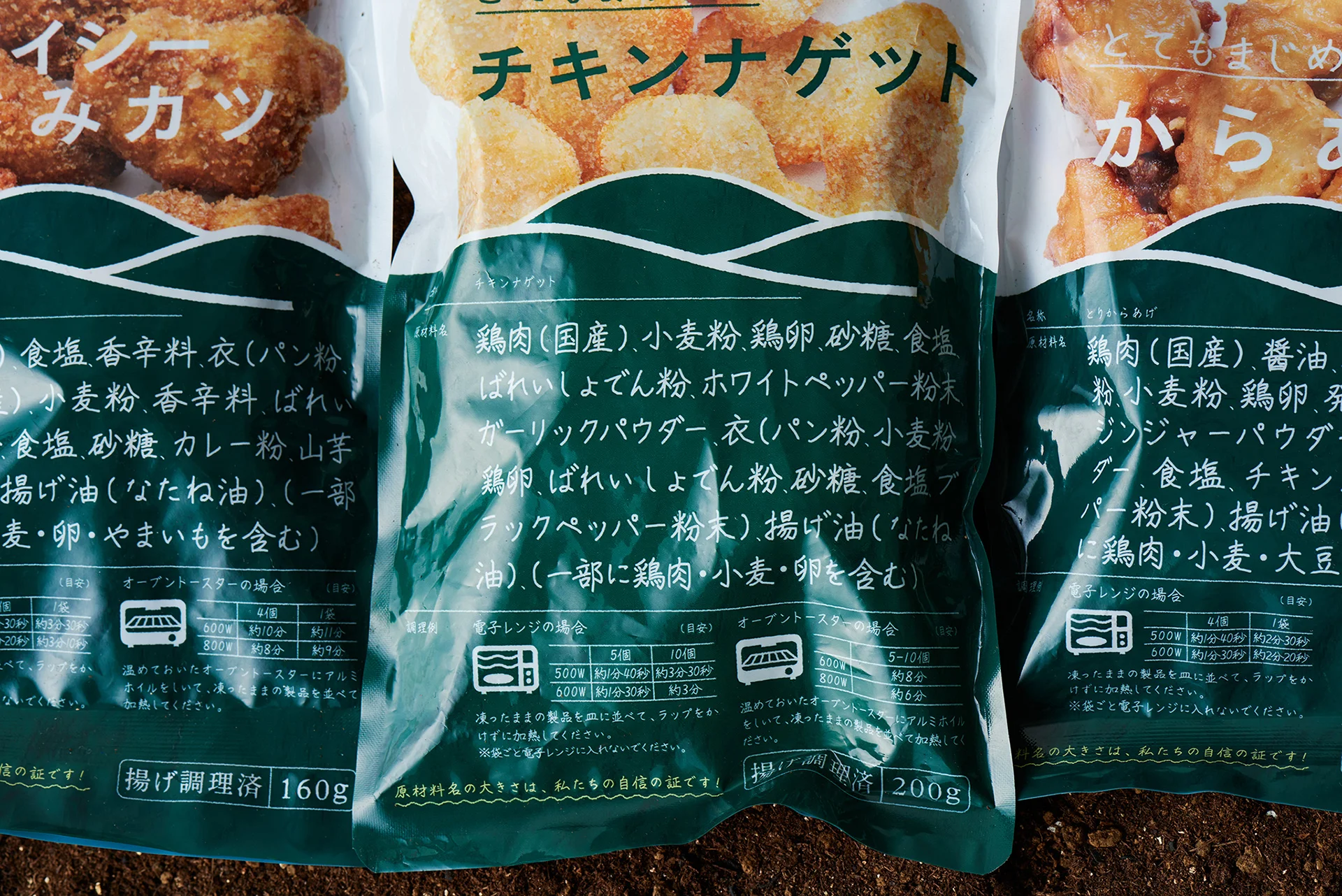
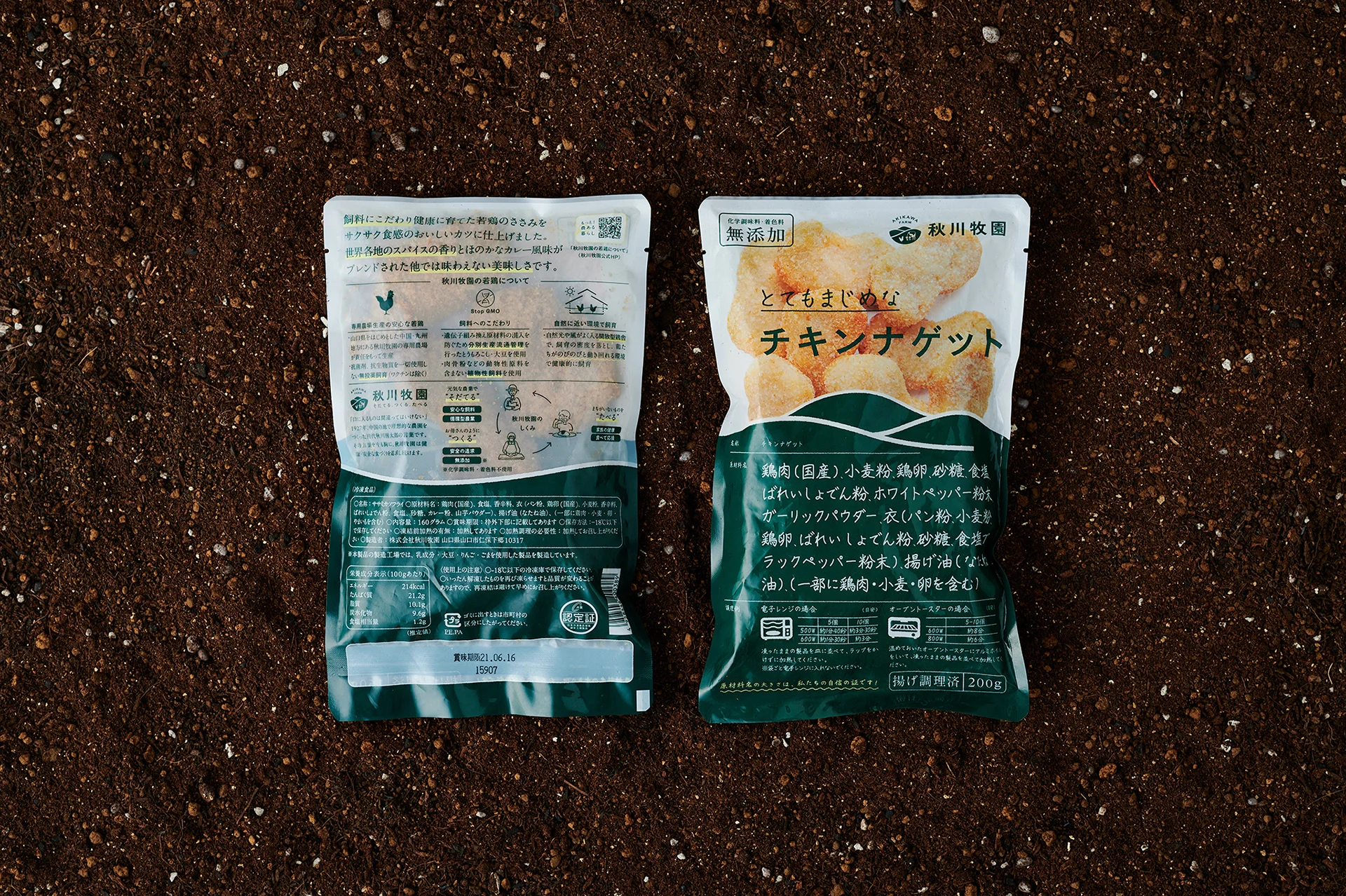
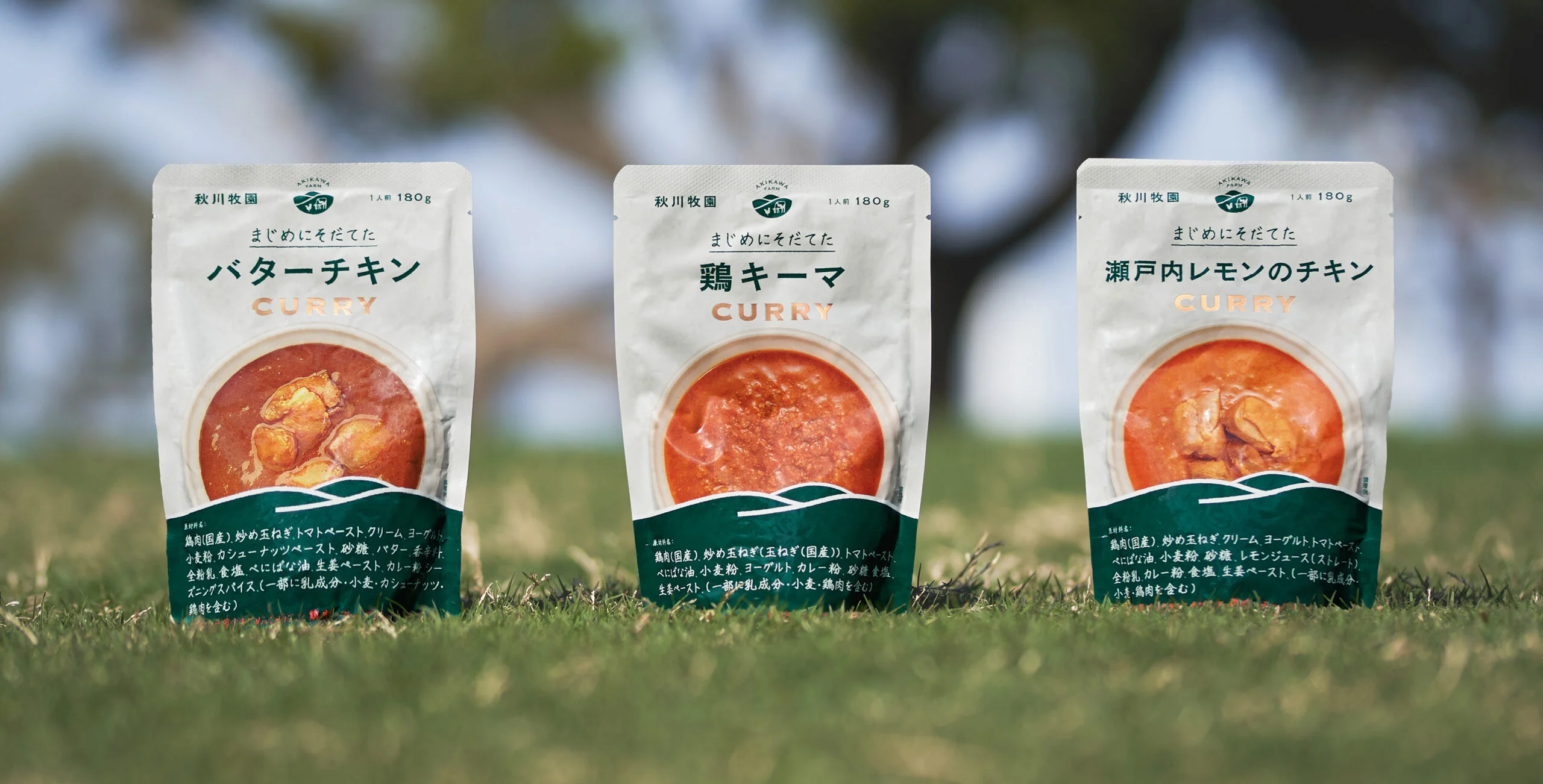
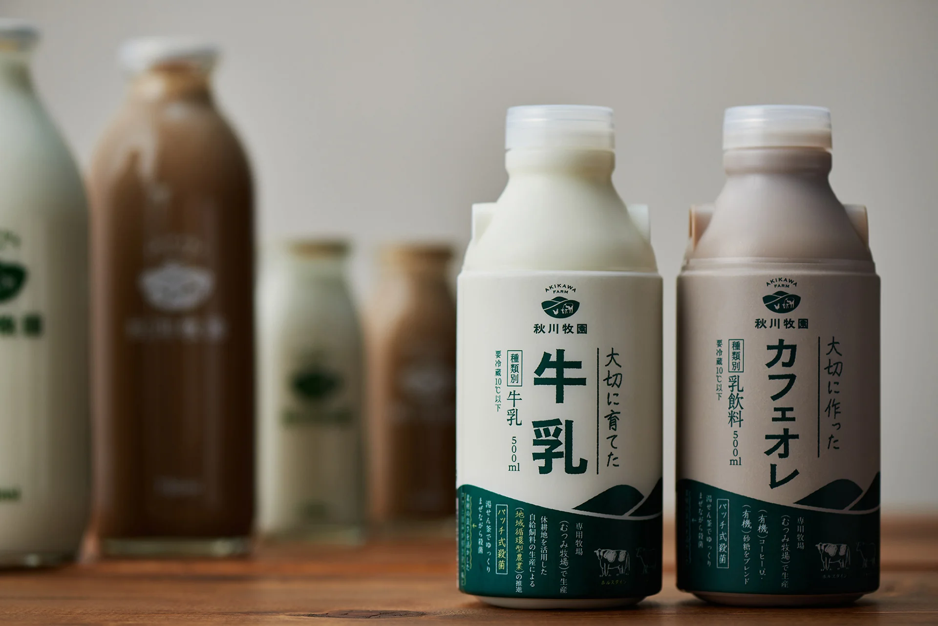
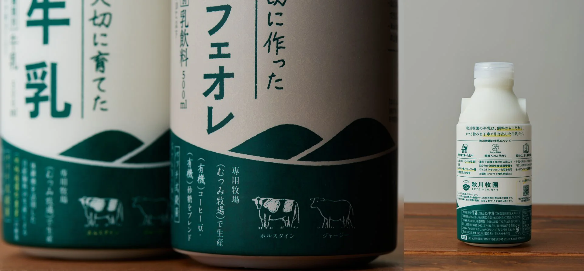
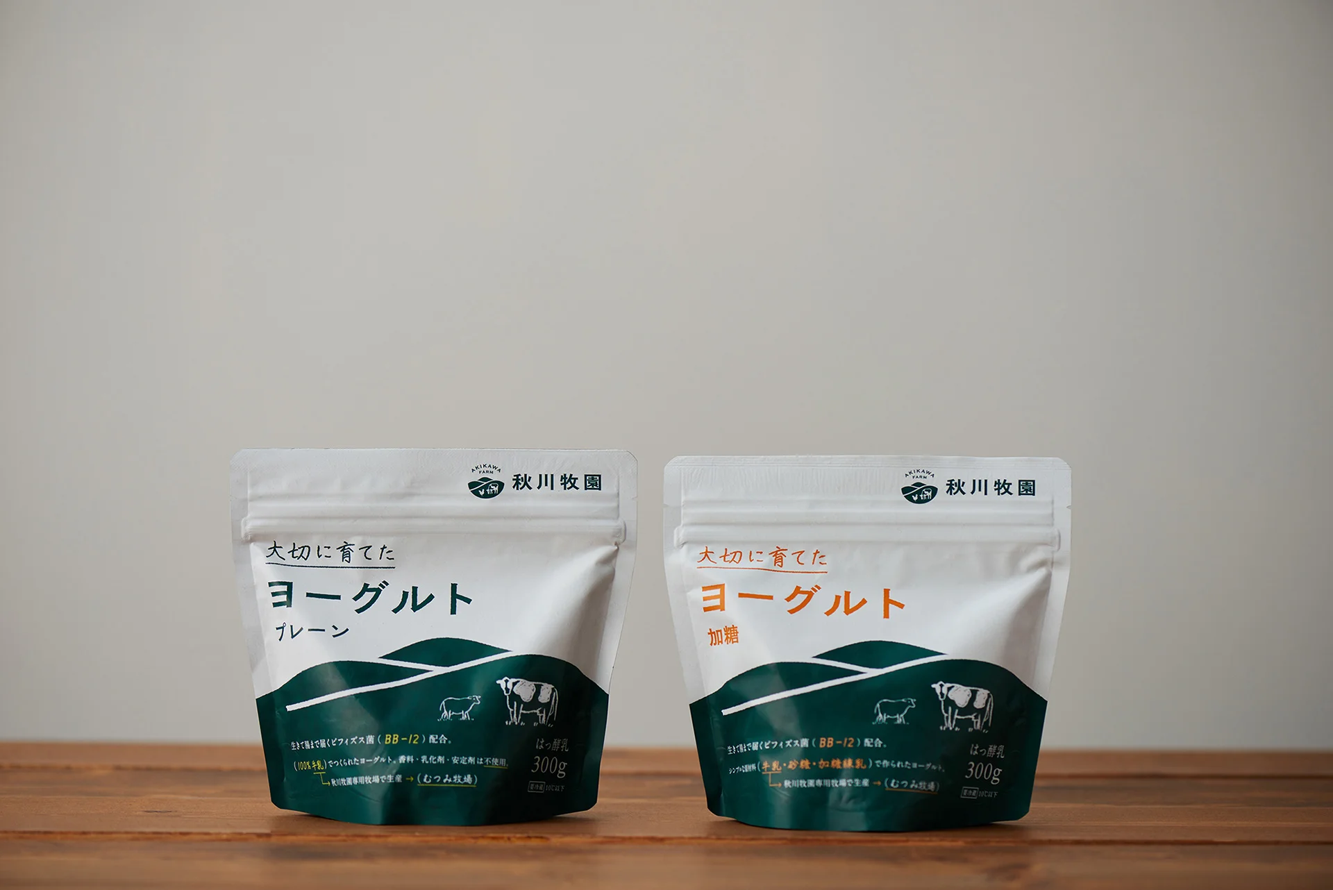
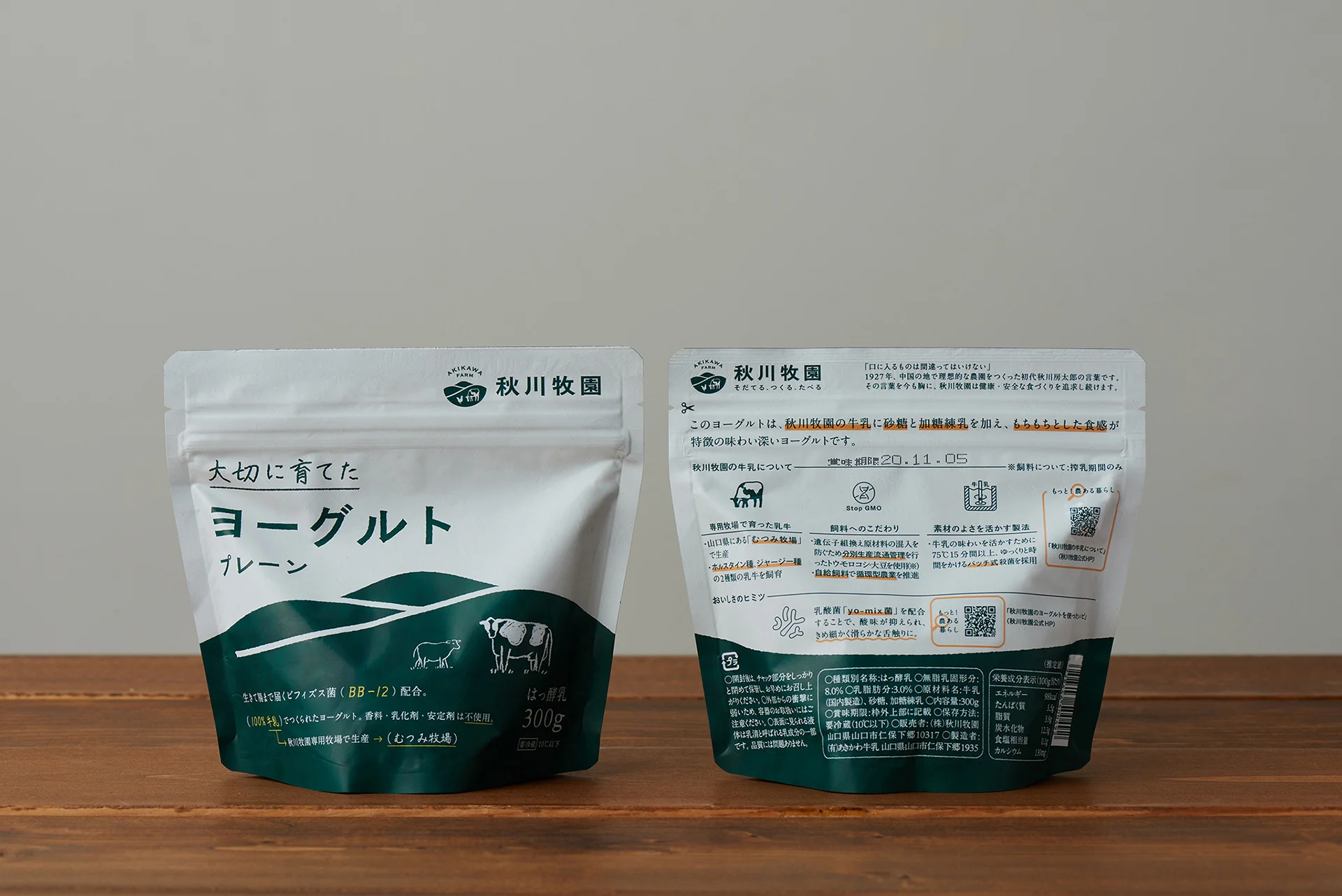
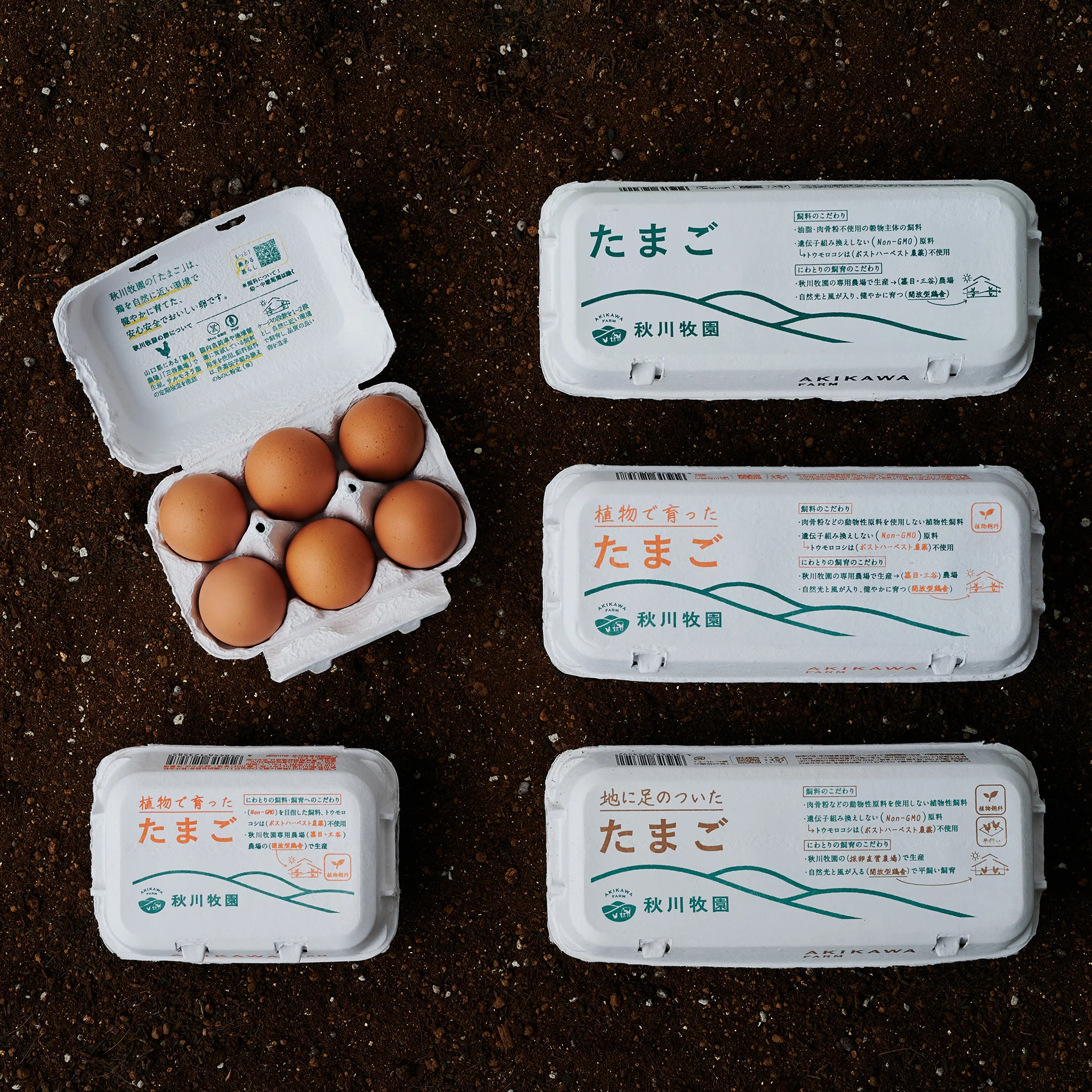
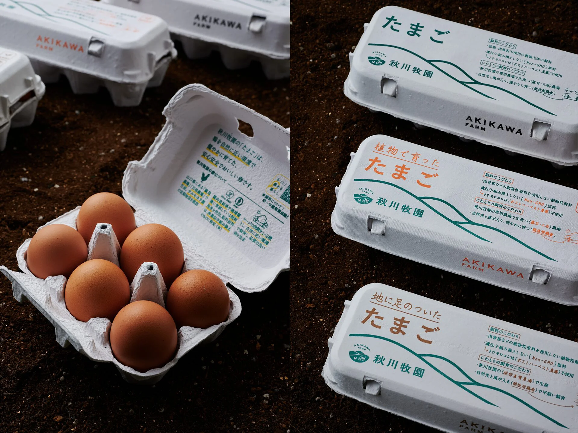
To embody this philosophy in the design of the packaging of processed products, we have made the content information, which is usually placed on the back of the product, appear prominently on the front of the package as the main design element. The design clearly states that no food additives or other “extras” are being used.
The “Boutaro Green” mountains on the lower half of the package and label are made as if they were a blackboard, and the “fill-in-the-blank” expression on the board are a reminder of the company’s commitment. The white background is also designed to be reminiscent of a textbook or reference book, to provide a fun way to learn about selecting safe food products.
CLIENT VOICE
Akikawa Bokuen is located in the rural area of Yamaguchi City and has long been dedicated to pursuing the ideal in food and agriculture. While the company had always valued building direct relationships with consumers, it was also beginning to confront the next step: branding. The question was, how can we express the unique path Akikawa Bokuen has been walking? This awareness was what led to our encounter with Mr. Tachikawa.
At first, we simply thought about fixing our inconsistent product packaging. But Mr. Tachikawa suggested, “If we’re going to do it, let’s start by rethinking the company’s mark.” We decided to follow his advice. Always frank and quick in his approach, Mr. Tachikawa absorbed even the opinions of us—design amateurs—whenever they were useful. Once the essence of Akikawa Bokuen took visible shape, we truly felt that our branding began to accelerate from there.
AKIKAWA FOODS & FARMS CO.,LTD.
Tadashi Akikawa
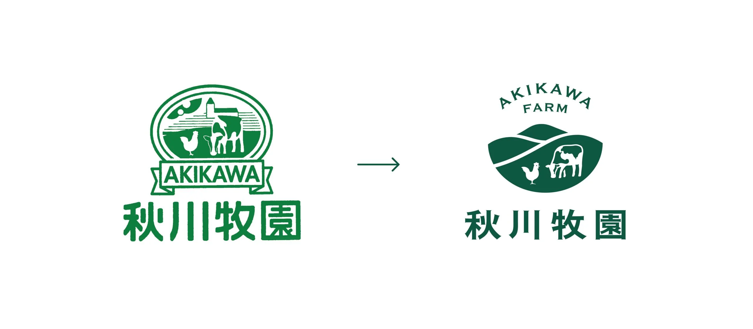
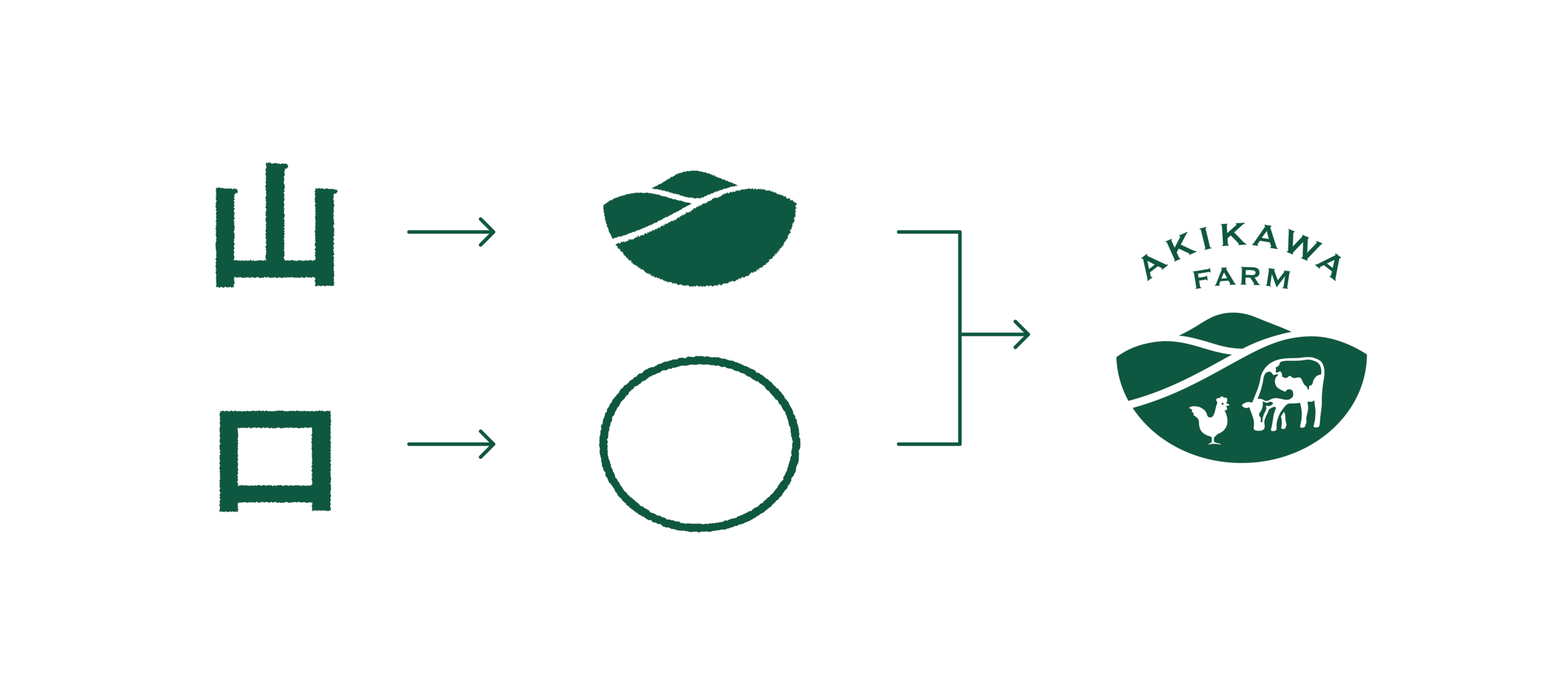
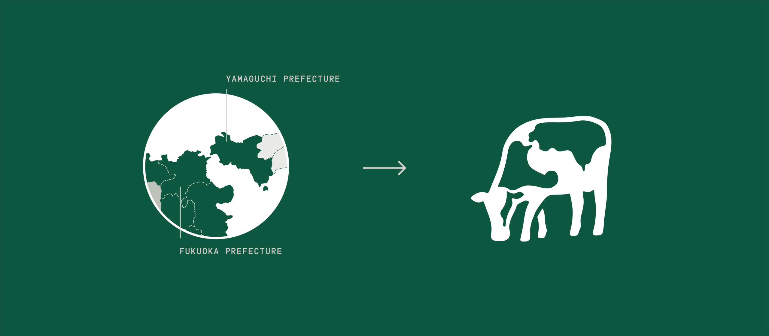
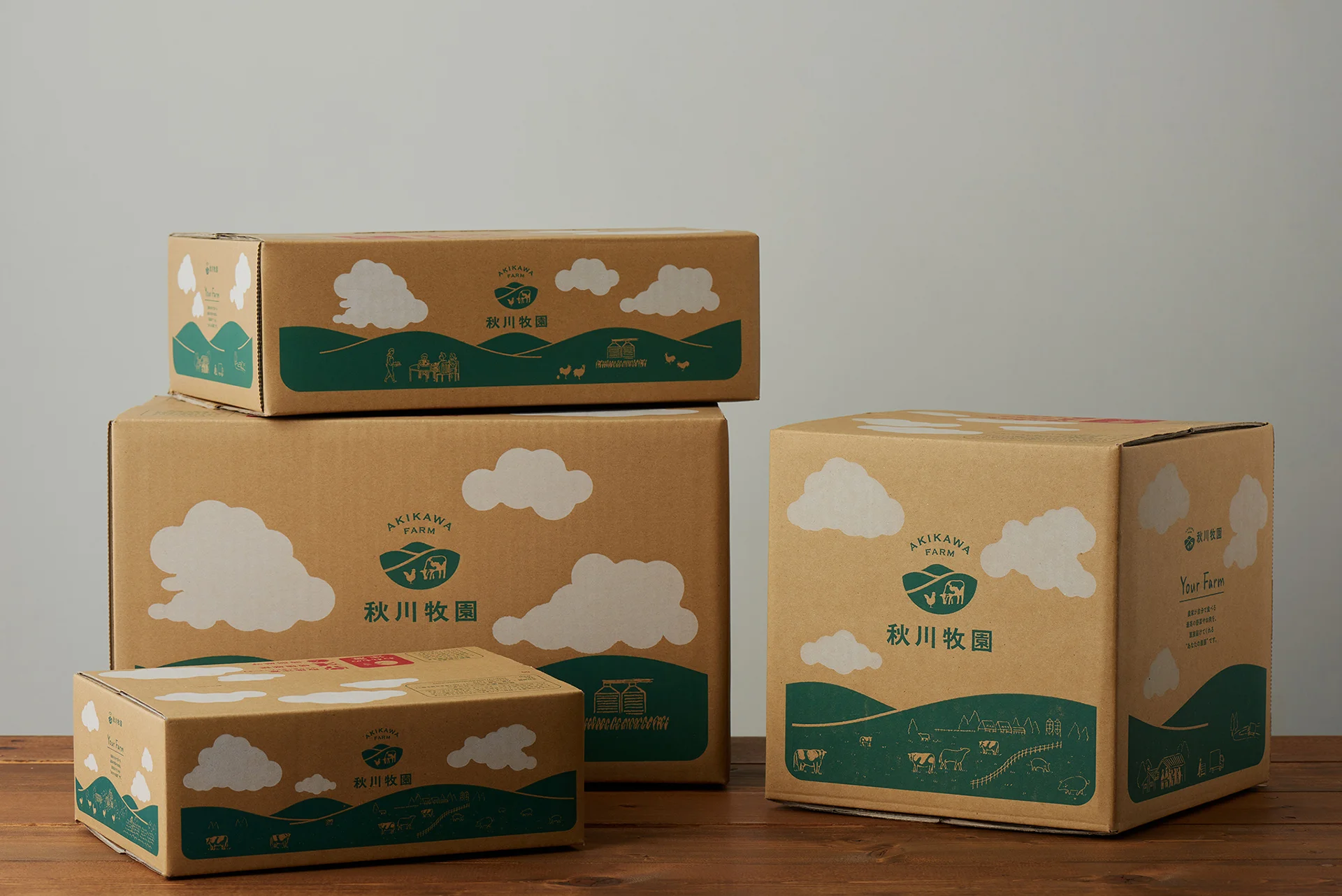
In the identity design, a new brand color, “Boutaro Green”, was set as a new brand color that recalls the good old farm idealized by the first generation of the Boutaro family. In addition, because the company is committed to creating a regional recycling-oriented agricultural model, we designed a logo with a motif of a mountain range in Yamaguchi Prefecture. The cow speckles, a motif inherited from an existing logo, was made to fit the shape of a map of Yamaguchi and part of Fukuoka Prefecture, where the company’s group farms are located. It shows the company’s intention to strengthen its ties with the local area and earn the pride of its community.
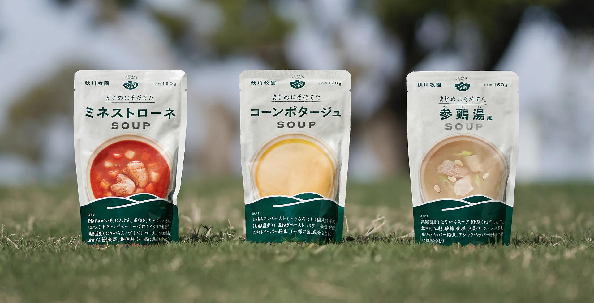
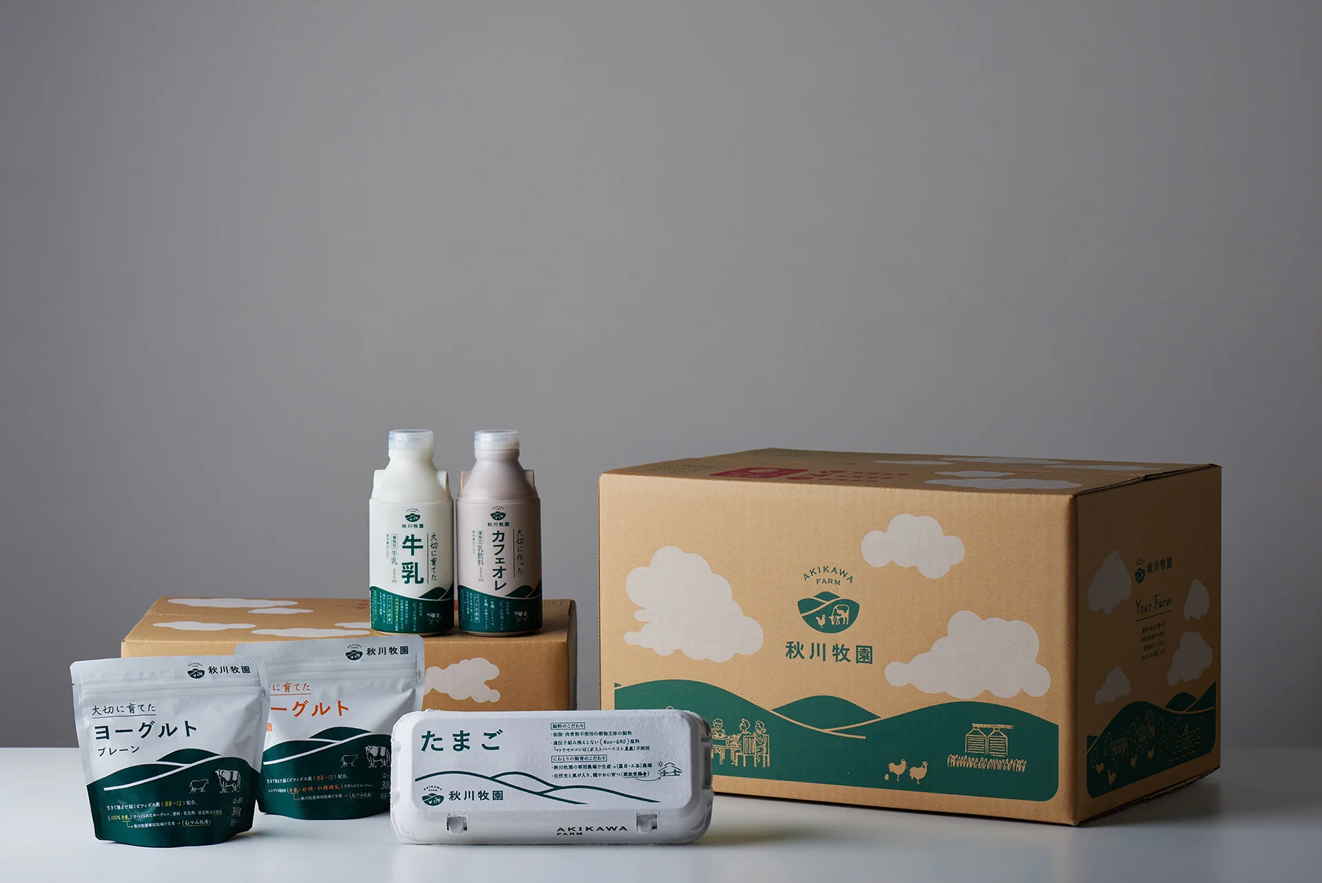
For other packaging, except frozen foods, we used the mountain range motif for consistency. Thanks to this, the mountains seem to line up when the products are side by side on the shelves, leaving a strong visual impression on consumers.
Also, when naming the products, we made sure to include a copy of each product’s “commitment”. Product names such as “Carefully Raised Milk and Yogurt” and “Down-to-earth Eggs” incorporate humor while conveying the brand philosophy.
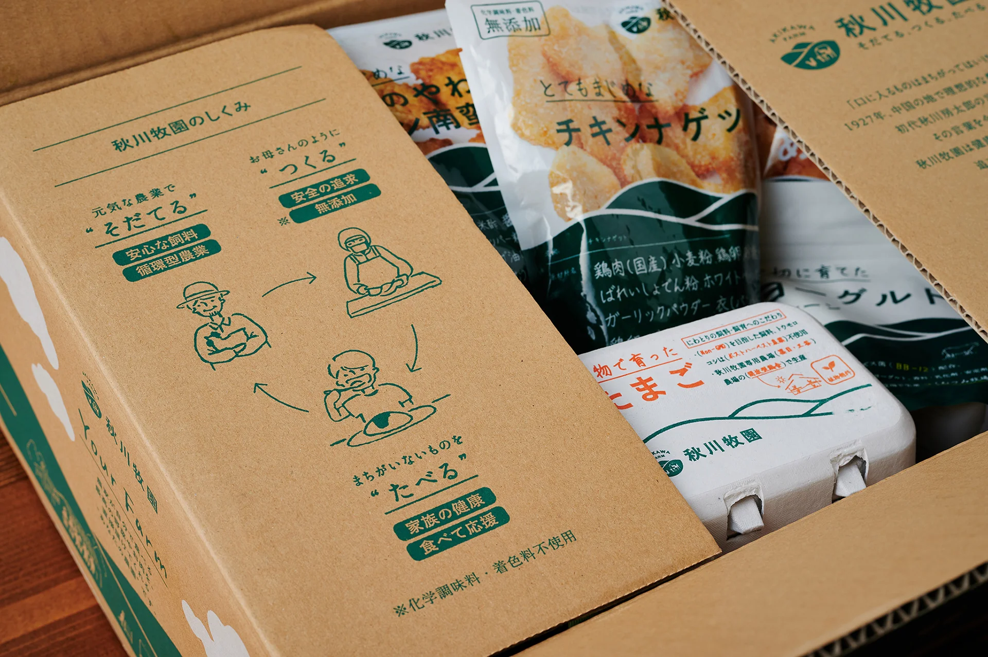
On the cardboard box, we drew an illustration of Akikawa Farm , connected on all four sides. The drawing goes from the ranch to the dining room table, embodying the tagline “Raising, Making, Eating”.
In addition, an infographic was printed on the inner lid to make the process easier to understand. When opening the cardboard box, the philosophy of Akigawa Farm can be understood at a glance.
WILL
A Japanese Initiative
to shape the future of food.
The designs we have created are beginning to be reflected in the packaging of our products. As a result, the rebranding helped to improve the company’s performance by expanding its sales channels, especially to organic shops in Tokyo, and the stock price more than doubled in the six months following the rebranding announcement. The Akikawa Farm’s effort to reconnect its reliable food philosophy with today’s awared consumers has just begun. I hope that Akikawa Farm will be recognized both domestically and internationally as a company that represents food safety, and that the movement to realize a sustainable food future will spread from Yamaguchi to the world.

INFORMATION
- What
- AKIKAWA FARM
- When
- 2020
- Where
- Yamaguchi, Japan
- Client
- Scope
- Re-branding / Logo / Packaging / Illustration / Photograph (社内リリース素材使用のみ) / Product Naming / Tagline / Promotion Strategy Support / CI Guideline
- Award
- German Design Award: Gold (2021)
- SDGs
CREDIT
- Art Direction
- NOSIGNER (Eisuke Tachikawa)
- Graphic & Packaging Design
- NOSIGNER (Eisuke Tachikawa, Ryota MIzusako, Ayano Kosaka)
- Photograph
- CCDN (Yuichi Hisatsugu)
- Brand Image Photograph
- Lisa Kashitani
- Video Producer
- LOCUS