PROJECT
KININAL
Invented fruit-shaped cakes mimicking real fruit. Shop at Uozu Buried Forest Museum, Toyama, tripled visitor numbers.
HOW
Devised
the simplest form of
fruit cakes.

Uozu is home to a beloved local cake shop called Lindenbaum. Additionally, Toyama Prefecture, where Uozu is located, is famous for its fruit cultivation. Together with them, we decided to set up a shop at the entrance and create a fruit cake brand that would attract attention both domestically and internationally. We conceived the idea of cakes that are dedicated to looking like fruit. We instinctively realized that the best design to achieve this would be cakes that look exactly like real fruit. Thus, we invented a completely new cake brand that recreates the shapes of fruits and nuts just as they are.
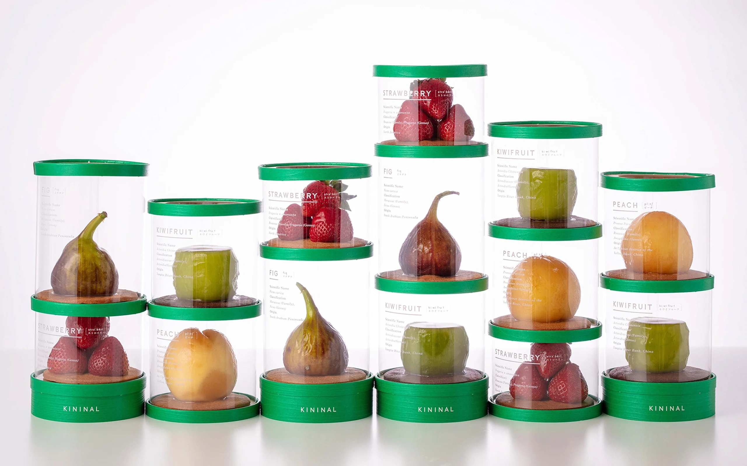
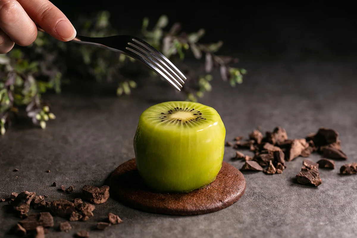
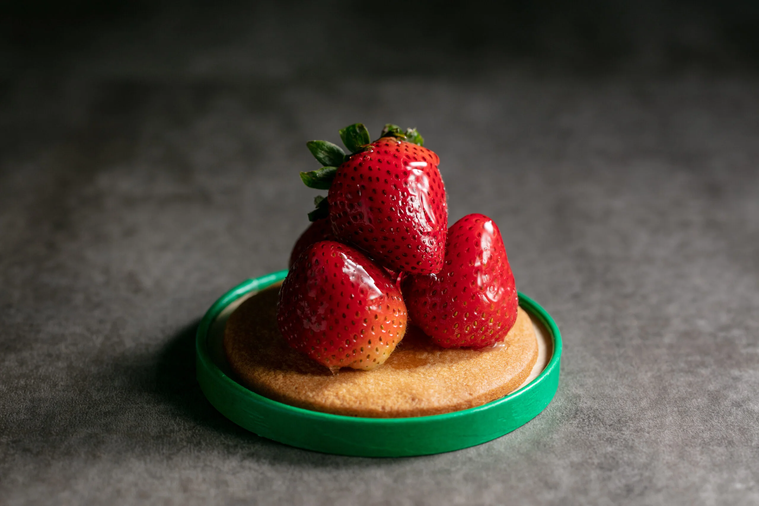
KININAL is a new cake brand that retains the exact appearance of fruits; a cake that looks exactly like a kiwi, a fig, to a cake that looks exactly like a peach. The cream hidden inside completes the fullness of the cake as it makes you think you were eating the whole fruit. There are also fresh juices produced “as it is”, where the skin of fruits such as grapefruits and oranges are used as eco-friendly containers. We do our best to be loyal to the environment and what we are able to gain from these trees.
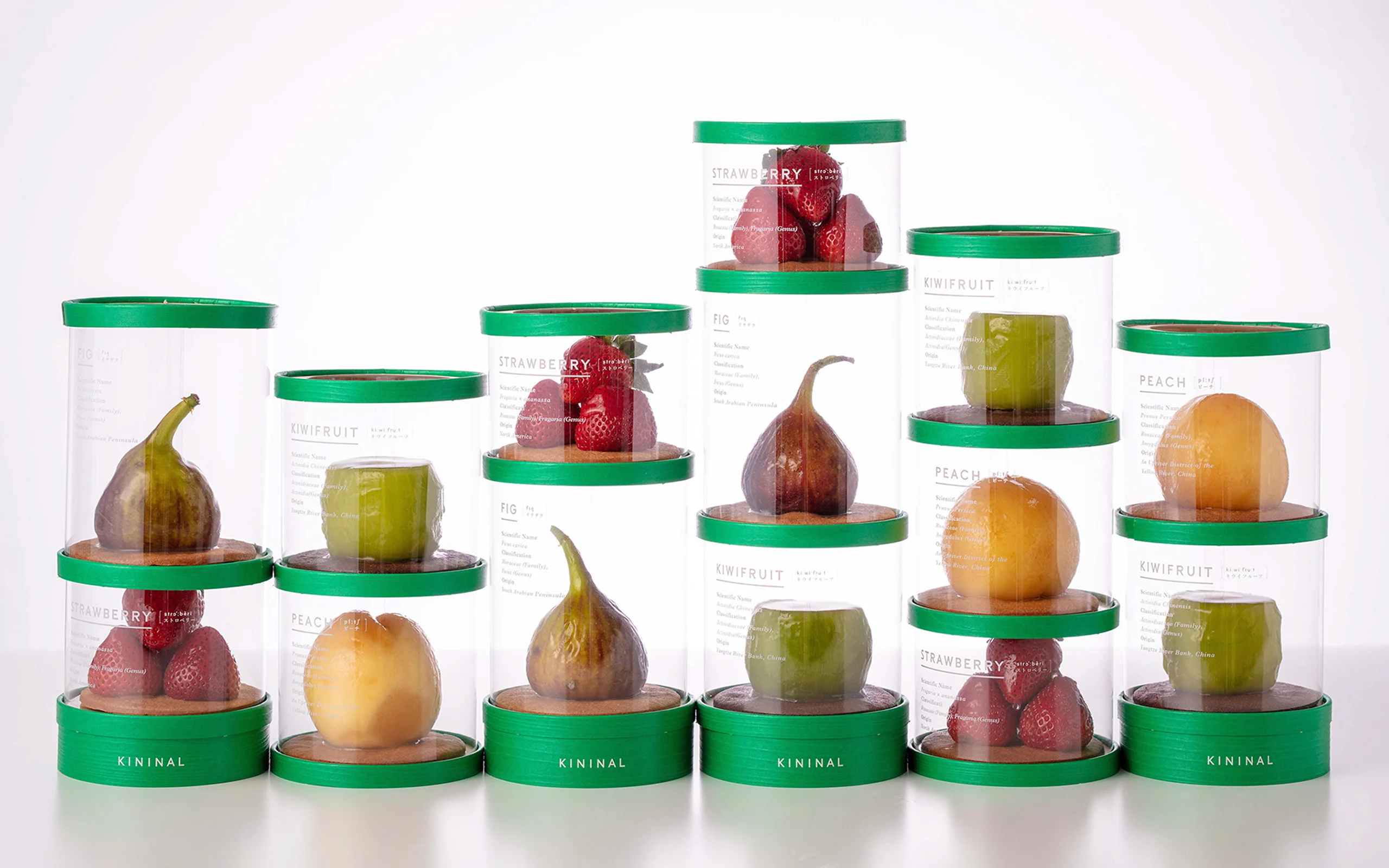
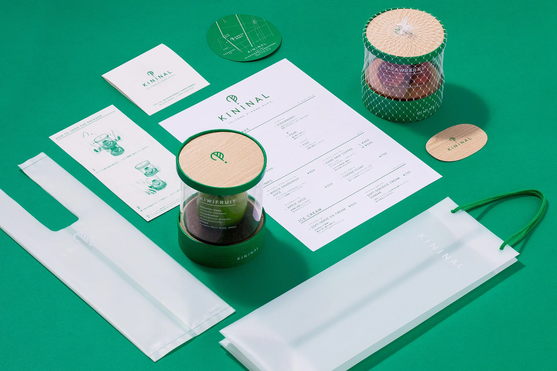
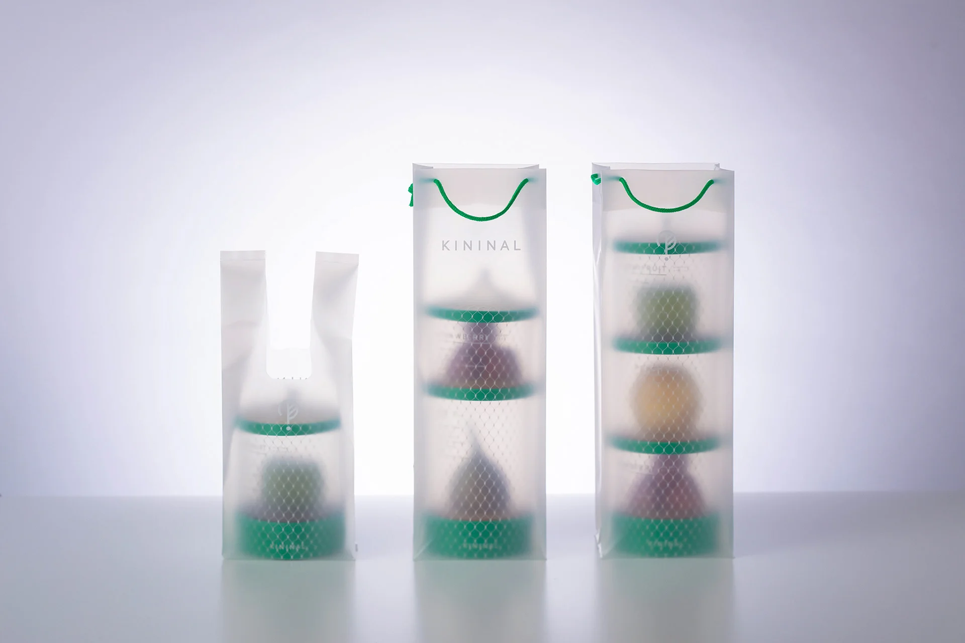
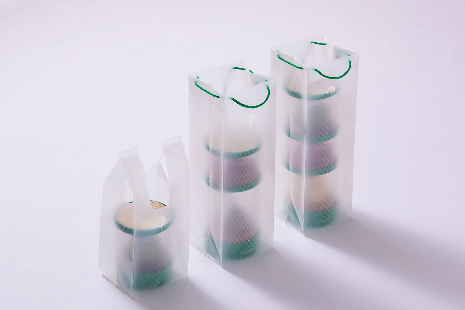
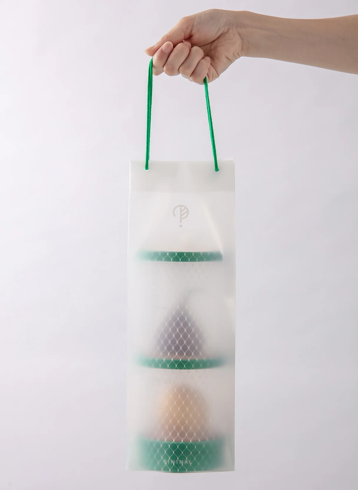
The package is designed with the theme of “fruit specimens”, to best express the essence of the fruits, which is the main characteristic of the cake. The fruit and scientific names are written on the transparent film, designed to look like a 3D stereoscopic book of fruits. The cakes are able to stack on top of one another by using the same lid size. This made it not only convenient for carrying the cake, but also to be beautifully displayed at the same time.


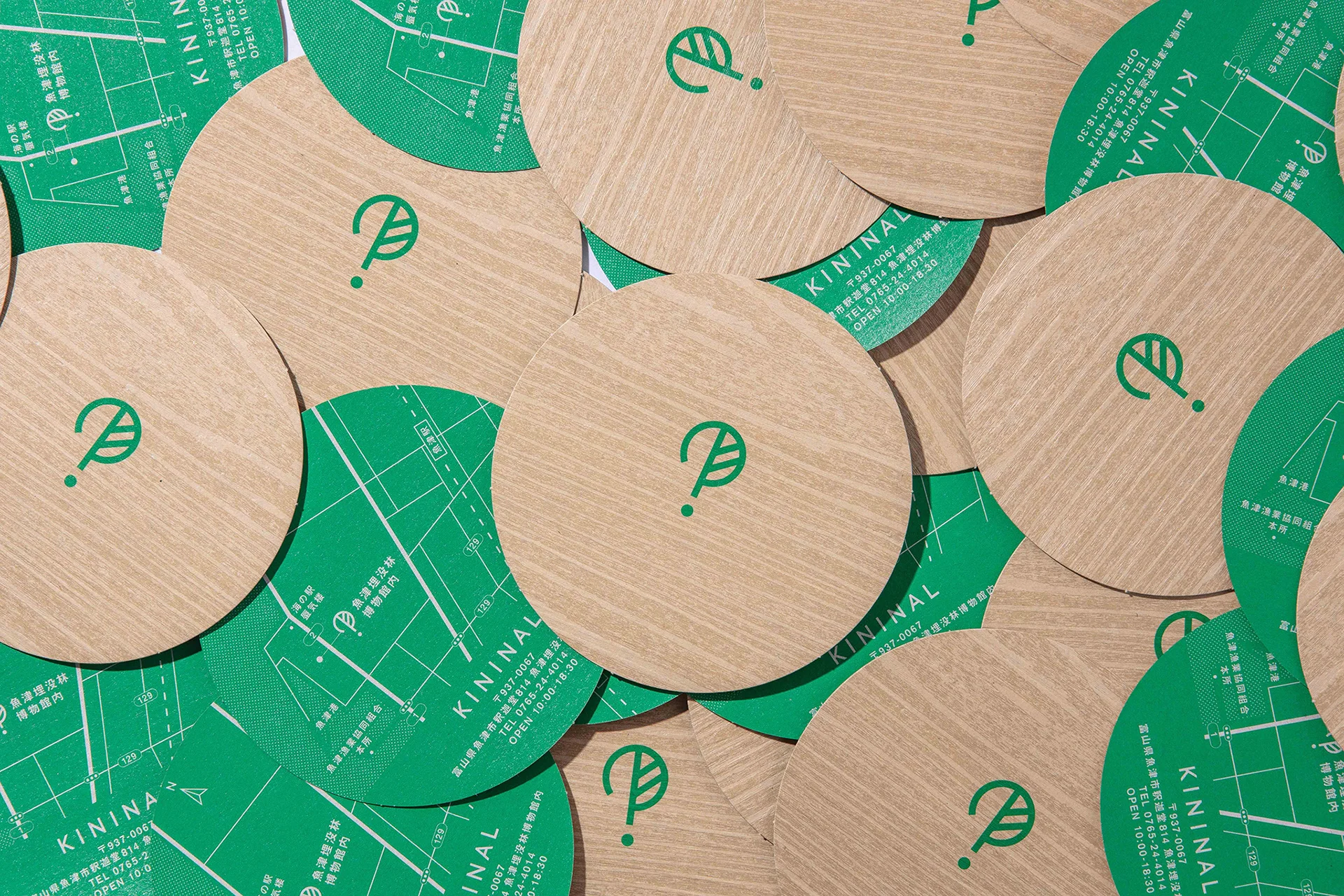
The original typeface “SIMPLA” is a geometric typeface that harmonizes the minimalistic form of the symbol. The “I” is in balanced and placed in the centre, aligned with the symbol.
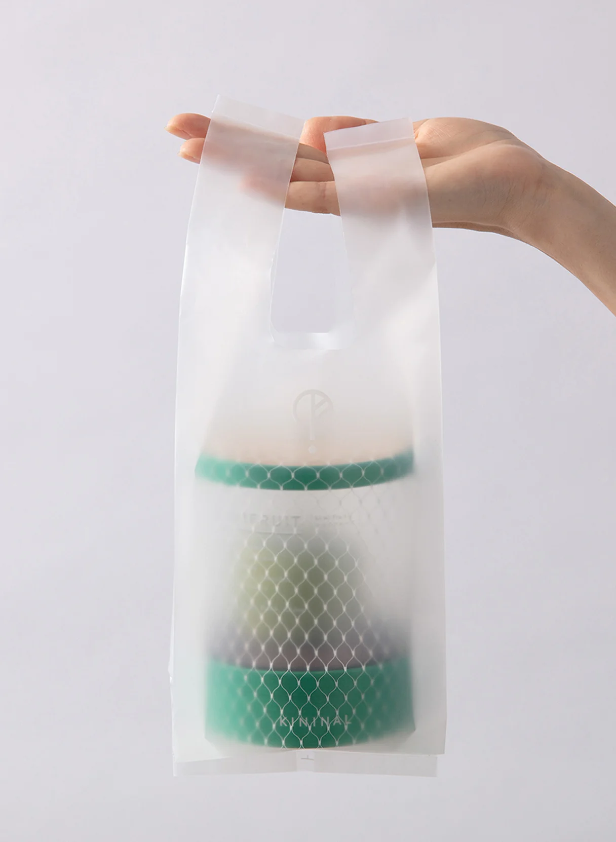
The shopping bag is semi-transparent, where the product becomes dimly visible when placed inside. The “?” symbol is then visible in front of the product, making us think and “wonder” about what is inside. To catch people’s attention, we arranged for the one symbol to be on the round card, placed on top of the packaged cake. We set the logo to each product to fit accordingly. We used the same logo typeface for the outer sides of the package, as we wanted to show an ascetic and straightforward impression.
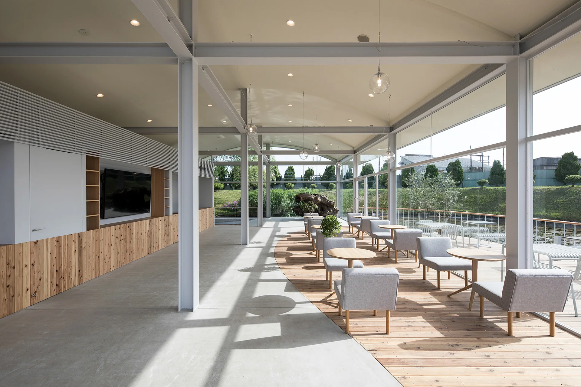
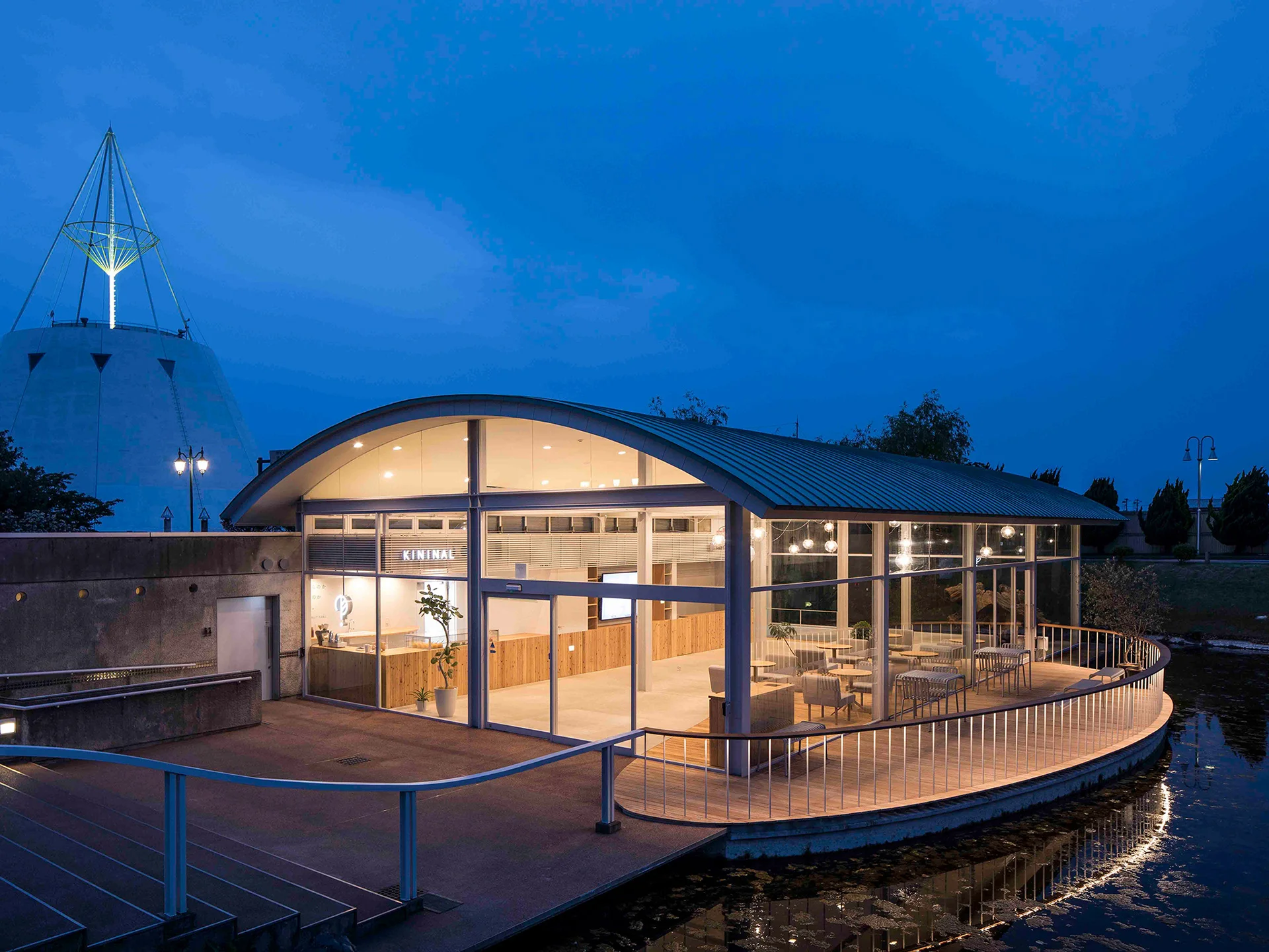
To make the most of the museum’s existing frame, at the same time change the space so that one can come in contact with the waterside area, we constructed an oval-shaped wooden deck that connects the interior and exterior spaces. The wooden floor creates a sense of openness by stretching it out to the open. In addition, we created a KININAL counter made with plenty of local wood, where the glass case has a limited frame for the fruit cakes to stand out to the customers.

WHY
To revive
a deserted museum
in a rural area.
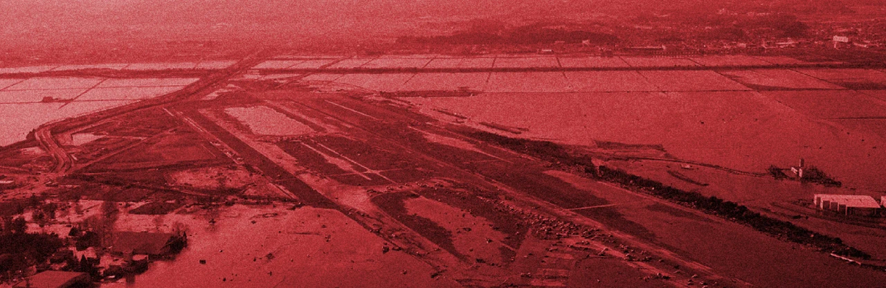
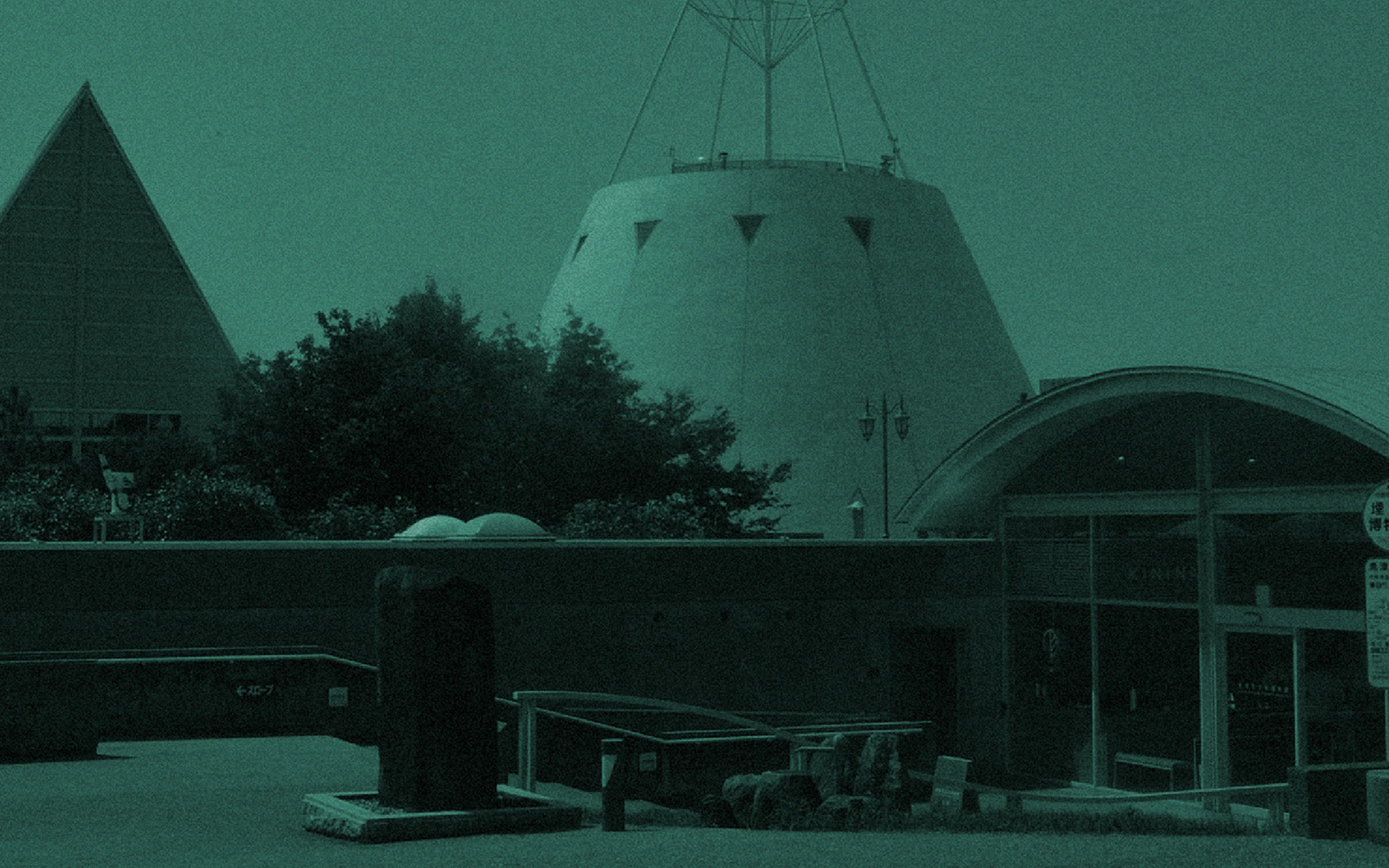
Within an 18-minute walk from the Uozu station, you will find the Uozu Buried Forest Museum in Uozu City, in Toyama Prefecture–a small town with a population of 40,000 people, only 2.5 hours away from Tokyo. You may not have heard of the name “Buried Forest” before. It is a unique process when trees become fossils in the sand, and is appointed as a natural monument in Japan. Despite opening for 64 years, there have been hardly any visitors in this unusual museum. We questioned how we could revitalize the future in Uozu by renovating the entrance of the museum.
WILL
Popular on social media,
now known worldwide.
KININAL is a small cake shop that quietly opened in the city, that became well-known through social media. It became a popular store that now people queue for. The number of visitors that come to the Uozu Buried Forest Museum increased by 2.5 times, making it an official place to visit in Uozu. Stay tuned for more from KININAL.
Awards:
10th WOLDA: GOLD Award (2019)

INFORMATION
- What
- KININAL
- When
- 2018
- Where
- Uozu city, Toyama, Japan
- Client
- LINDEN BAUM Co., Ltd
- Scope
- Branding / Branding stationary / Logo / CI Guideline / Packaging / Business card / Font(SIMPLA) / Sweets Design / Space / Signage / Promotional items
CREDIT
- Art Direction
- NOSIGNER (Eisuke Tachikawa)
- Graphic Design
- NOSIGNER (Eisuke Tachikawa, Ryota Mizusako, Shun Kudo)
- Sweets Design
- NOSIGNER (Eisuke Tachikawa, Linden Baum (Shuichi Tamamori)
- Space Design
- NOSIGNER (Eisuke Tachikawa), Aki Hamada Architects Inc (Aki Hamada, Musashi Makiyama)
- Photo
- ohakoikeda (Noriyuki Ikeda)