PROJECT
ANYTHING
伝統的な手法による前掛けメーカーのブランディング。 世界中で販売される人気商品へと成長。

WHY
商人文化の象徴で
ある前掛けは風前の灯だ。
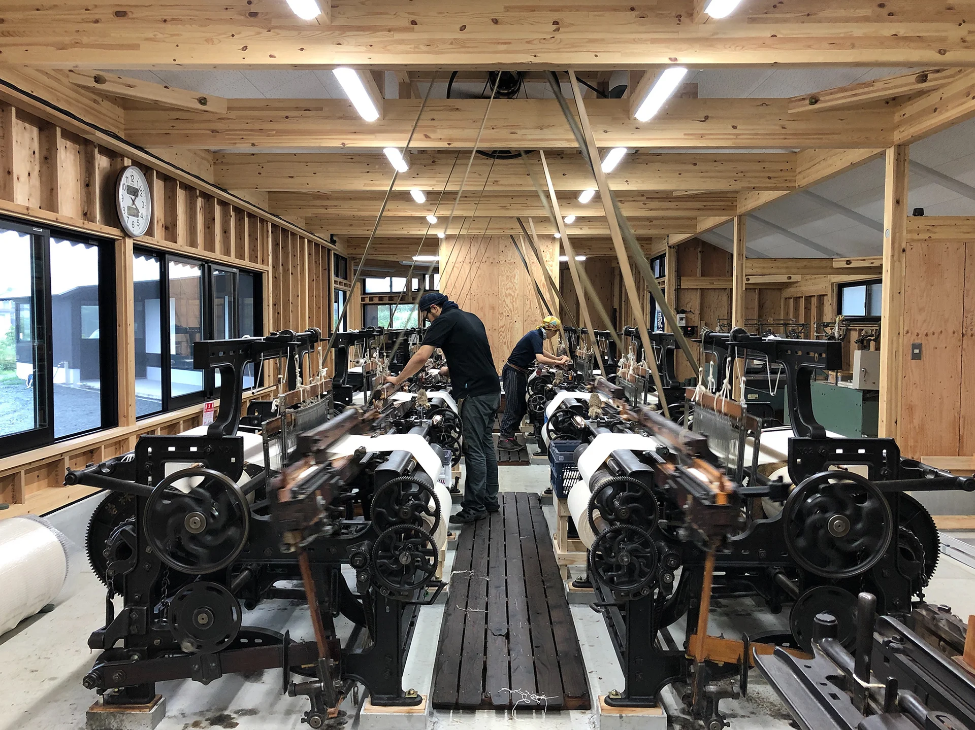
日本には、酒屋や魚屋、米屋などがエプロンのように腰に巻いて使う「前掛け」という作業着があります。15世紀頃を起源とし、江戸時代から現在に近い形になったと言われる前掛けは、働く人たちの腰を守り、衣類の破れやけがを防いでくれます。このような実用性に加え、明治時代頃からは「屋号」が染め抜かれ、ユニフォームや広告宣伝としても使われるなど、前掛けは日本の商人文化を象徴するものとして多くの人たちに愛用されてきました。前掛けの産地として知られる愛知県豊橋市は戦後、前掛け需要の高まりとともに製造量が急増しましたが、時代とともに需要が減り、いまでは江戸時代から使われてきた「一号」と呼ばれる分厚い前掛けの生地を織ることができる工場は、すでに一軒を残すのみとなっていました。日本の商人文化を象徴する前掛けの文化や産業は、もはや風前の灯火とも言える状況でした。
伝統的工芸品産業の生産額等の推移。


HOW
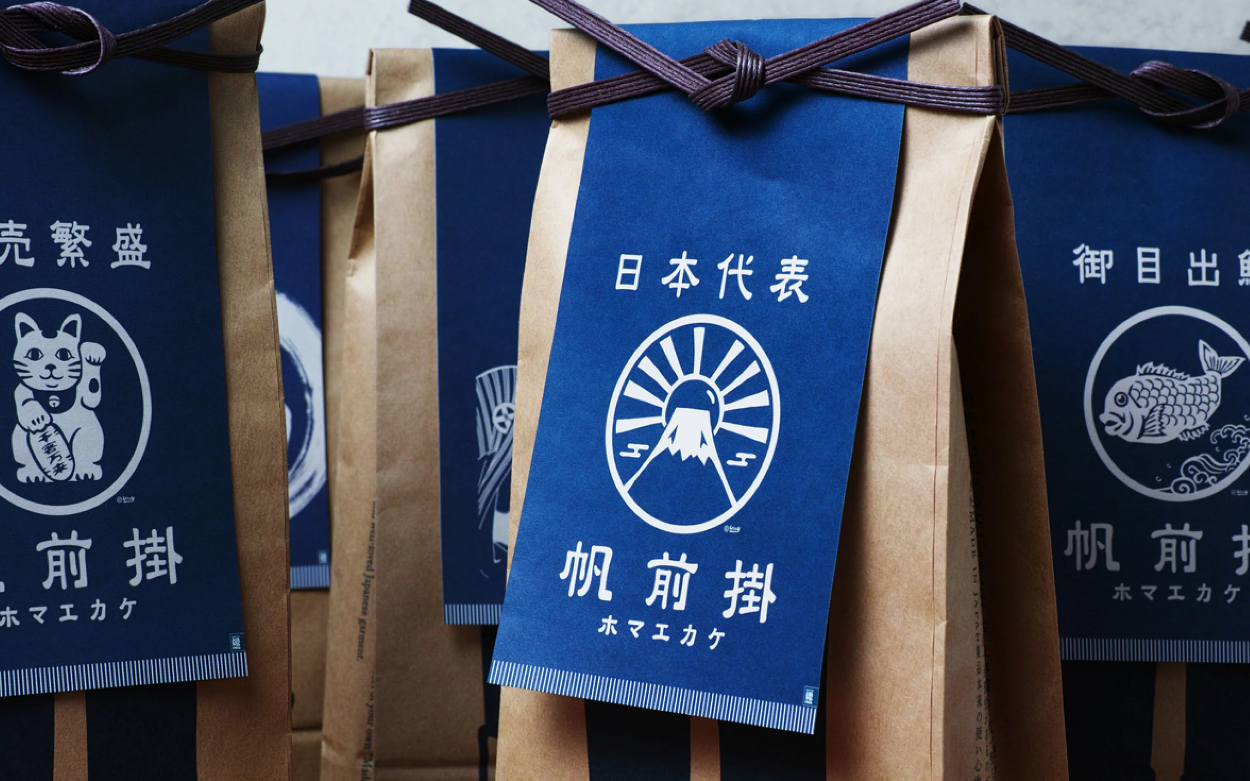
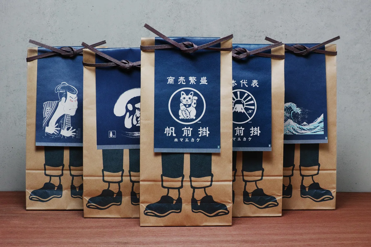
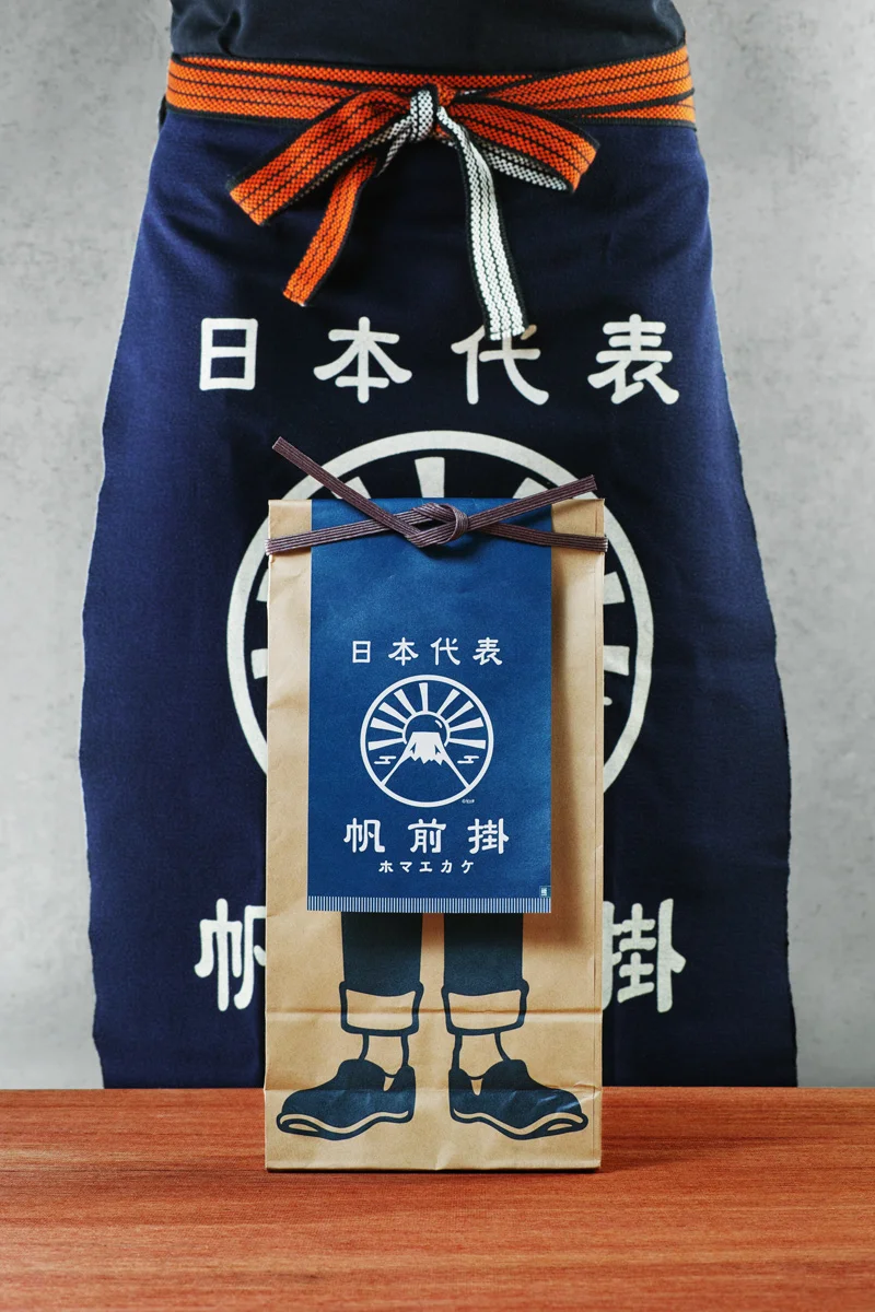
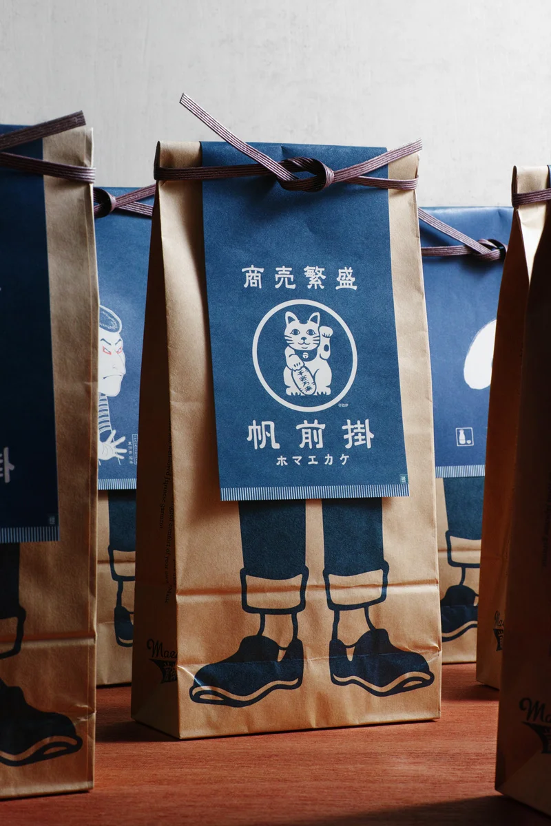
紙製のミニチュア
前掛けパッケージ。

現存する唯一の一号前掛け製造工場の職人とともにつくる前掛けブランド「エニシング」のパッケージをデザインしました。これまで同ブランドでは、Tシャツを販売するように前掛けをビニールで包装していましたが、折り畳まれた状態になるため全体の柄が確認できないことはもちろん、一号前掛けならではの質感を確認することもできず、時には前掛けであることすら認識されないケースも少なからずありました。一方、スペース上の問題などから、店頭の壁などにディスプレイすることも難しい中、私たちは前掛けの販売にイノベーションを起こすことを目指し、商品と同じ絵柄がプリントされたミニチュアの前掛けを、足だけが印刷された米袋に貼り付けたパッケージを提案しました。これらが店頭に並ぶことによって、ブランドの多彩なラインナップと着用時のイメージを同時に伝えることが可能になりました。さらに、後ろ側には小さな穴を開け、前掛けの質感も確認できるようにするなど購買体験の価値を向上させるとともに、パッケージの脱プラスチックによって環境負荷の削減を実現するサステナブルなデザインになっています。
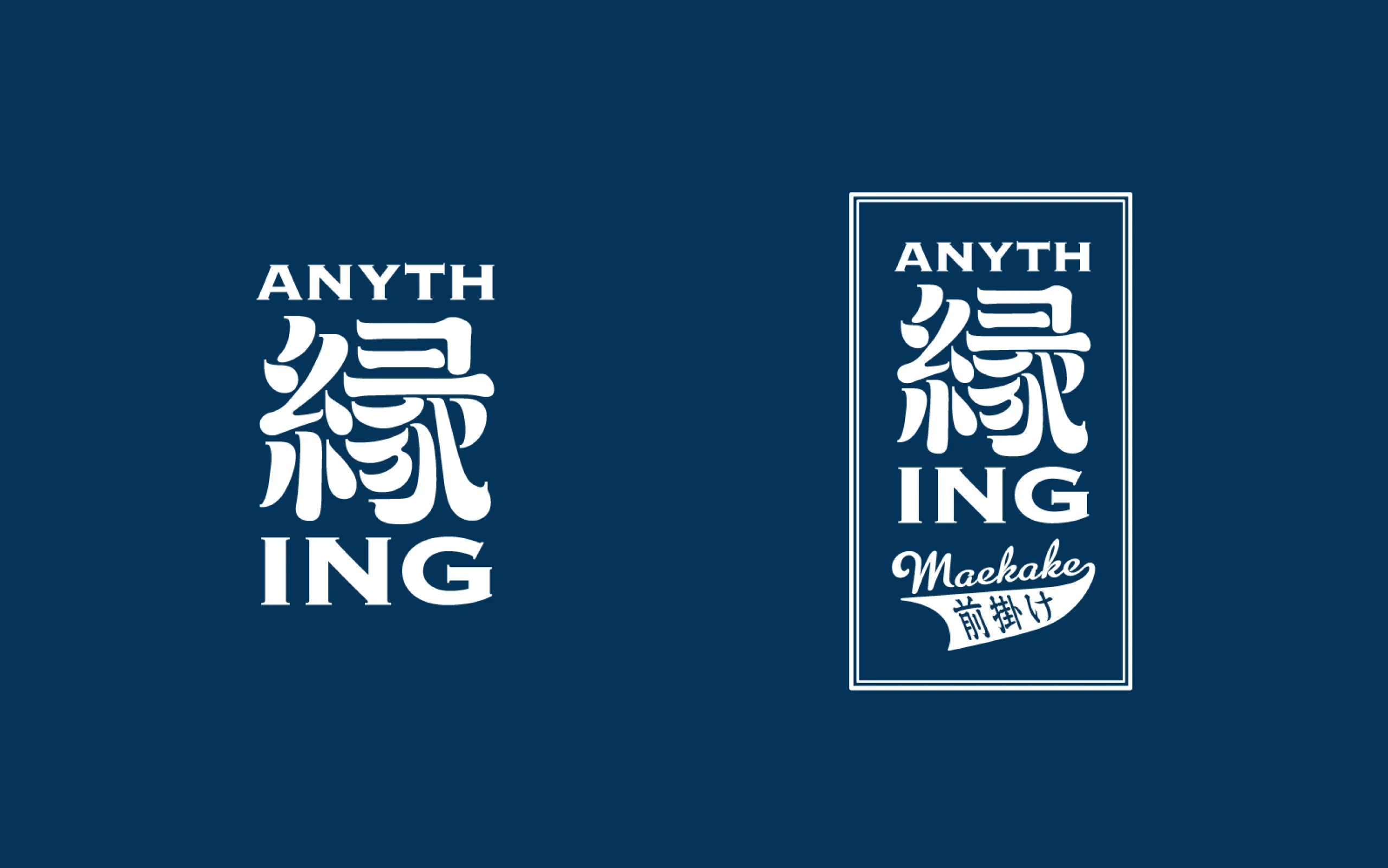
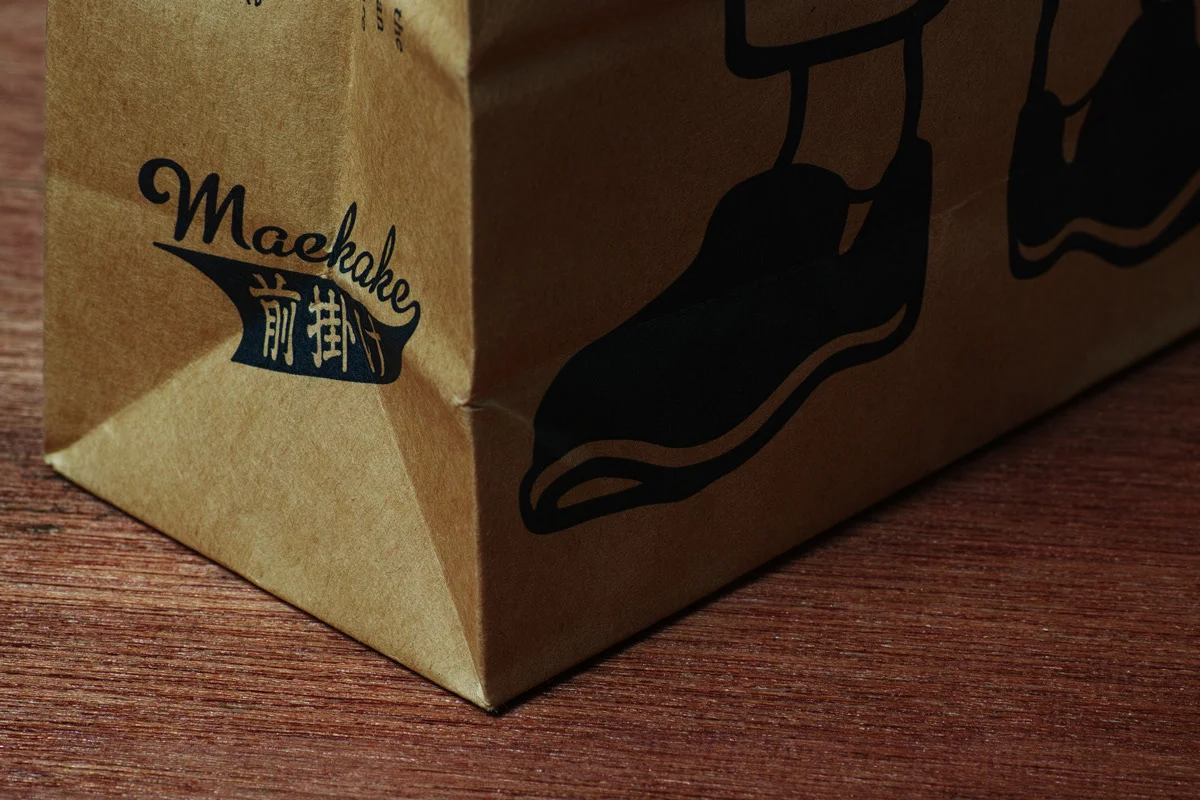
漢字と欧文を併記したロゴデザインは、「人と人が出会う=ご縁(えにし)が続いていく(ing)ことで役に立つ仕事をしたい」という社名の由来を視覚化したものです。漢字の「縁」に、前掛けが普及した江戸時代の看板文字調の書体を用いることで、威風堂々とした雰囲気や前掛けが象徴する商人文化を表現しました。一方、欧文部分には同じく看板などに使われることも多いゴシック体「カッパープレート」を用いることで、日本文化の伝統に現代性を加味したデザインになっています。
WILL
日本の前掛けは
世界のヒット商品に。
店頭での購買体験が劇的に向上したエニシングは、パッケージをリニューアルしてからの4年間で売上が2.2倍増となりました。前掛けをユニフォームに採用する飲食店や、PRやノベルティなどの用途でオリジナルの前掛けをつくる企業やブランドなども増え、さらに空港などでも販売されるようになったことで、外国人旅行者がお土産として購入するケースも多く見られるようになりました。
現在は、イギリスやアメリカなどを中心に世界約30か国のカフェやガーデニングショップ、雑貨店、ミュージアムショップなどで取り扱われており、2021年公開の映画『007/ノー・タイム・トゥ・ダイ』で、登場人物が自宅で料理中にエプロンとしてエニシングの前掛けを使っていたことがきっかけで、クッキング用のエプロンとしてさらなる注目を集めました。
風前の灯火だった一合前掛けの製造も、現在はビジネスとして成立するまでに復活を遂げています。日本の商人文化を象徴する伝統の前掛けが、これからさらに世界中に広がっていくことを私たちは願っています。

INFORMATION
- What
- ANYTHING
- When
- 2014
- Where
- Toyohashi City, Aichi Prefecture, Japan
- Client
- Scope
- Branding / Logo / Packaging / Promotion Strategy Support
CREDIT
- Art Direction
- NOSIGNER (Eisuke Tachikawa)
- Graphic Design
- NOSIGNER (Eisuke Tachikawa, Kaori Hasegawa)
- Photo
- NOSIGNER (Kunihiko Sato)