PROJECT
warew
Organic skincare brand embodying Japanese beauty. Pentawards Gold winner in cosmetics packaging category.
HOW
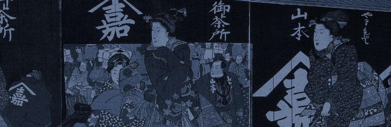
Cosmetics that fit the aesthetics of shrines and “Shiromuku.”
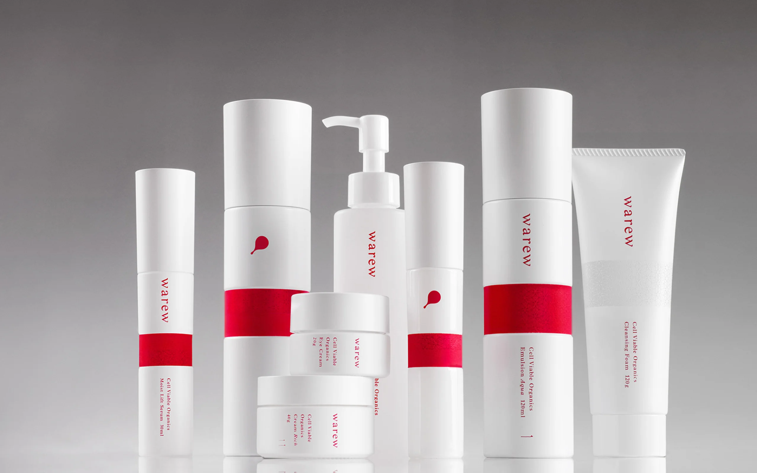
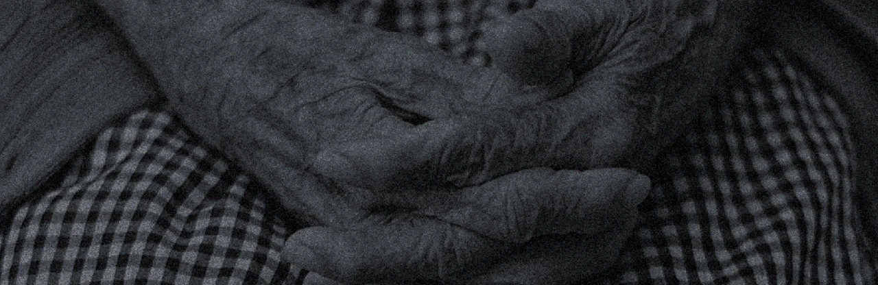
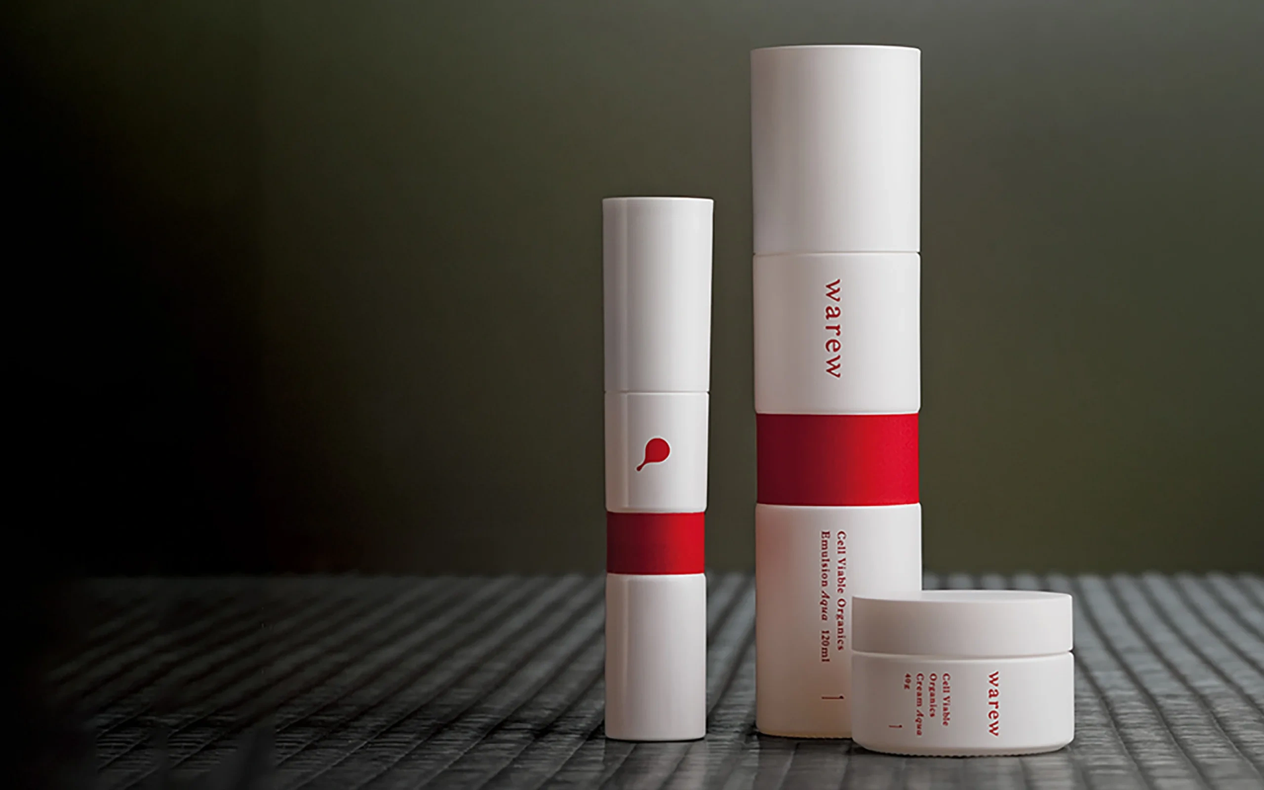
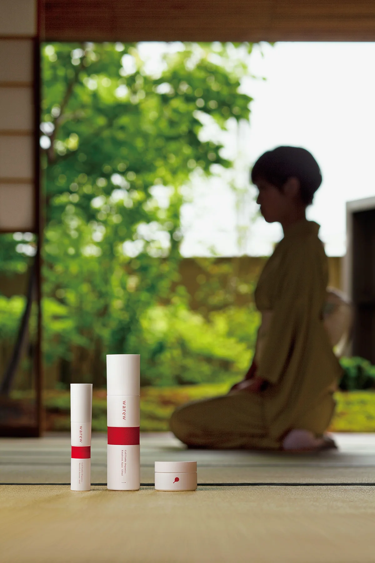
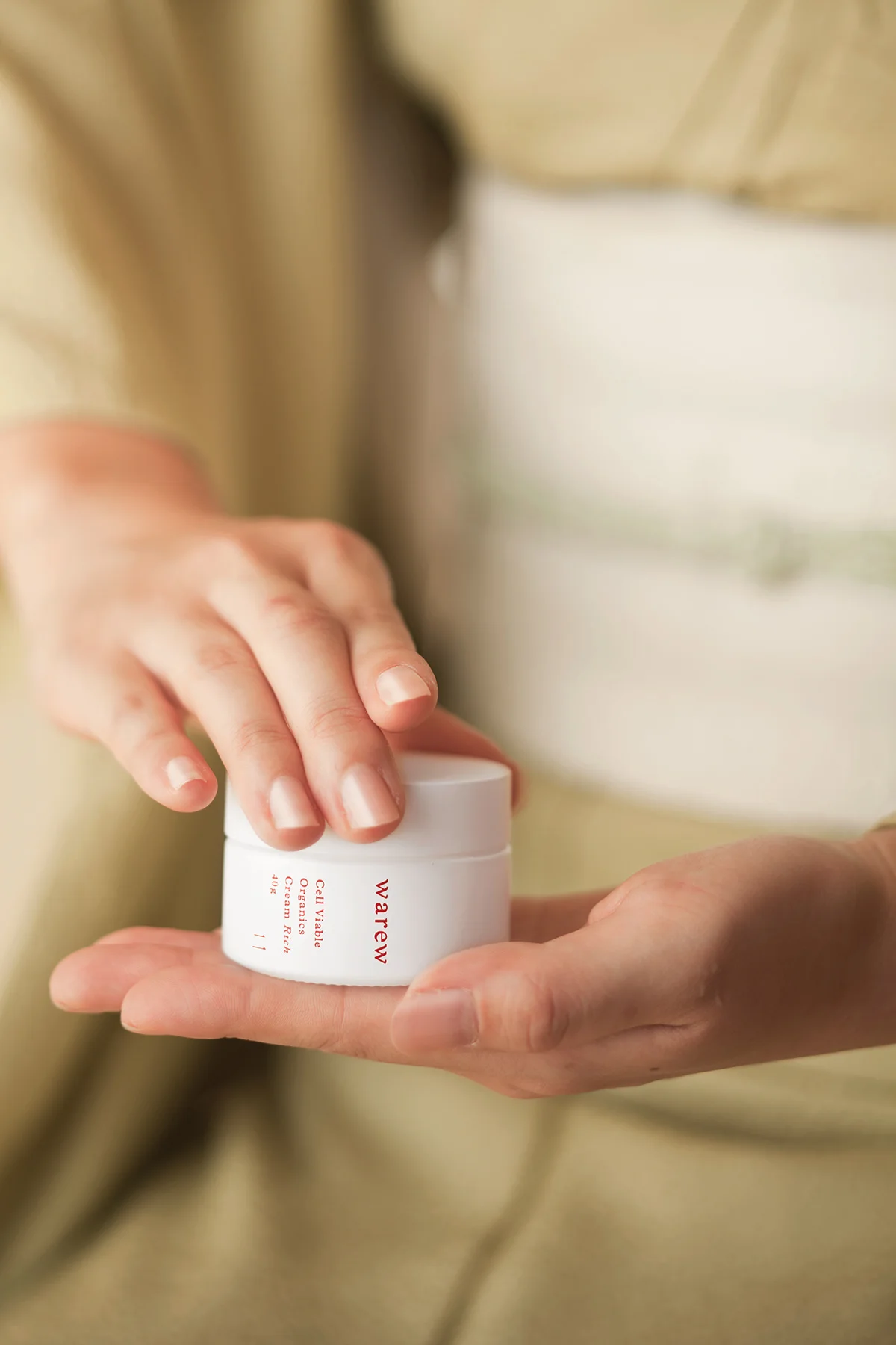
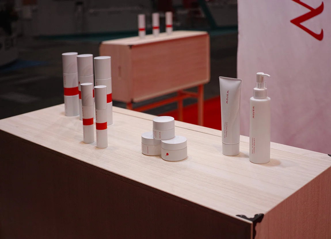
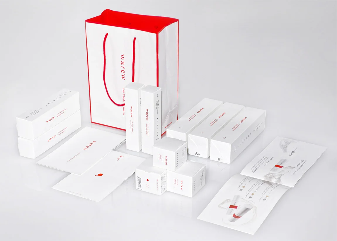
We were in charge of branding the skincare brand “warew” (和流), which means “Japanese style.” We aimed to make a new standard in Japan, focusing on the formalities of the natural ingredients and its domestic origin. As a brand for women who masters in Japanese beauty, we chose a transparent white and a deep vermillion as their brand color. We were inspired by “shiromuku” (a traditional pure white) and its roots of “shrines,” that is a symbol of Japanese women’s beauty. The symbol expresses the essence of the “Hinomaru” (circle of the sun in the Japanese flag) is made to look like a hand mirror that is a tool symbolizing women’s beauty. The glass bottles were inspired by the standing posture of Japanese women, with the band wrapped at the center. By using this band, we produced natural and elegant skincare, where we aimed to makes you feel beautiful from within, which connects to the philosophy of warew.
WHY
To carry the wisdom about medicinal herbs from ancient Japan.
In Japan, plants have been used since ancient times for things such as treatment of diseases, prevention of diseases and also maintenance and improvement of health. They play a role in supporting a healthy lifestyle for the people today, in the form of herbal medicines. From the viewpoint of beauty and aging care, this has caught attention worldwide. We questioned what kind of design was necessary today to deliver Japan’s unique sense of beauty aesthetic. We utilized the power of domestic plants for a superior skincare product to women all over the world.


WILL
Recognized as one of the world’s best package design in cosmetics.
The package design of warew expresses the unique sense of Japanese beauty aesthetics found in the invisible spirituality of “wabi sabi,” referring to its deep and rich simplicity. We were granted the Gold Award for PENTAWARDS in 2014, gaining a top position in cosmetic packaging. The brand continues to develop, with other brands are formed simultaneously. Warew continues to grow with derivative brands, where we assumed horizontal development of the brand from the beginning.
INFORMATION
- What
- warew
- When
- 2013
- Where
- Japan
- Client
- Scope
- Design strategy / Branding / Packaging / Space
- Award
- JPDA: Bronze2015
- PENTAWARDS: GOLD2014
CREDIT
- Art Direction
- NOSIGNER (Eisuke Tachikawa, Takeshi Kawano)
- Graphic Design
- NOSIGNER (Eisuke Tachikawa, Takeshi Kawano)
- Photo
- Masaharu Hatta (products, hands, and woman dressed in a kimono),
Takeshi Kawano (packages, exhibition space)