PROJECT
smaluna
Online pill prescription service rebrand. Design creates approachable, positive brand experience supporting women's reproductive autonomy.
HOW
Promoting the pill as a way of calibrating one’s rhythms to be “true to myself”.

We were responsible for the rebranding of smaluna, a service that offers online examinations, pill prescriptions, and consultations, and handled the entirety of the creative direction and design of the logo, package, and starter kit.
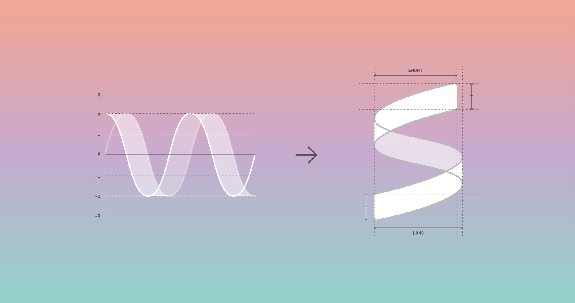
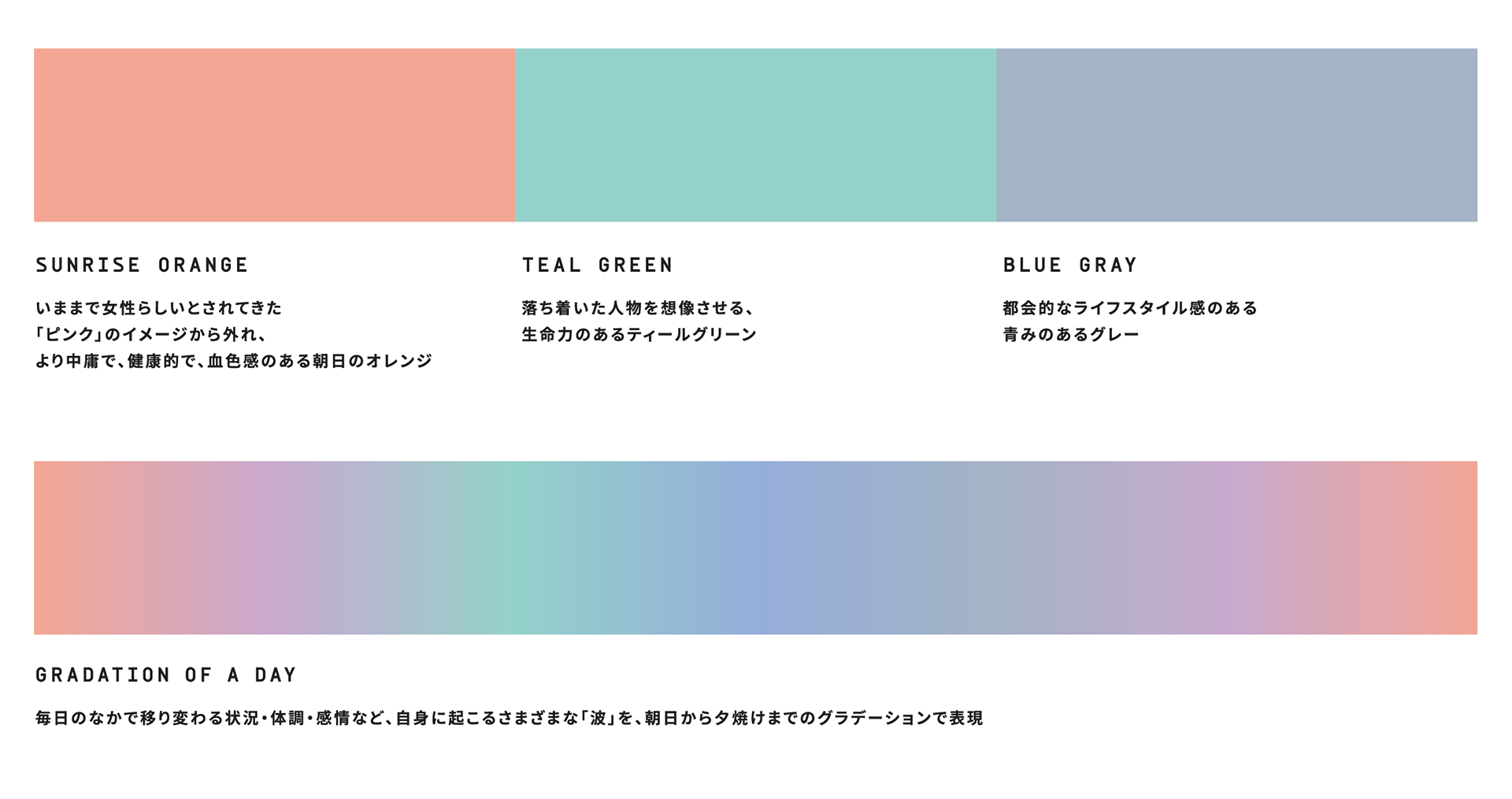
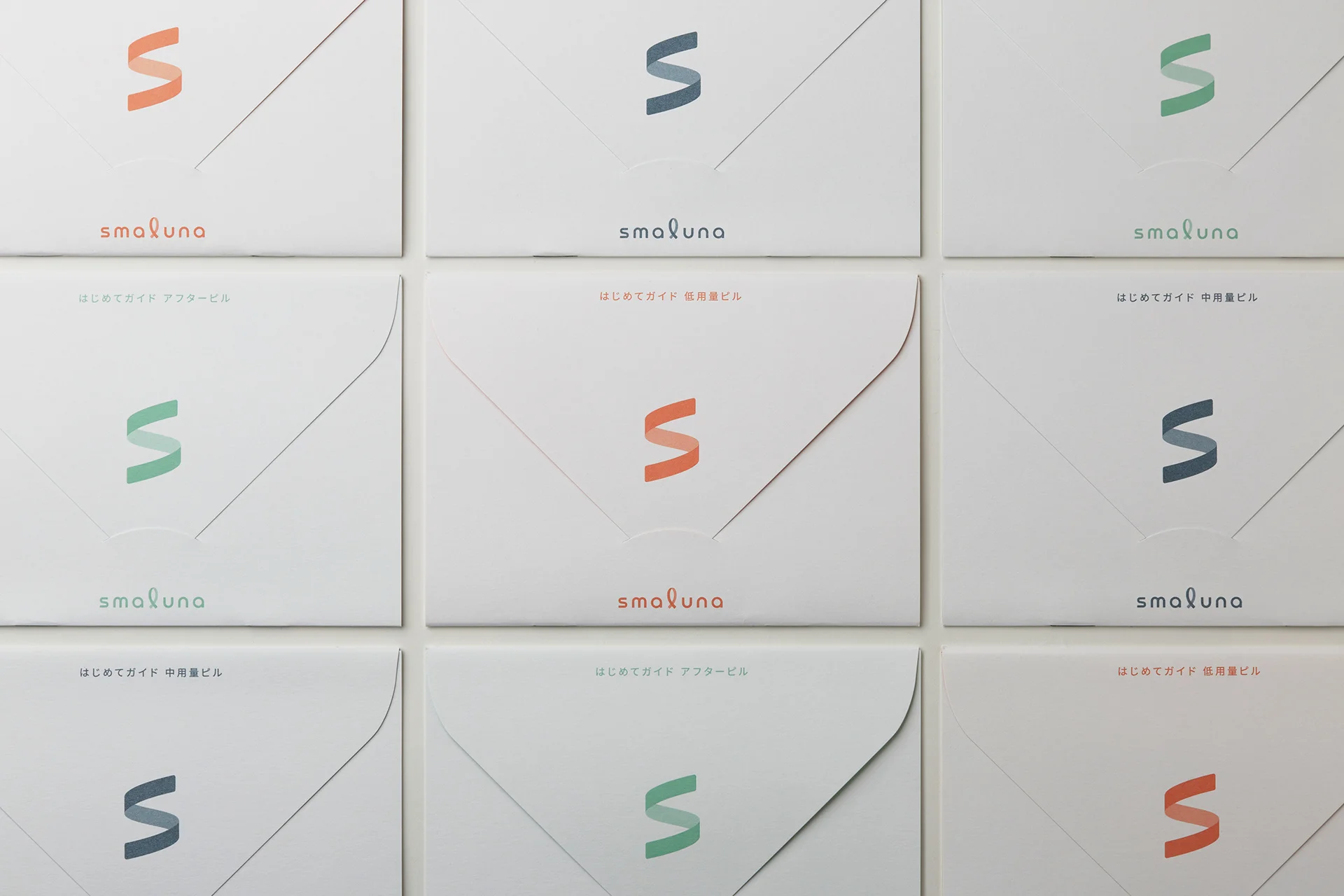
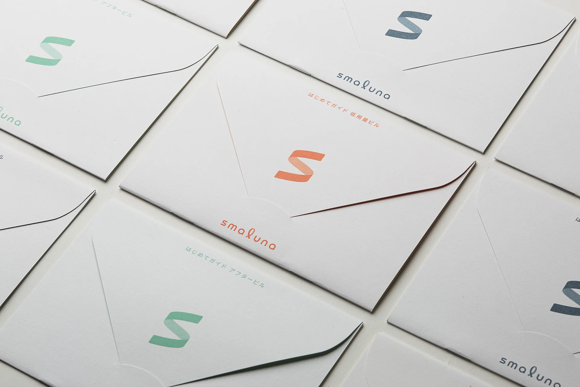
Our first goal was revamping the image of the pill as something solely for contraception towards something offering a positive experience and incorporated the notion of smooth, flowing waves to suggest freeing women from the instability of menstruation and letting them feel more unfettered. The logotype was designed to capture the undulating form of the “S” in the smaluna brand name and liken it to a smooth wave while revolving around a looped “L” as a central motif. A gradient was used to suggest the transition from sunrise to sunset, conveying the physical and emotional transitions a woman undergoes over the course of a day. The branding was designed to suggest freeing women from the tension and constraints of menstruation and enabling them to restore a more stable cycle in line with their lifestyle.
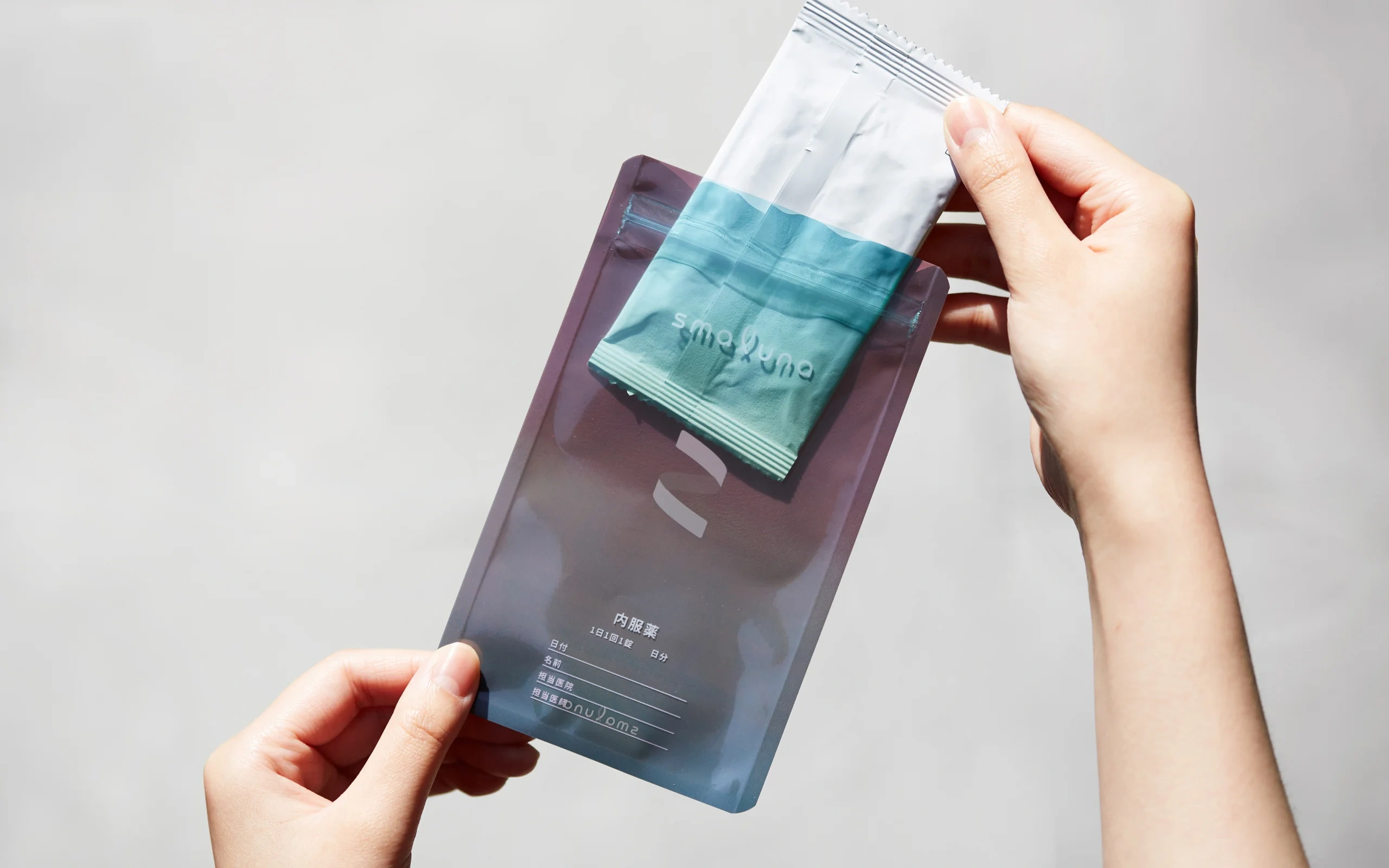
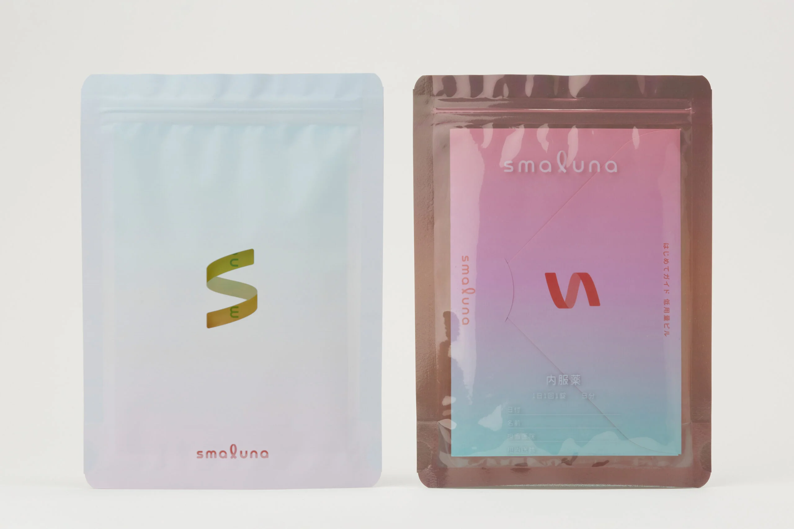
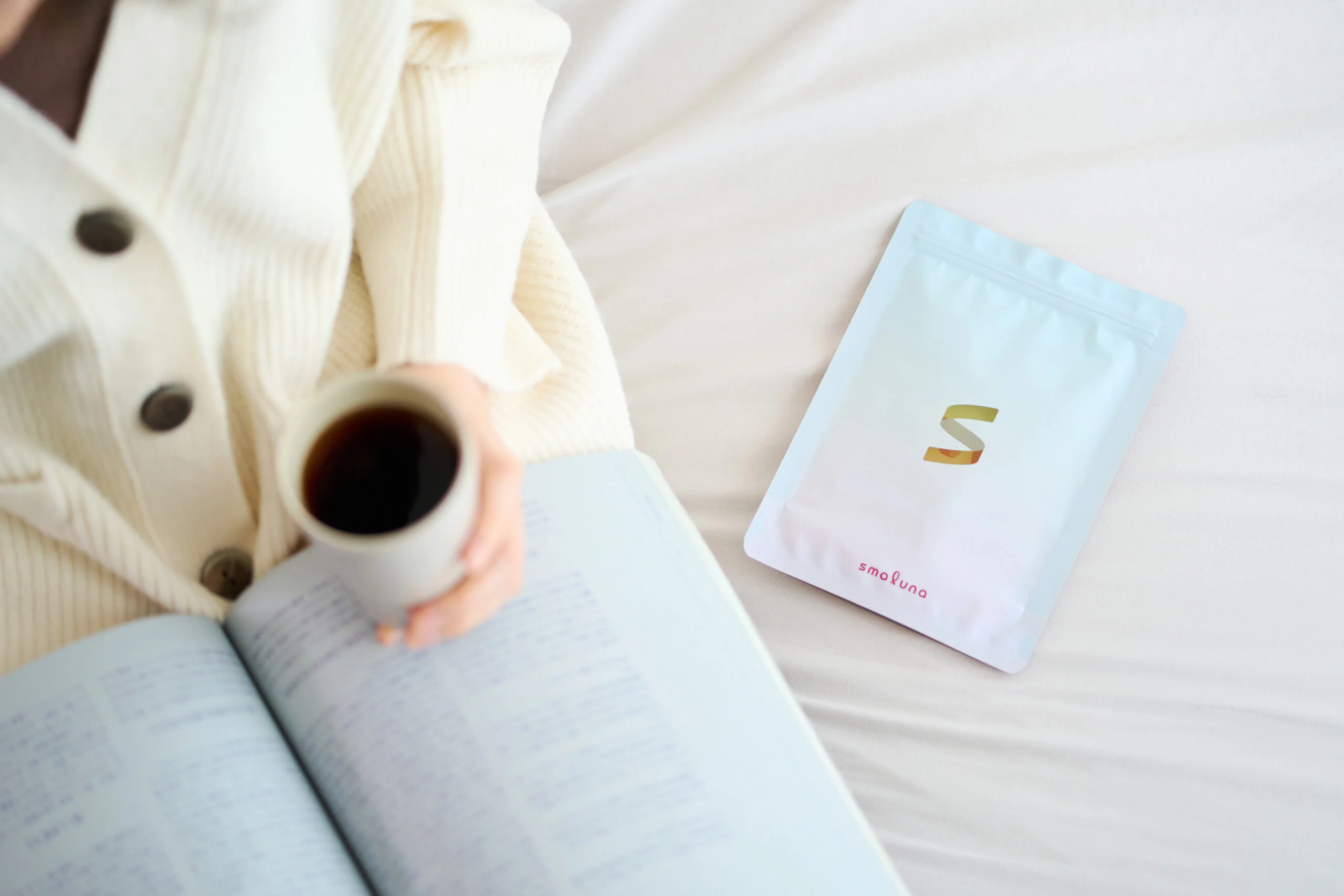
The medicine pouches are made of a transparent material, to which several layers of film were applied to colourize them, ensuring that the contents are given a vibrant look. This design is intended to soften the perceived frustrations of menstruation and suggest a more uplifting experience with the pill that enables a woman to restore a positive cycle. The simple, neutral packaging design reduces consumers’ hesitation about storing the pill out in the open, while also helping to “camouflage” the pill inside. In addition, the choice to make one side of the package white was done to enable the user to select whether to show it facing forward or not.
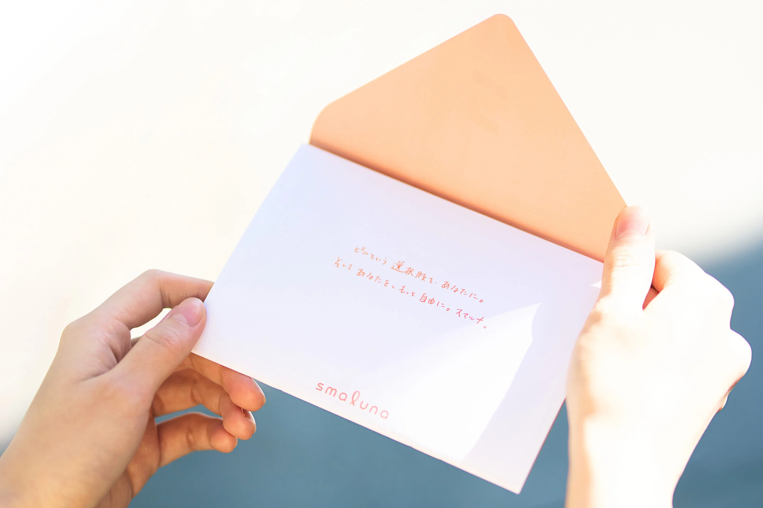
The starter kit contains three formulations: a low dosage formulation, a medium dosage formulation, and a morning-after pill. The kit is accompanied by a First-Time Guide, in which we developed a message encouraging women to have the confidence to not only use the pill but select the right one for them. The branding was designed to suggest a handwritten letter, conveying smaluna’s personal commitment to working closely with women seeking to be truer to themselves, and is intended to be supportive and affirmative of their choices.

WHY
Longstanding biases cause Japanese women to endure the struggle of menstruation.
Menstruation can lead to symptoms like premenstrual syndrome (PMS) and greatly impact the mood of the person. The low dosage pill is formulated to ameliorate menstrual cramps, regulate the menstrual cycle, and improve symptoms of PMS and offer an effective and safe way of regulating menstruation. Moreover, there is data available indicating that the pill is used more frequently in countries in which women have a higher rate of employment in professional occupations. In addition to acting as a contraceptive, the pill aids in reducing discomfort and anxiety to help women lead the lives they want to lead.
Low-dose pill use among women in married or cohabiting relationships
However, just 1-3% of women in Japan use it, and it has failed to gain wider acceptance in society. The low dosage formulation of the pill was approved for use in 1999, but just 10% of Japanese women are aware of its benefits outside of contraception. Moreover, awareness remains flatlined and is not trending upward. The use of the pill in Japan falls far below global levels, and there are longstanding misconceptions and negative attitudes towards it. According to statistics, even today, more than 70% of Japanese women are opposed to using the pill (Source: Japan Family Planning Association, Survey on Male and Female Lifestyle Attitudes). What must be done to promote a correct understanding of taking it in Japan and create a context in which women do not feel constrained to make such choices?
Scatterplot of low-dose pill use and gender gap index
Countries with lower gender gaps tend to have higher rates of pill use.

WILL
Towards a society where women can choose from more options to be just the way they are.
Many Japanese women have psychological misgivings about using the pill due to preconceived notions and biases. smaluna is today posting major growth for its offering an accessible approach to the pill.
Our goal through this project was to help women alleviate some of the concerns and frustrations associated with menstruation and offer them the pill as another option to maintain themselves in their best condition and lead a more stable way of life.
We believe that the efforts being made by smaluna and other players are helping create a society in which women’s well-being is considered a matter of course, and in which more women have the opportunity to shine their best.
INFORMATION
- What
- smaluna
- When
- 2020
- Where
- Japan
- Client
- Scope
- Branding / Logo / CI Guideline / Packaging / Pamphlet / Photograph
- SDGs
CREDIT
- Art Direction
- NOSIGNER (Eisuke Tachikawa)
- Graphic Design
- NOSIGNER (Eisuke Tachikawa, Ayano Kosaka, Nozomi Aoyama, Moe Shibata)
- Photograph
- NOSIGNER (Yuichi Hisatsugu)
- Collaboration