PROJECT
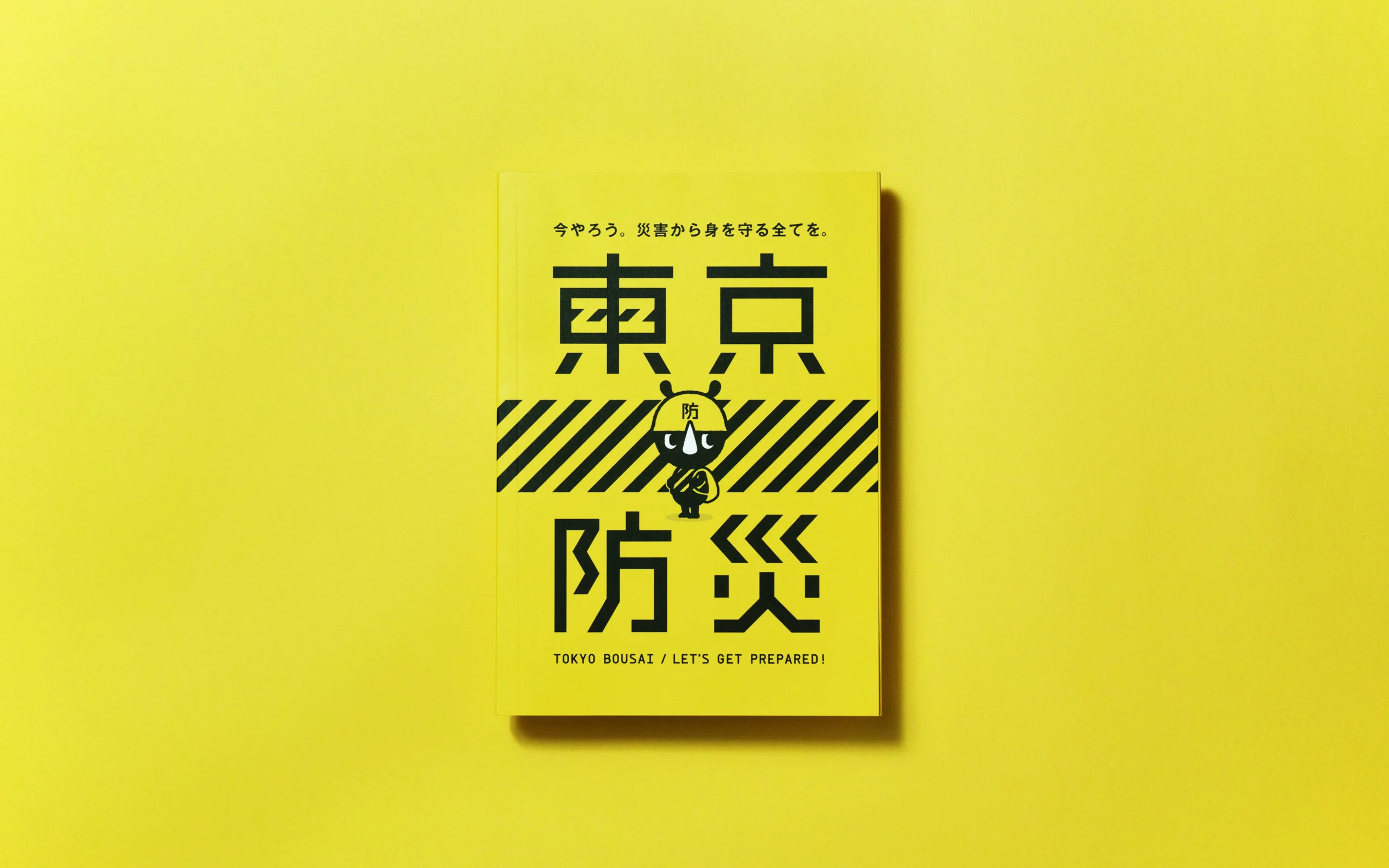
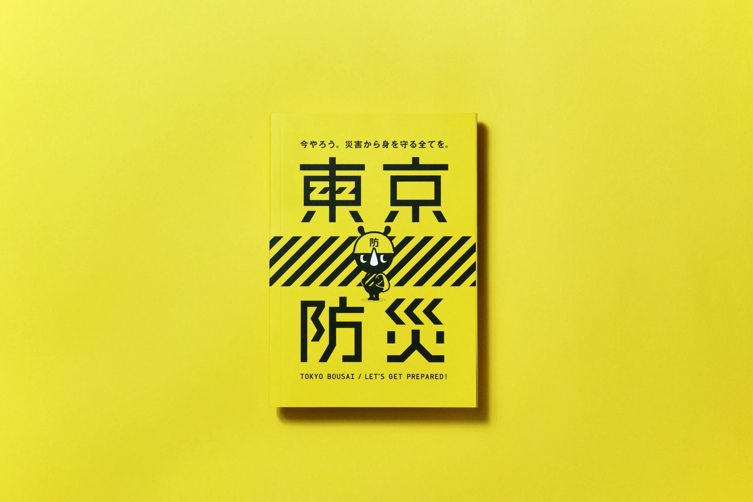
TOKYO BOUSAI
8.03 million copies to all Tokyo households—largest government publication ever. Disaster preparedness book wins Good Design Gold, transforming safety culture.
WHY
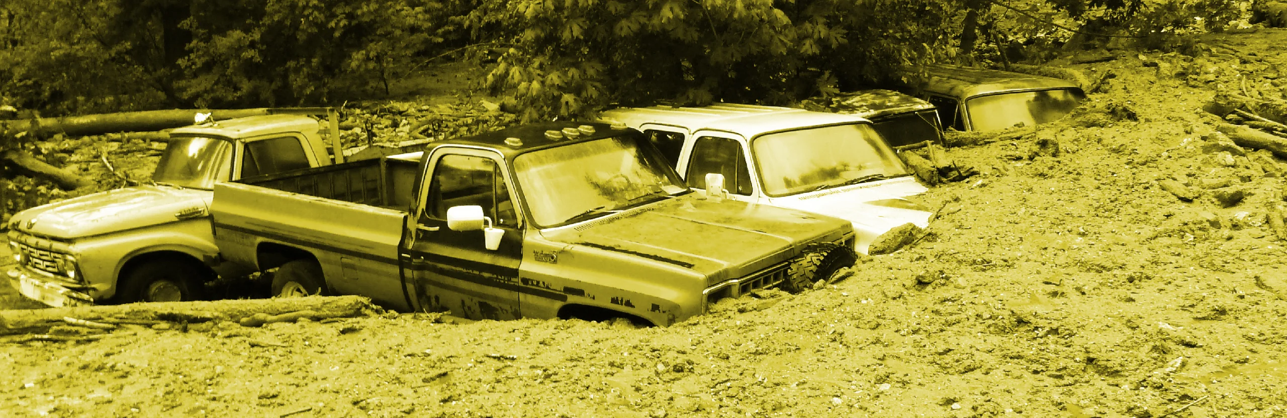
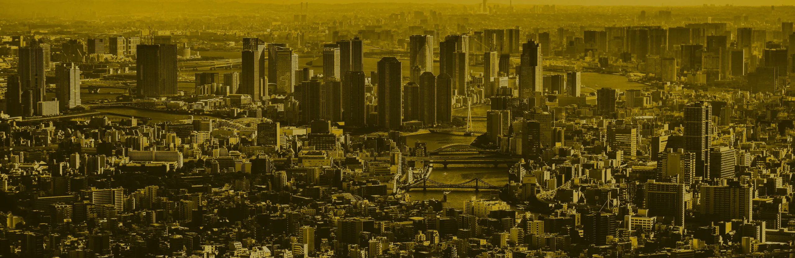
Tokyo is the city with the highest risk of natural disaster in the entire world.
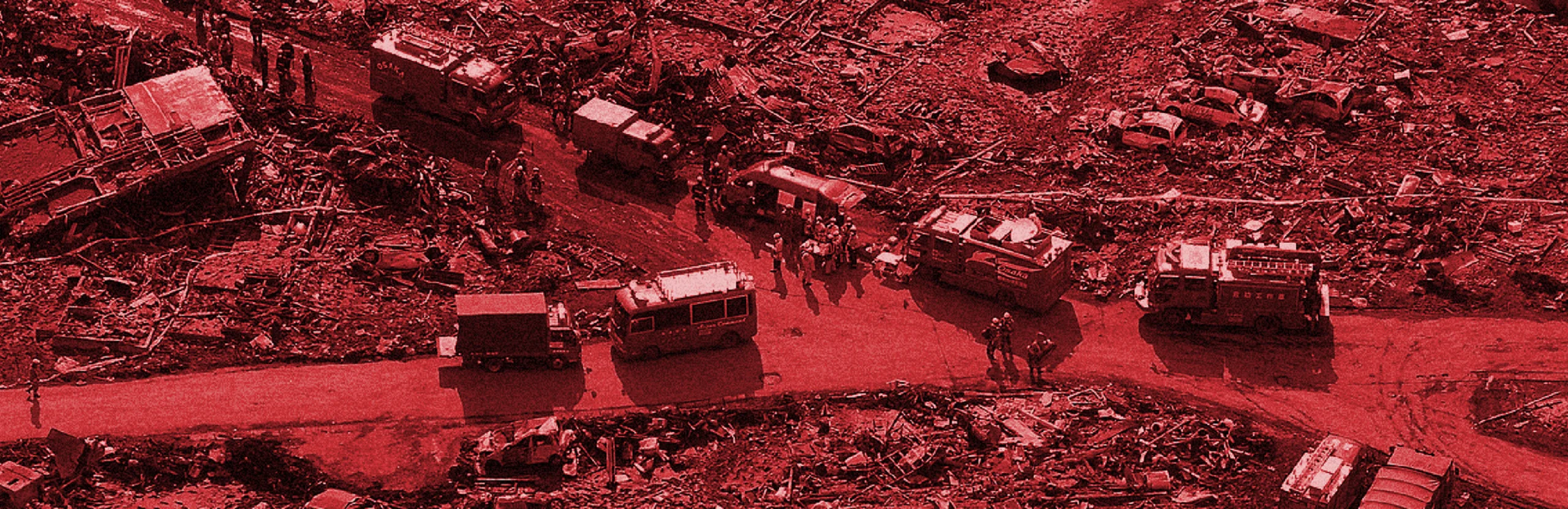
The Great East Japan Earthquake that struck on March 11th, 2011, claimed the lives of 15,899 people. In addition to the widespread devastation of the Tohoku area, where the epicenter of the earthquake was located, the disaster also resulted in massive damage to the rest of Japan, including Tokyo, making it the natural disaster that caused the greatest economic damage to mankind in all of history.
Moreover, it has been forecasted that another earthquake will very likely strike the suburbs of Tokyo in the near future, and there are fears that such an earthquake will devastate the densely populated Tokyo metropolitan area. In fact, Tokyo has been ranked as the most disaster-prone city in the world in the Combined Natural Disaster Risk Index for cities around the world.
What can we do now to ensure that we are well prepared when disaster strikes?
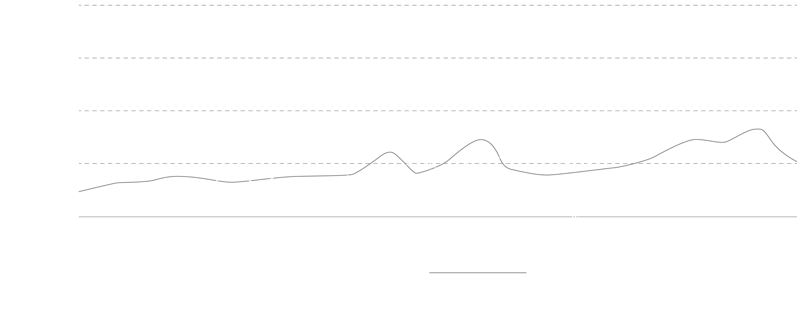
Number of earthquakes of magnitude 6 or greater worldwide
The scale of the Great East Japan Earthquake
The natural disasters risk index of cities worldwide
Trends in the number of reported events
Are you always prepared for disasters?
HOW
Distributing a fun disaster prevention book to all households in Tokyo.
Residents cannot simply rely on their local and national governments for public assistance during a major natural disaster. It is especially important in metropolitan areas for individual residents to change their mindset and acquire the necessary knowledge to keep themselves safe and render aid to others. Unfortunately, public institutions have not been successful in sharing disaster prevention information with residents effectively because of the unappealing nature of the content and its lack of resonance due to flaws in communication.
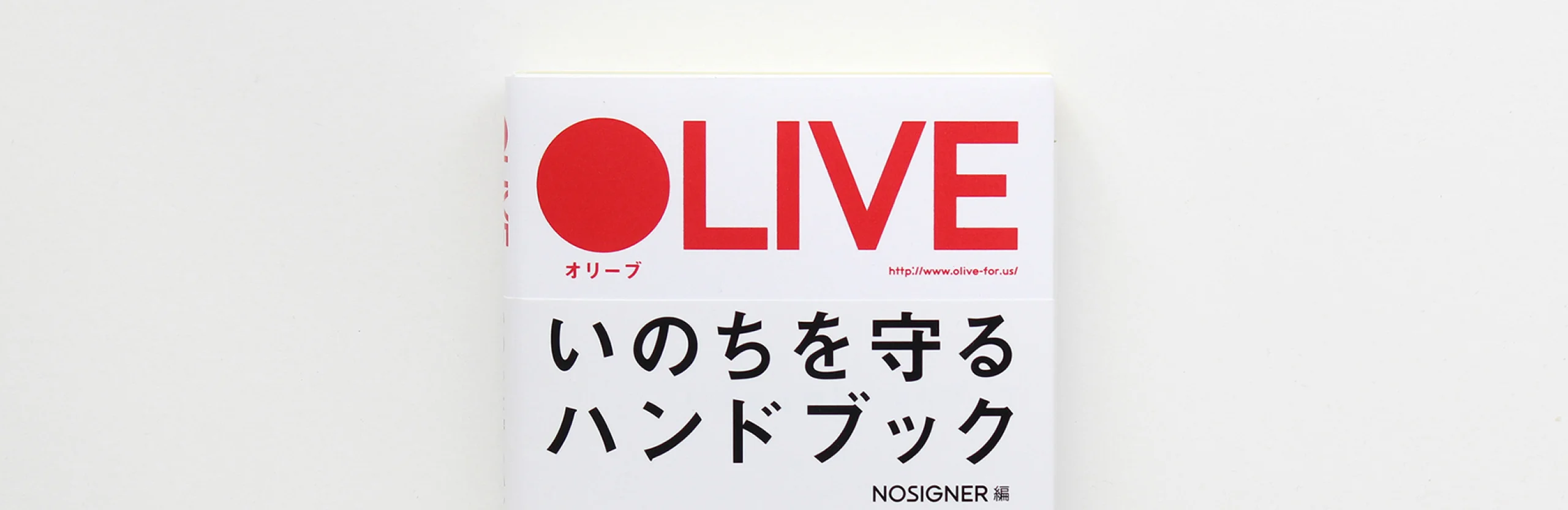
In view of these issues, the Tokyo Metropolitan Government decided to launch a project to distribute disaster prevention books to all of its 6.6 million households. Since the “OLIVE Handbook for Protecting your Life” that we had published after the Great East Japan Earthquake was highly rated, we have used it as a reference for the prototype of this disaster prevention book. Tasked with the design and editing of “TOKYO BOSAI,” the disaster prevention book at the heart of this historic initiative, we decided to collaborate with the advertising agency Dentsu on the production of this book.
CLIENT VOICE
Reflections on Tokyo Bousai
I first came across this book just before it was released. At the time, someone from the advertising agency behind the project came to me—knowing that I had some background in disaster preparedness—and asked for my thoughts. The moment I opened it, I felt there was something truly remarkable about this work.
What impressed me most was the balance it struck. On one hand, disaster preparedness demands reliability and accuracy—what you might call its “hard” side. On the other, it needs to reach ordinary people in their daily lives, requiring a sense of familiarity and warmth—the “soft” side. This book managed to hold both in perfect harmony
And it wasn’t just a matter of clever surface design. The balance was clearly the result of deep reflection on the very essence of disaster preparedness. Information that could easily feel overwhelming or chaotic for a wide and varied audience had been carefully organized, making it easier for readers to take initiative themselves.
For me, that was the moment I truly caught a glimpse of the depth and thoughtfulness in Eisuke Tachikawa’s design.
Phase Free Association CEO
Tadayuki Sato

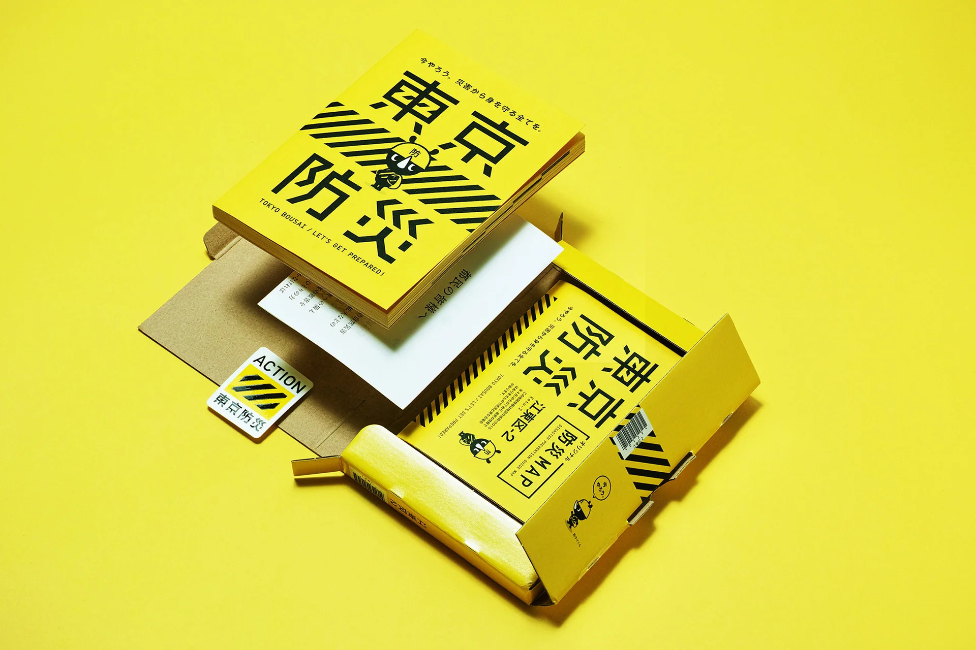
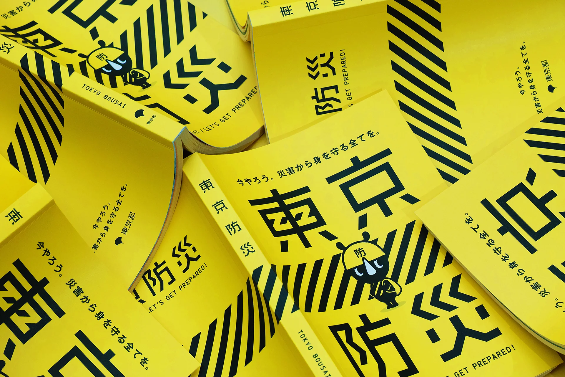
With an initial circulation of 8.03 million copies and a total of 330 pages per book, “TOKYO BOSAI” is one of the largest publication projects in the history of Japan’s government publicity materials. Distributing this book to all households in Tokyo with the goal of transforming public awareness on the subject of disaster prevention was a massive challenge.
If residents continue to think that disaster prevention is a mundane topic that can be safely ignored, it will be difficult for important information to be communicated to them. This is why our goal for this project was to add an entertaining touch to disaster prevention.
Our design of the book for this project was quite literally aimed at “readers of all generations.” Therefore, it was essential for us to incorporate design elements that possess entertainment value for all generations in a simple manner without any bias towards a specific target age group.
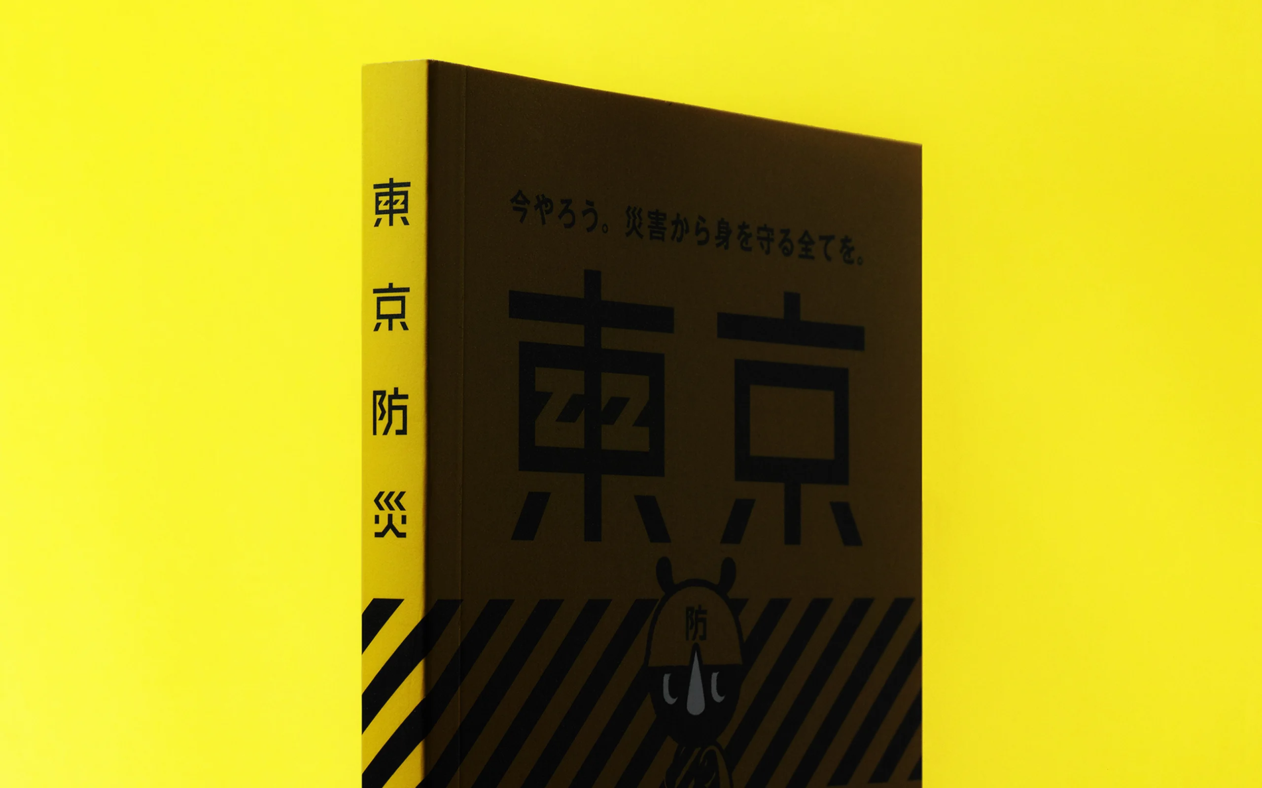
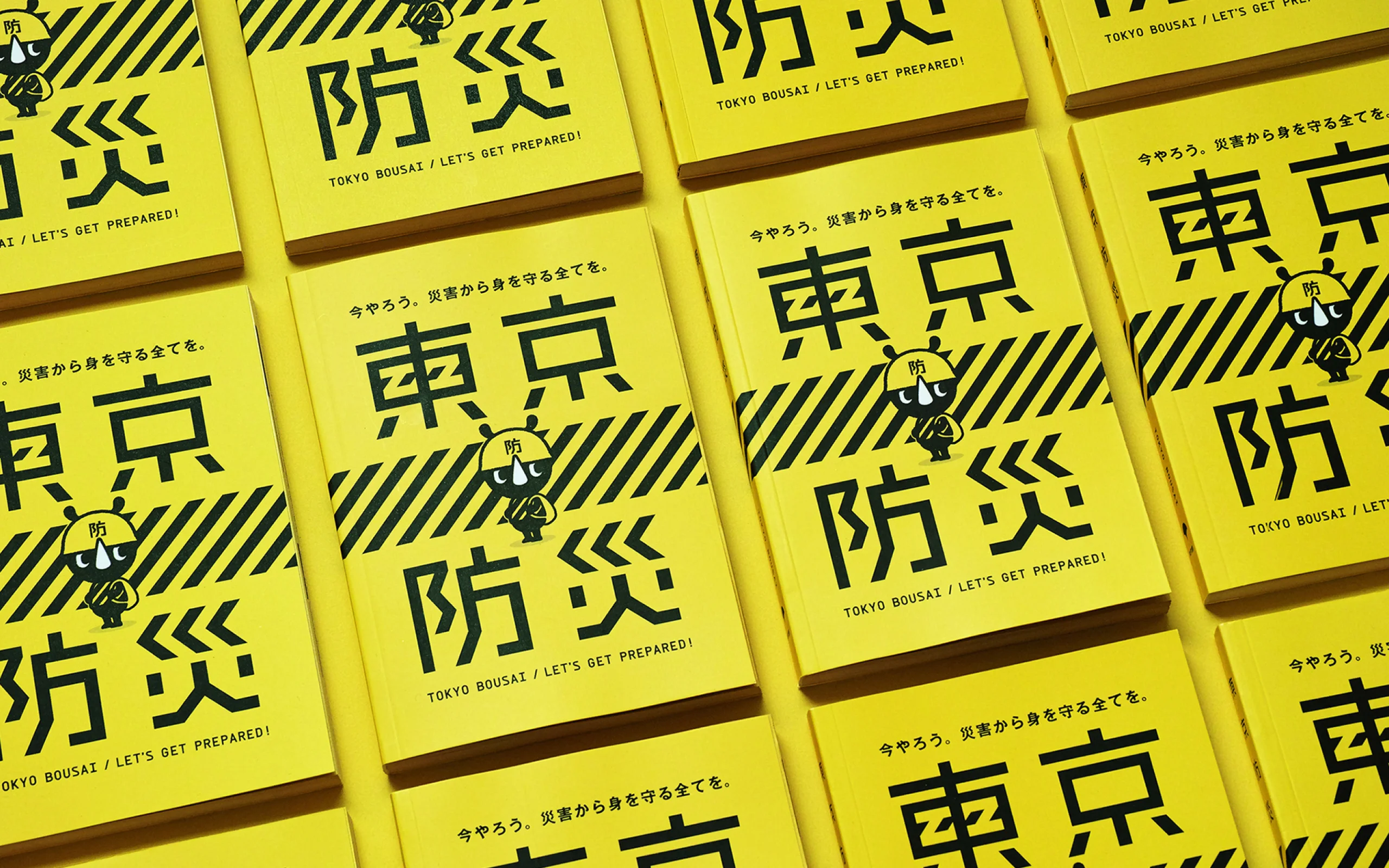
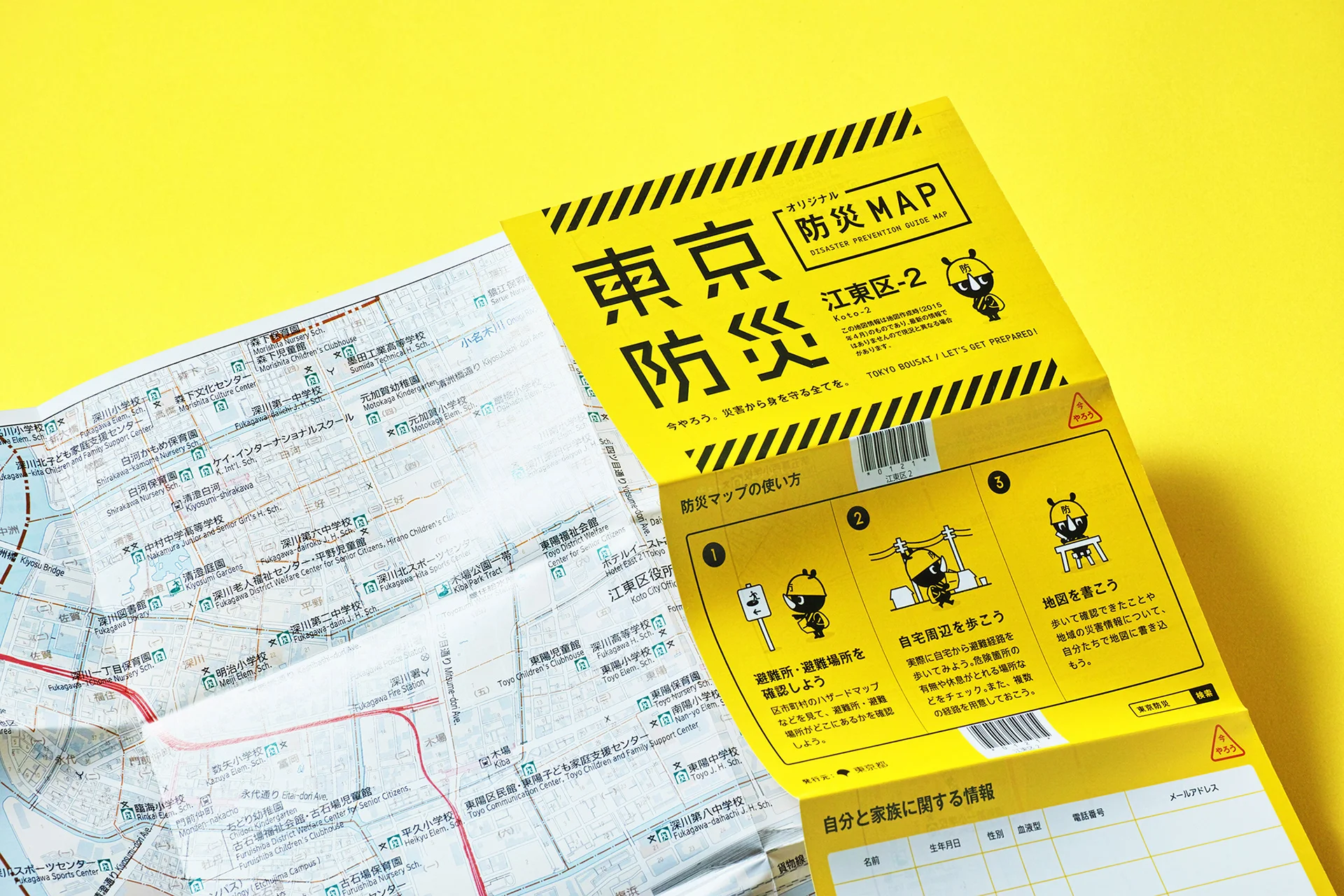
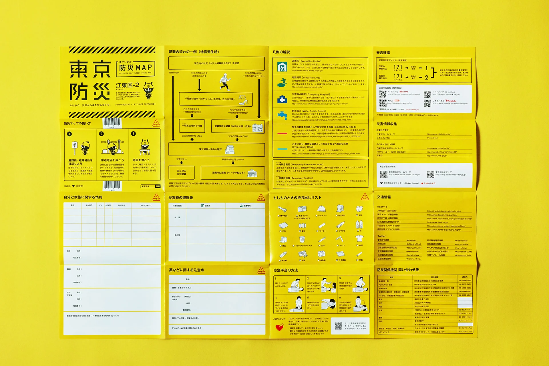
First of all, we made use of yellow and black stripes typically used at construction sites as the main set of visual cues for this project. In order to ensure that the book is easy to find in case of emergency and that it is unique to Tokyo, we based our key icons for urban disaster prevention on a color scheme that is widely recognized as one that denotes the presence of hazards. By limiting the number of printed colors in this way, the book can stand out from its surroundings.
To achieve our aim of fostering a disaster prevention movement that transcends generations, we incorporated the use of various design elements in the pages of the book.
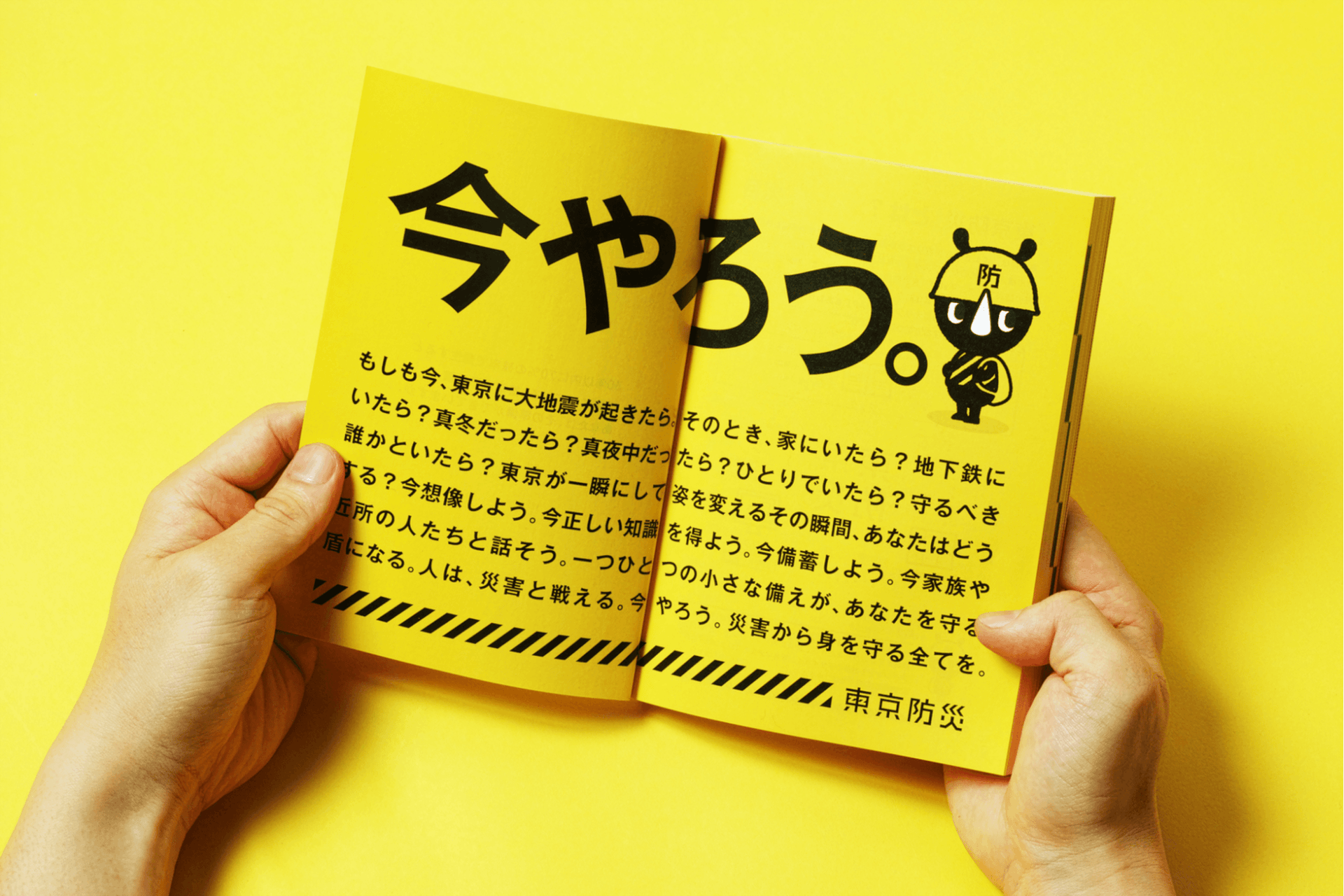
Our design of “BOSAI-KUN (BOSAI = Prevention),” a character who uses a helmet to protect himself, was inspired by his potential appeal to young children. We also created character animations along the edges of the pages in the style of a flipbook.
During the editing process, we used the illustrations of Yuta Okamura, an artist familiar to teenagers, to simulate the experience of a disaster and allow readers to have fun while having a sense of what a disaster might feel like in reality. We also drew inspiration from our “OLIVE Handbook for Protecting your Life” and redesigned some of its illustrations before featuring them across 40 pages of “TOKYO BOSAI.”
In addition, we included manga drawings by Kaiji Kawaguchi, an artist who is highly popular with middle-aged readers, at the end of the book to depict the scenes of a disaster with extraordinary realism. The use of UD fonts in line with our emphasis on universal design makes the pages of the book easily readable even for the elderly.
By harnessing a variety of design techniques to offer entertainment that satisfies readers of all generations, we have successfully developed an unprecedented form of disaster prevention communication through “TOKYO BOSAI.”
WILL
Creating a future in which residents can proudly say that they are the most well-prepared people for natural disasters in the world.
Information about “TOKYO BOSAI,” the largest disaster prevention publication project in the world, started to spread in the blink of an eye and saw the emergence of fans not only in the Tokyo metropolitan area but throughout the entire country, and it came to be regarded as Japan’s national project.
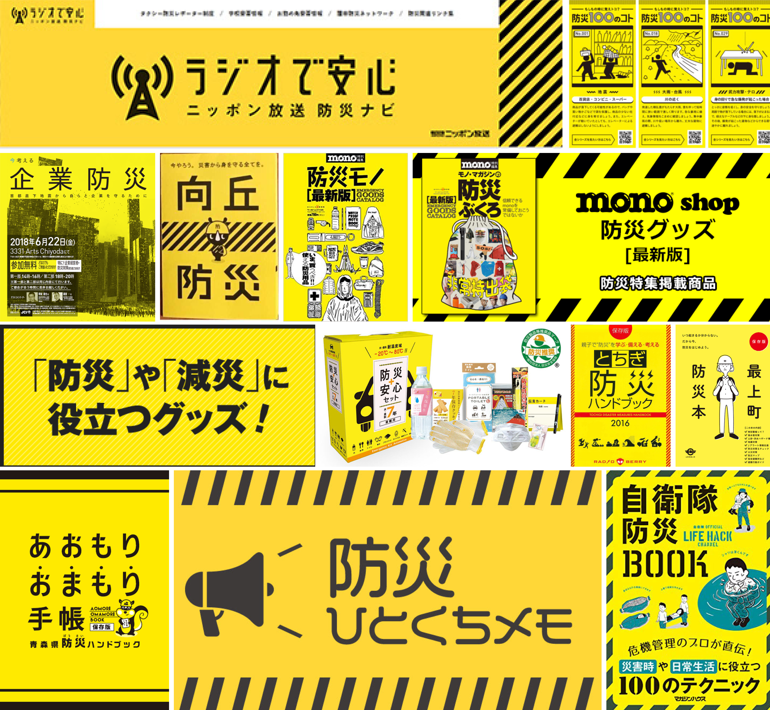
Although several years have passed since the publication of the book, readers still share information from the book on social media whenever an area in Japan is hit by a major disaster. “TOKYO BOSAI” is widely recognized as a project that has fundamentally revolutionized the nature and image of disaster prevention in Japan. In fact, many subsequent disaster prevention projects after the book was published have adopted similar designs with yellow and black as their primary colors, cementing the place of “TOKYO BOSAI” as the initiative that introduced a completely new set of visual cues used in disaster prevention design.
ex.
Yellow and black disaster preparation projects that we have not designed (might have influenced).
When searching “防災(disaster preparation)” on Google image search, not only does TOKYO BOUSAI appear at a considerable rate, but also many projects use yellow and black colors in the same style after TOKYO BOUSAI was published.
There is no doubt that “TOKYO BOSAI” is one of the very few projects in the world that have demonstrated that public awareness can be successfully transformed and countless lives can be saved through the use of communication design aimed at the general public. In fact, various other public issues besides disaster prevention can be tackled through revamping designs in a fun and aesthetically pleasing way. “TOKYO BOSAI” can serve as an inspiration for future efforts on this front.
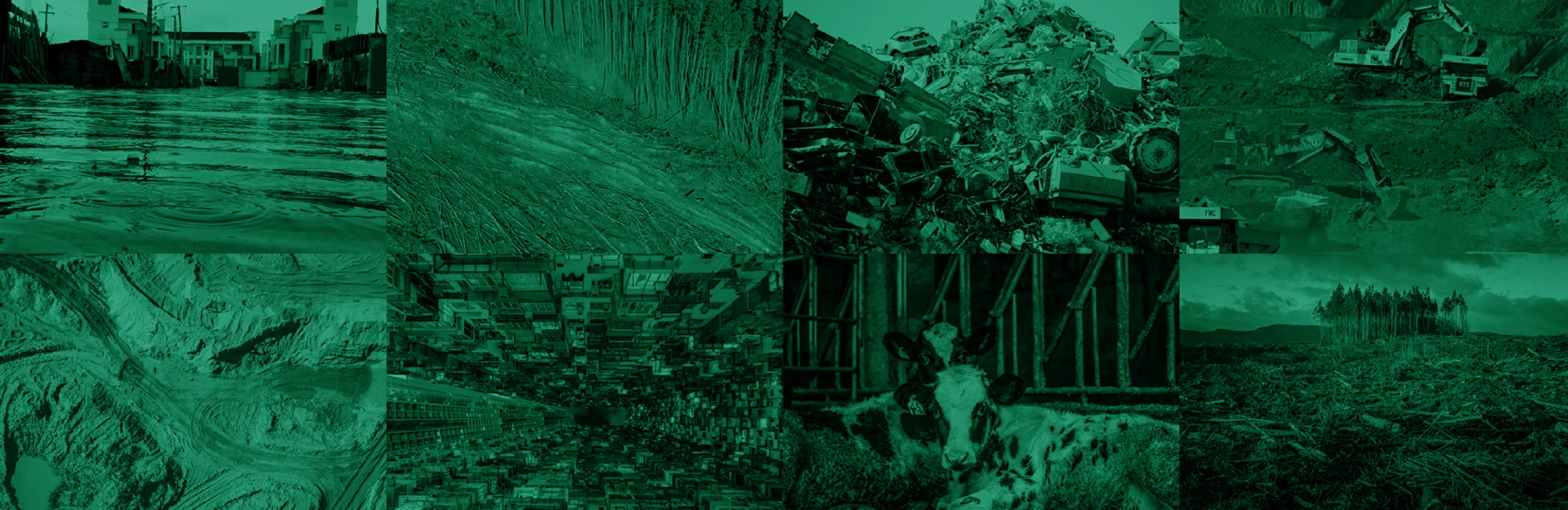
Climate change has resulted in a dramatic increase in the frequency of natural disasters in recent years. The number of hurricanes, typhoons, and localized torrential rain caused by linear precipitation zones is rising, and a record number of natural disasters are occurring around the world year after year. Designs aimed at disaster prevention have become increasingly essential in an age where we have no choice but to lead our lives while grappling with the natural disasters brought about by a tempestuous natural environment.
We hope that with more and more people equipping themselves with the necessary knowledge to protect themselves and their loved ones through the information in this book, the destruction in the past can be avoided the next time a major disaster strikes.

INFORMATION
- What
- TOKYO BOUSAI
- When
- 2015
- Where
- Tokyo, Japan
- Client
- Scope
- Branding / Logo / Packaging / Edition / Book cover and inner page design / Photograph
- Award
- Good Design Award: Gold (2016)
- SDGs
CREDIT
- Art Direction
- NOSIGNER (Eisuke Tachikawa), DENTSU INC. (Ryosuke Sakaki)
- Graphic Design
- NOSIGNER (Eisuke Tachikawa, Kaori Hasegawa, Andraditya D.R.)
- Editors
- NOSIGNER (Eisuke Tachikawa, Kaori Hasegawa), DENTSU INC. (Ryosuke Sakaki)
- Illustration
- Yuta Okamura
- Collaboration
- DENTSU INC.
- Photo
- NOSIGNER (Kunihiko Sato)