PROJECT
Bach Collegium Japan
Branding for Japan's world-class Baroque ensemble using Bach-era typography.
HOW
Express classical typefaces in terms of architectural drawings.

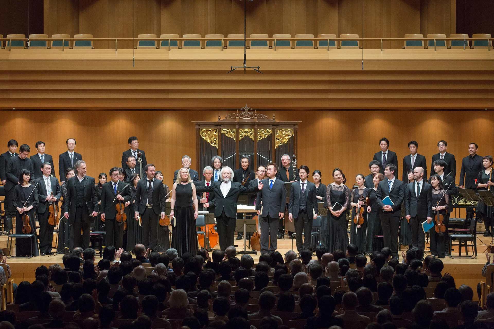
The Bach Collegium Japan is a baroque orchestra and choir founded in 1990 by Masaaki Suzuki, a world-renowned Bach performer, conductor, and highly regarded researcher both in Japan and abroad. We were fortunate enough to meet them and became involved in the branding of the orchestra through the performance program for their subscription concerts.
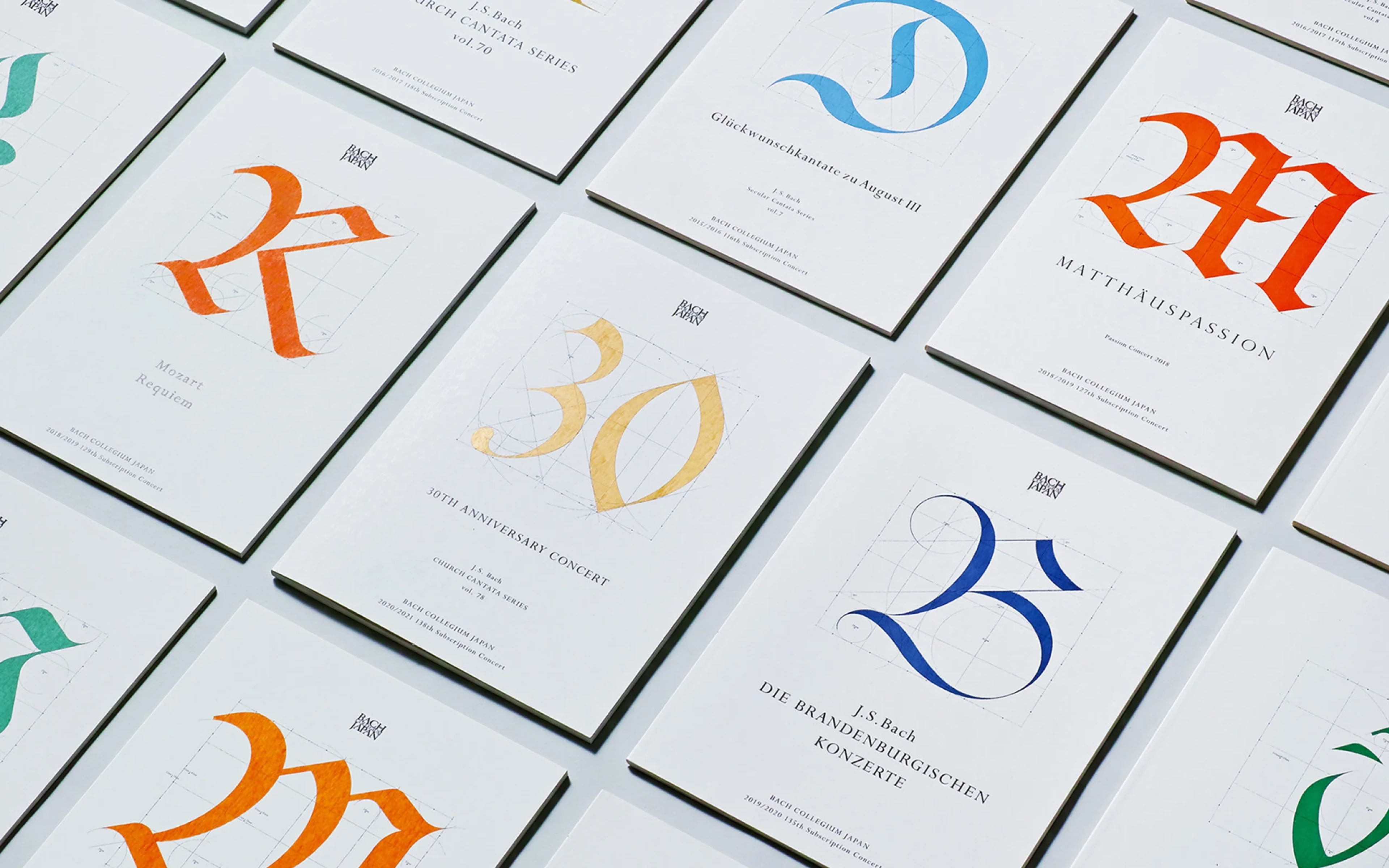
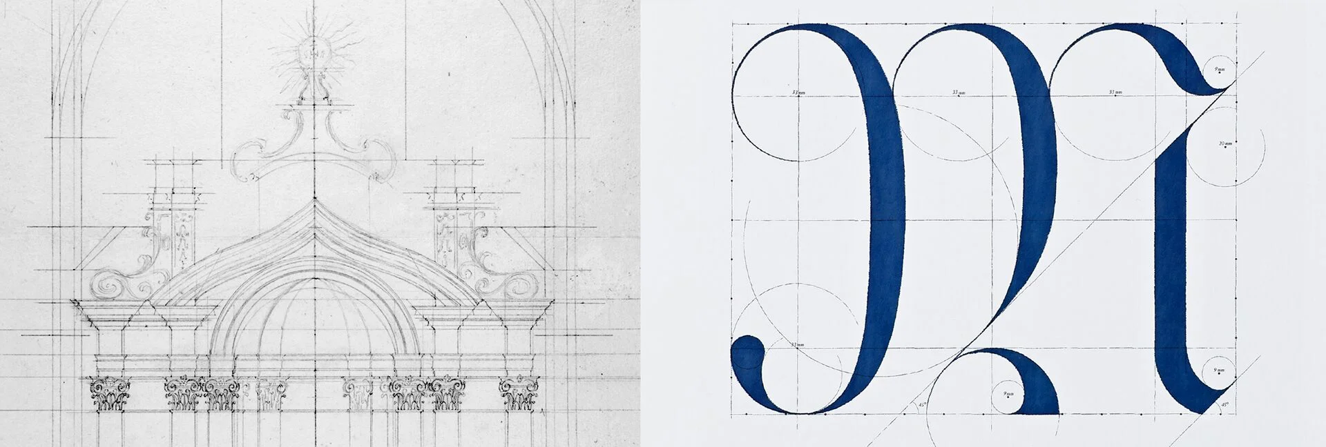
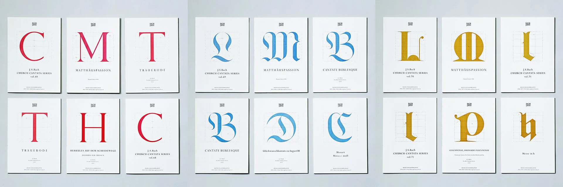
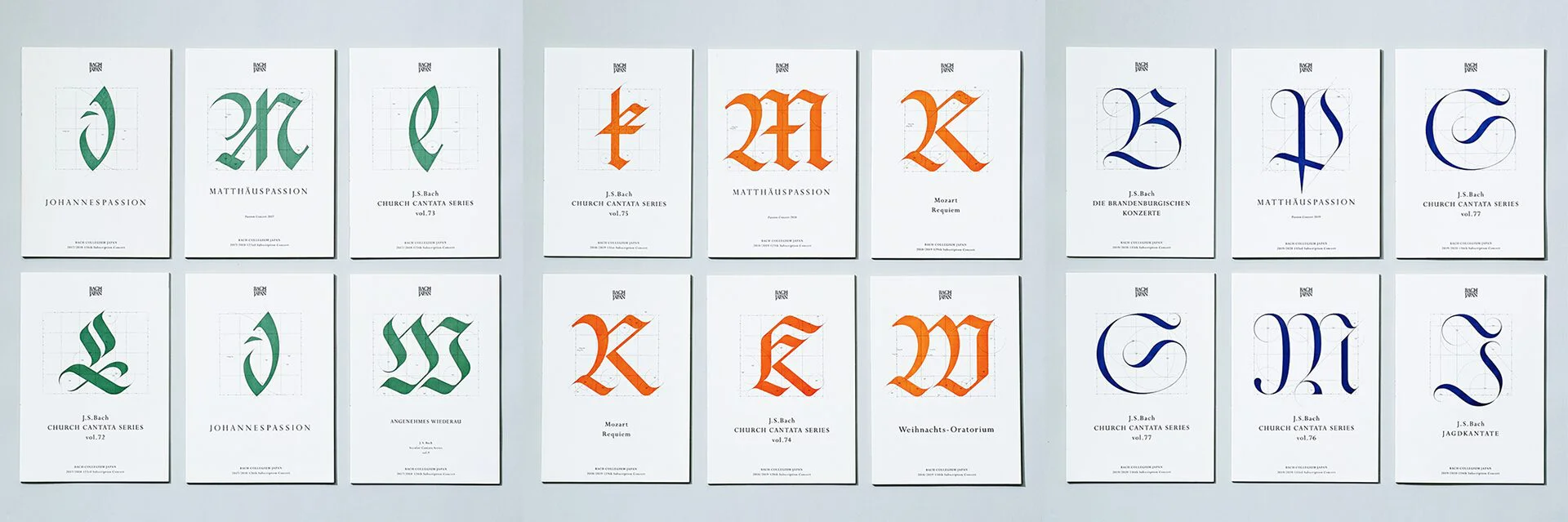
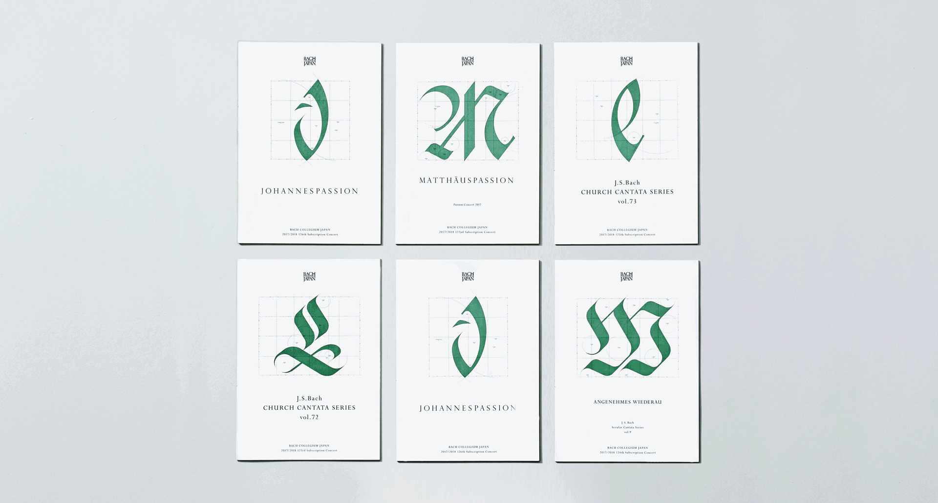
The research aspect of Bach Collegium Japan focuses on baroque music and the religious works of J.S. Bach. It is of great academic value, along with its performance content which reproduces the original sound using old instruments. We thus decided to update the program with a design using collections of historical typefaces that were held in high regard during Bach’s time. Each year we would highlight a new classical typeface, such as Uncial and Fraktur which were used during the 18th century in Germany, and develop them into graphics that represented typeface rules and structure like an architectural drawing.
In addition to conveying the atmosphere of the era in which the composer lived, our design sought to reveal Bach’s architectural composition style and the true nature of the beauty of his music throughout his own exploration of the structures and rules of beauty.
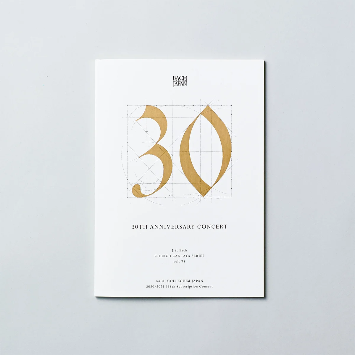
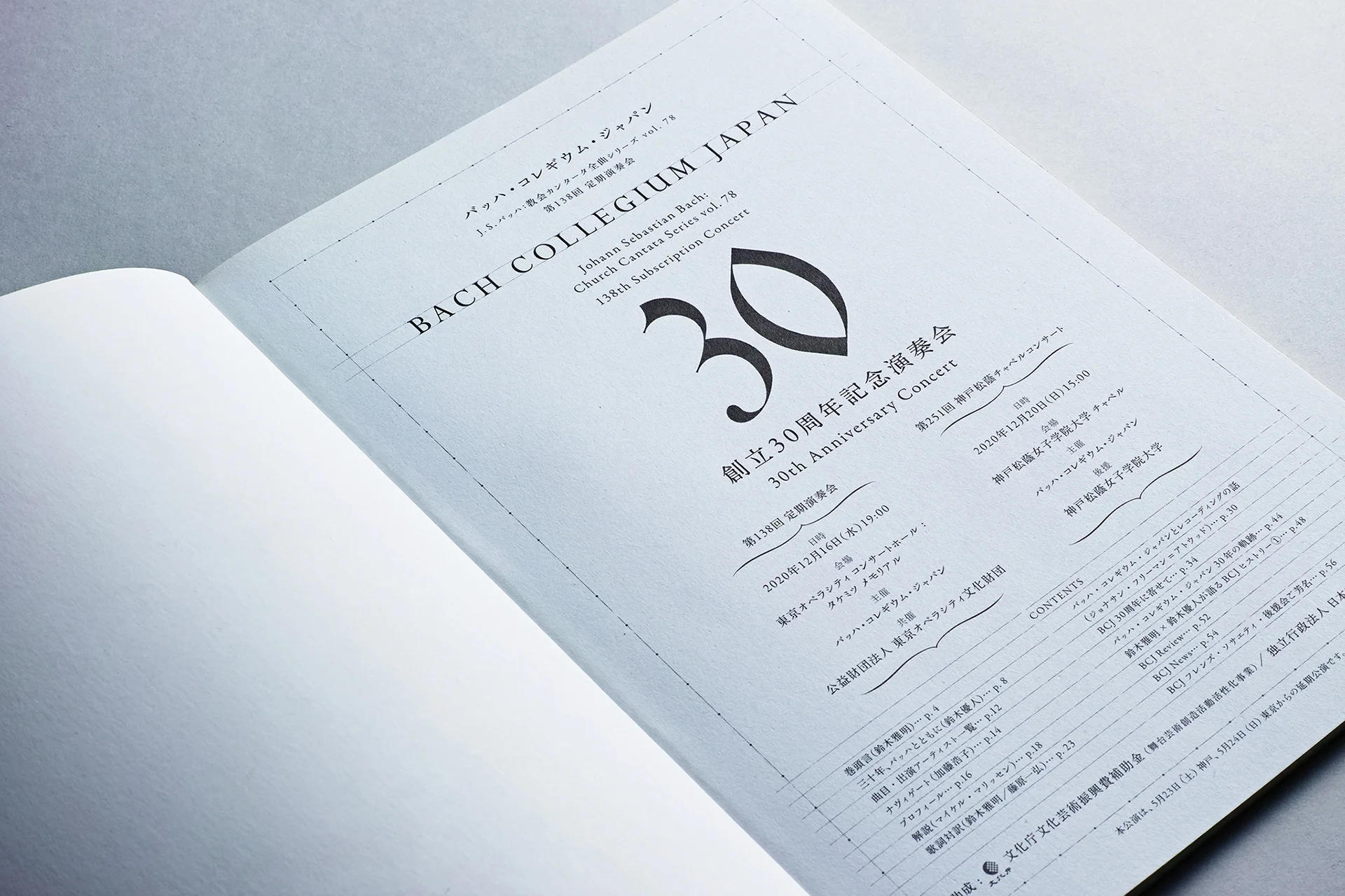
Using a similar approach, we also created the orchestra’s 30th anniversary logo in 2020 and the format design for their program.

Using a sketch of an 18th century architectural drawing (left) as a motif, the structure and design rules of classical typefaces are incorporated visually.
WHY
Will classical music survive in the future?
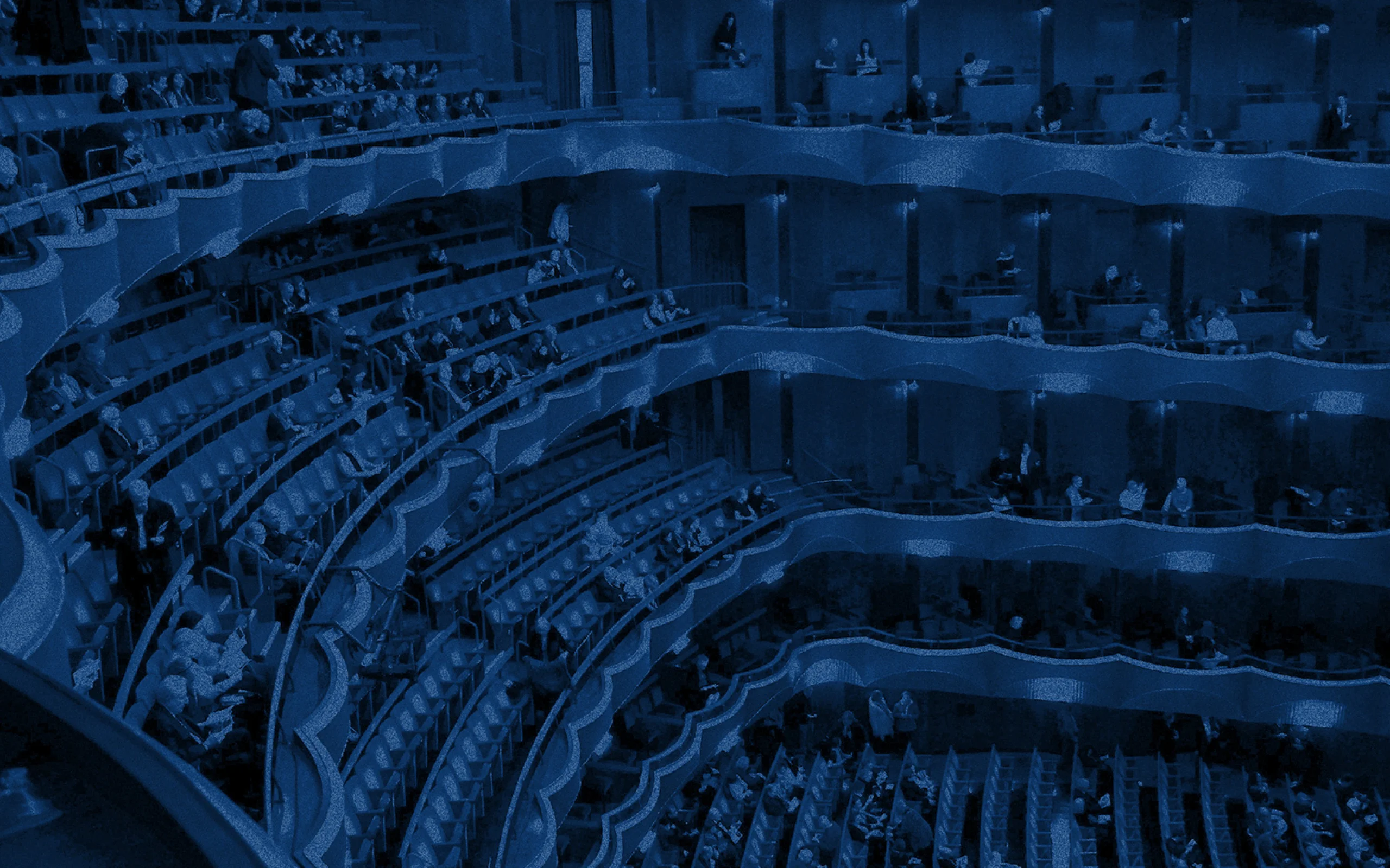
The Meiji Restoration at the end of the 19th century marked the beginning of the importation of Western culture to Japan, and it was during this time that classical music spread throughout the country. Beethoven’s “Symphony no.9” became a traditional end of the year song, giving birth to a culture of its own. However, fast forward to today, and the limited fan base and declining music market share are threatening the survival of classical music along with the orchestras that strive to preserve their legacy.
Throughout their history, Tokyo’s orchestras have developed such a high level of technical ability that they are on par with those of Berlin or Vienna. Japanese orchestras across the nation have also gained international recognition in terms of classical music studies.
What will it take to rediscover the power of Japanese orchestras, to reach a segment of the population they have not yet reached, and to support their high academic activities? What can we do for the classical music which has transcended cultural lines to become a shared heritage in order to connect it to the future?
WILL
The beauty of Bach’s music will continue to pass to the future.
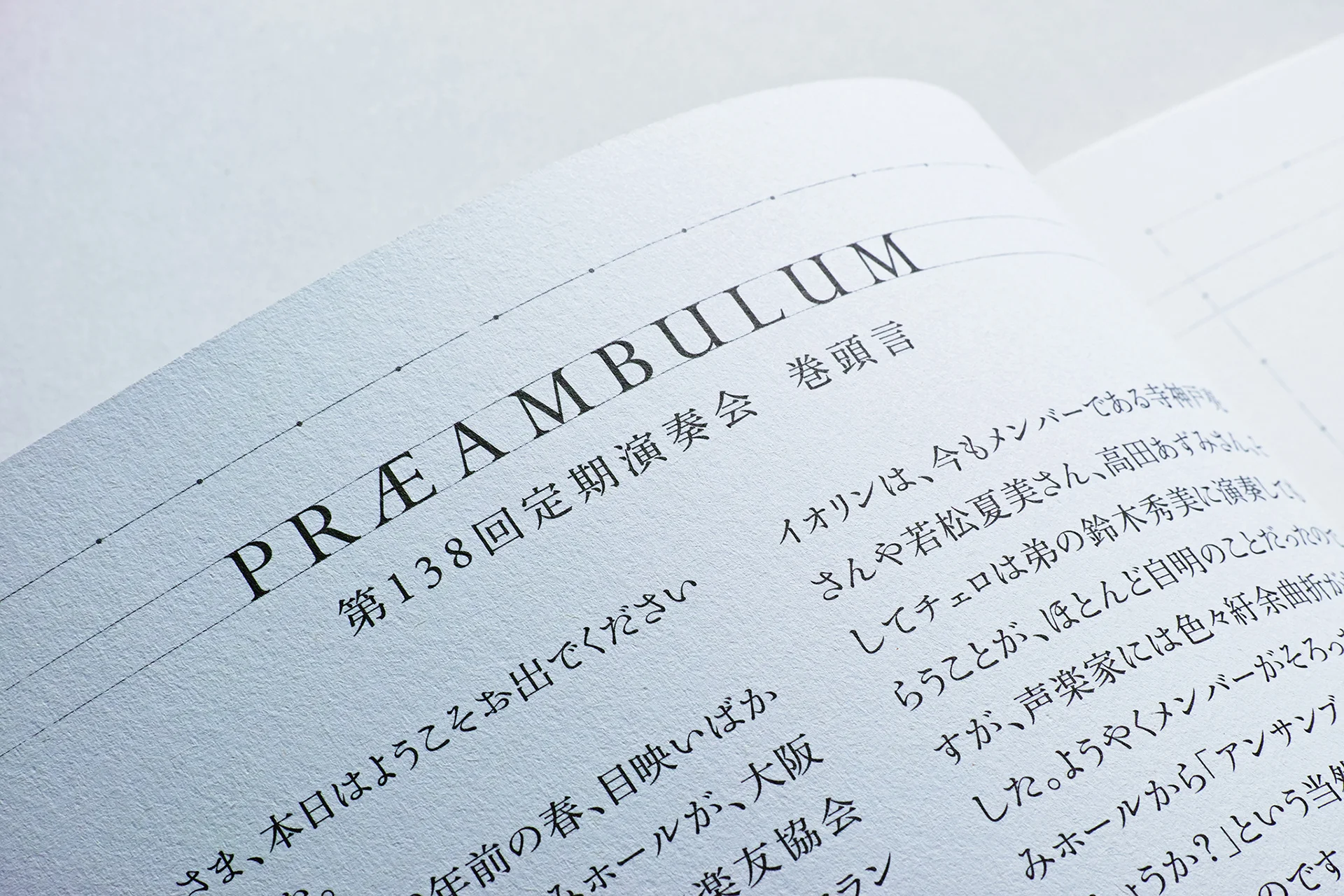
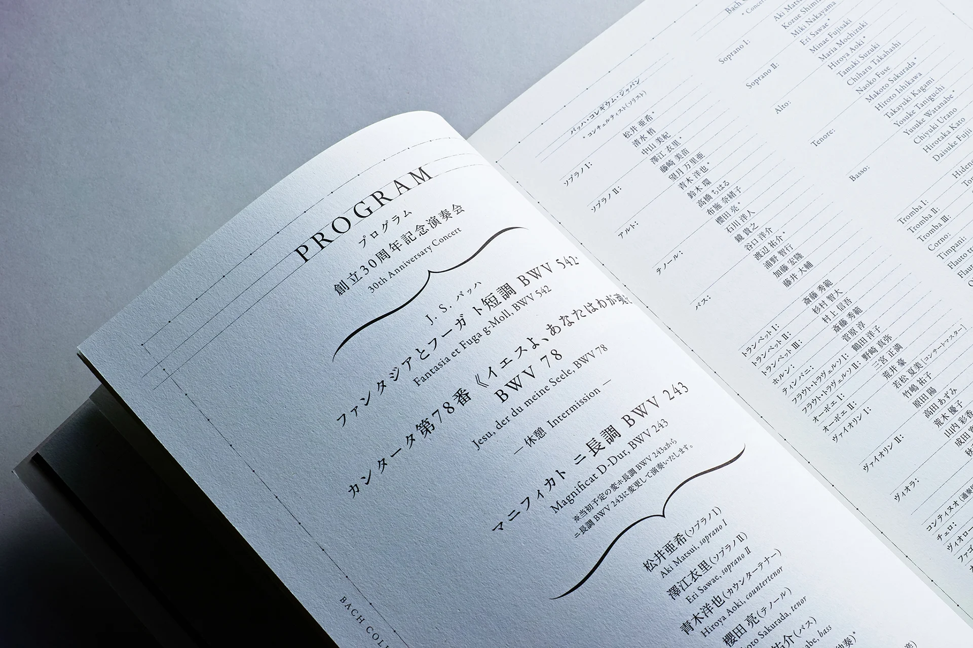
The performance programs, which have been designed in a consistent format since 2014, have become popular as collectors’ items and are being purchased by more and more people. These proceeds help support the orchestra’s activities.
The Baroque music of the 18th century, Bach’s time, is considered to be among the classics of classical music. Bach Collegium Japan has done an immeasurable job of preserving the original nature of over 250-year-old music and its very existence is a miracle. We would like to continue to support their activities from a design aspect, and help pass on classical music culture to future generations.
INFORMATION
- What
- Bach Collegium Japan
- When
- 2014-
- Where
- Japan
- Client
- Scope
- Book cover and inner page design
CREDIT
- Art Direction
- NOSIGNER (Eisuke Tachikawa)
- Graphic Design
- NOSIGNER (Eisuke Tachikawa, Toshiyuki Nakaie, Nozomi Aoyama, Jin Nagao)
- Photograph
- CCDN (Yuichi Hisatsugu)