PROJECT
AQUAIGNIS
We lead the rebranding of Aqua Ignis, a resort complex in Yunoyama Onsen, Mie Prefecture.
HOW
Rebranding hot spring facilities
to fit local culture and
giving them modern interpretation.
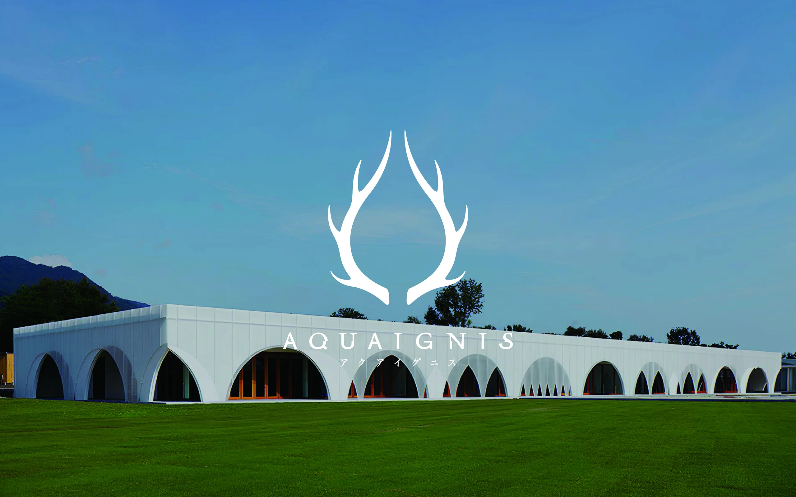
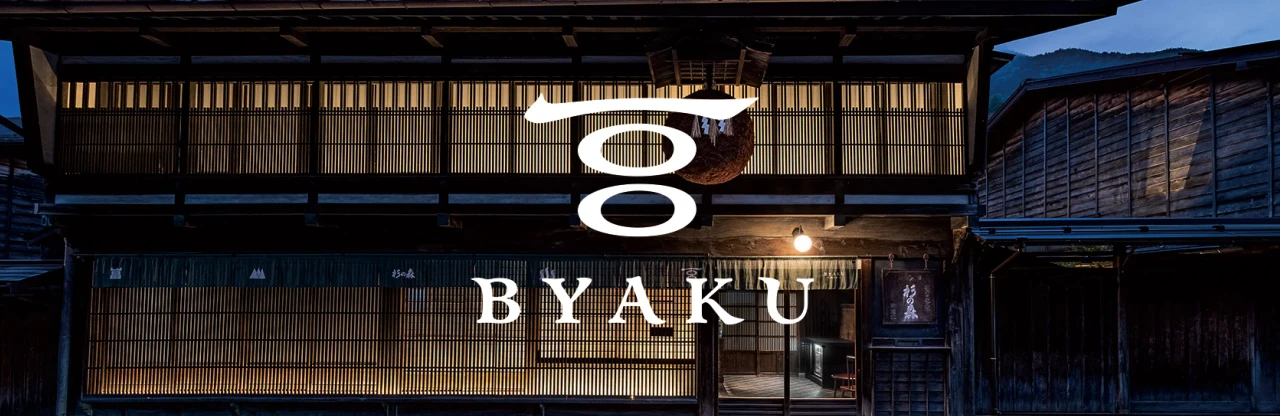
Aqua Ignis is a resort complex located in Yunoyama Onsen, Komono-cho, Mie Prefecture. After the relocation of the Yunoyama Kataoka Onsen in 2012, Aqua Ignis was built as a facility to provide comfort and cuisine. It soon became one of the best tourist spots in the Chubu area, widely loved by tourists and local residents alike. To fulfill the demand from inbound tourism, the facility set strove to become a destination for travelers from all over the world and decided to rebrand in 2016. We lead creative direction in their rebranding.
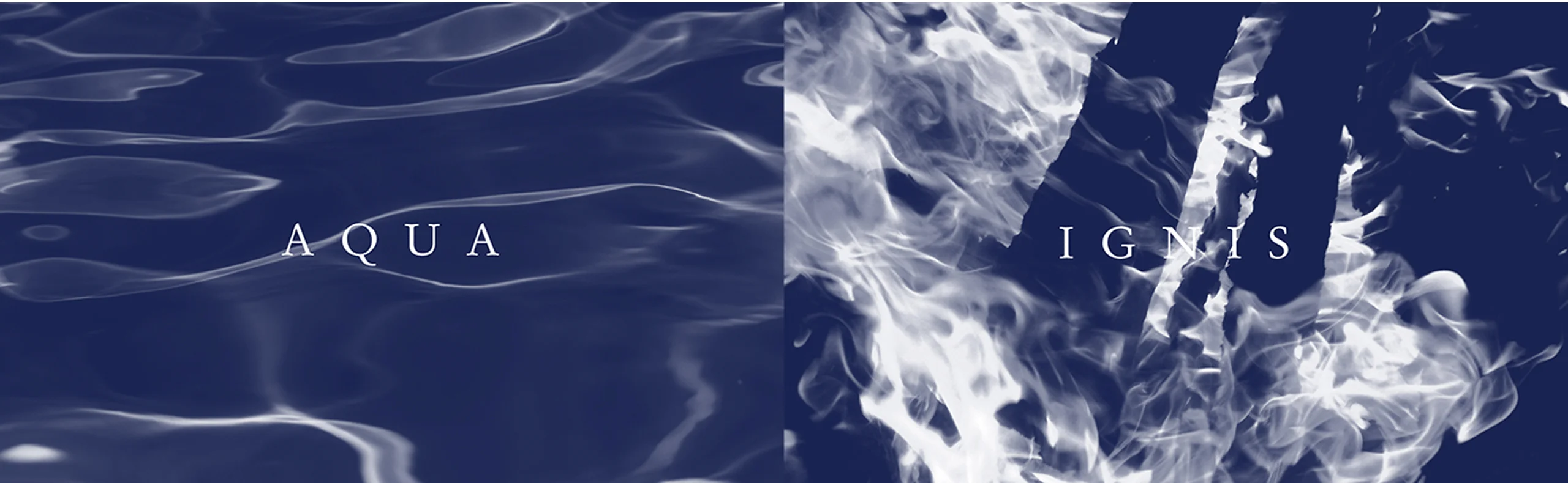

Our goal for the rebranding was to maximize the value of the facility by taking the culture of the region and connecting it to the richness of modern life. We then designed the symbol mark using the antlers of a deer as a motif with fire and water. This comes from the name of the facility, which is derived from the Latin words “aqua”, meaning water, and “ignis”, meaning fire. The deer in the mark comes from the many places and shrines around Komono related to deer, which have long been known as the sacred animal of the region. The logotype is a fusion of “Garamond,” a serif typeface used since the 16th century, and “Akzidenz-Grotesk,” a sans-serif typeface created in the 19th century, and embodies the old coexisting with the new.

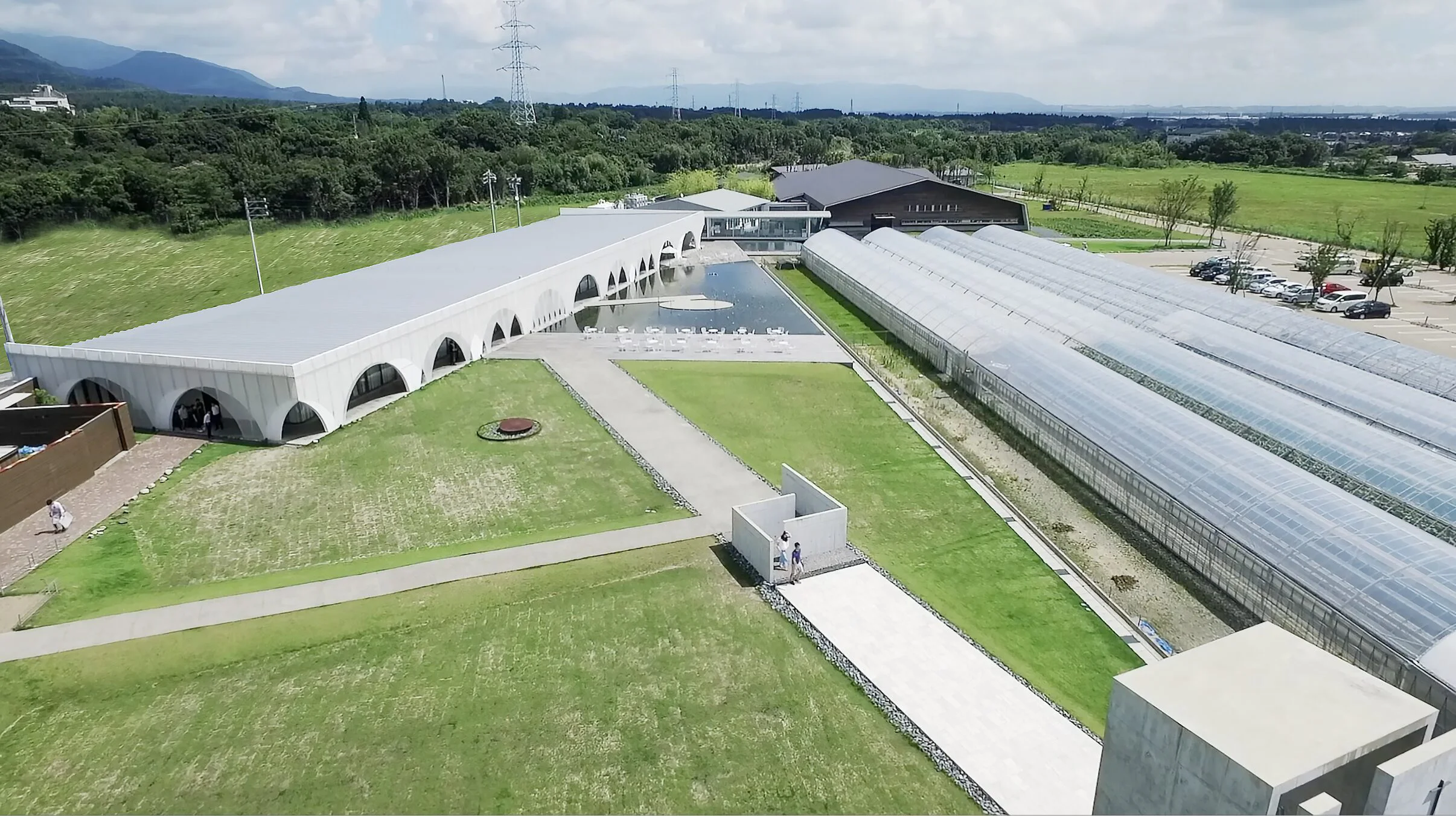
In terms of visuals, we emphasized the direction of the photography. We shared the key concepts and rules of photography with facility staff, who did photography as a hobby, and created an environment where high-quality photos with a consistent mood could be provided. In addition, every aspect of the design, from the signage within the facility to the website, communicates the luxurious nature of the hot spring facility.


WHY
The current state of
the once flourishing
Japanese hot spring towns.
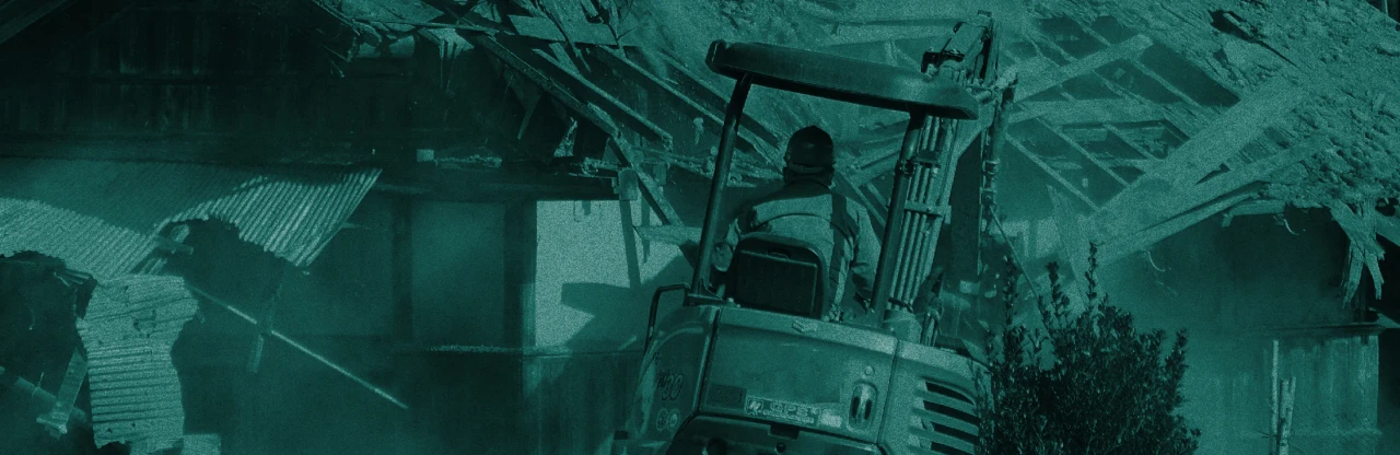
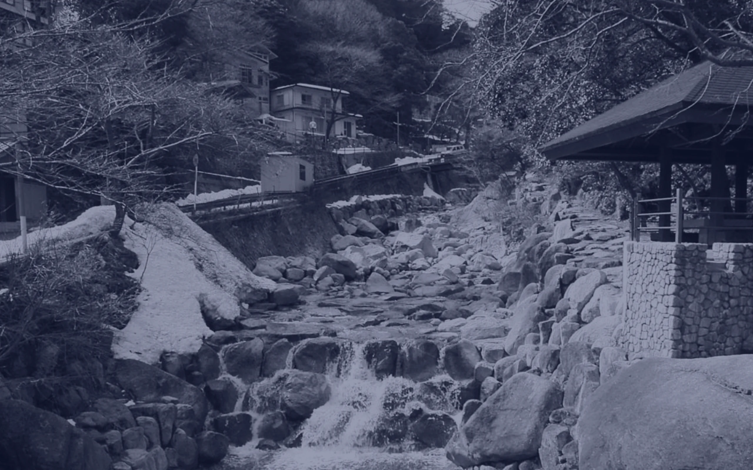
The onsen boom, coupled with the bubble economy, led to countless bustling hot spring towns, with tourists both from inside and outside Japan visiting in droves. From the 1980s onward, the bubble economy brought about a boom in hot spring tourism, the hot spring resorts in every reach were crowded, creating the opportunity for the development of various industries in the region, including food and beverage, manufacturing, and traditional crafts. The market size of the lodging industry reached its peak in the early 1990s, with historic hot spring inns beginning to transform themselves into huge, modern-looking lodging facilities through large-scale capital investment. However, the collapse of the bubble economy caused tourist demand to decrease, and many hot springs and lodging facilities fell onto financial hard times, with many losing their liveliness, causing old facilities to be left behind in many places. Redesigning the fallen hot spring towns into places that could draw in visitors and bring vitality to their regions became a nationwide issue to be solved.
Market Size Trends in the Lodging Industry (Nationwide)

WILL
Polish up the slumbering
value of facilities to
bring light to the regio.
Aqua Ignis now attracts more than one million visitors a year, about four times as many as before its relocation, many of which are tourists from abroad. We hope that our branding strategy played a part in contributing to the rapid growth of the facility.
Aqua Ignis has achieved outstanding results, standing out even among other Japanese regional revitalization projects, and has been selected for the Mie Furusato Creation Project in Taki Town, Mie Prefecture, becoming an example of how the revitalization of hot spring resorts can lead to the revitalization of entire regions. We hope to contribute to the revitalization of local communities, both in hot spring resorts and in other local areas by uncovering dormant resources and creating new designs, and creating value for regions both domestically and internationally.
INFORMATION
- What
- AQUAIGNIS
- When
- 2016
- Where
- Mie, Japan
- Client
- Scope
- Re-branding / Logo / CI Guideline / Business card / Web / Signage / Promotion Strategy Support
CREDIT
- Art Direction
- NOSIGNER (Eisuke Tachikawa)
- Graphic Design
- NOSIGNER (Eisuke Tachikawa, Toshiyuki Nakaie, Ryota Mizusako)
- Web Design
- NOSIGNER (Eisuke Tachikawa, Toshiyuki Nakaie, Shun Kudo)
- Photograph