PROJECT
YAMAMOTOYAMA
Rebranding business of gift products made from local ingredients. Won the Red Dot Design Award, achieving three times the sales forecast and contributing to factory expansion.
WHY
Can we preserve the spirit and culture of the Edo period for the future?
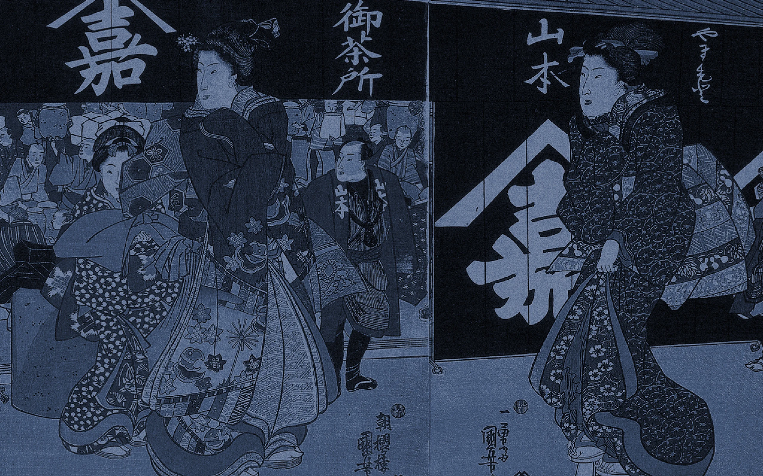
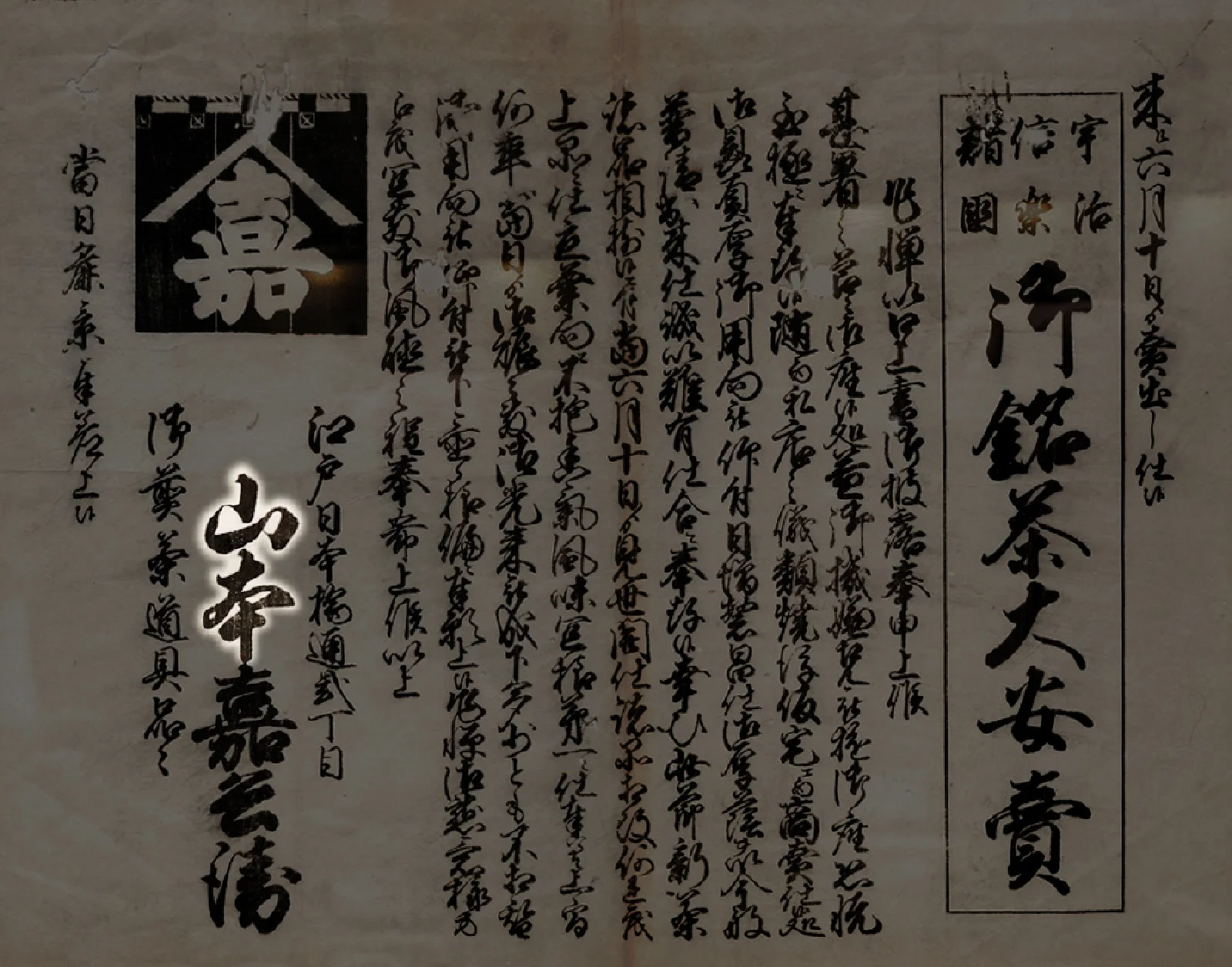
YAMAMOTOYAMA, one of Japan’s long-established companies, is known to many as the famous TV commercial along with other programs broadcasted until the 1990’s. It is well-known as the first tea company in Edo to ever sell Sencha (a type of Japanese green tea), first founded by Kahei Yamamoto in 1690 (Genroku 3), developed by ancestor of Nagatanien founder Souen Nagatani. YAMAMOTOYAMA has a strong image as a seaweed maker due to the influence of commercial advertisements, also as a famous tea company that invented Gyokuro (another type of Japanese green tea), which is still enjoyed today. There is a history here that has greatly contributed to the development of Japanese green tea culture. However, due to the recession, although having supported Japan’s food culture and sense of beauty of Edo, has been going through a difficult time to stay in the market in places such as department stores.
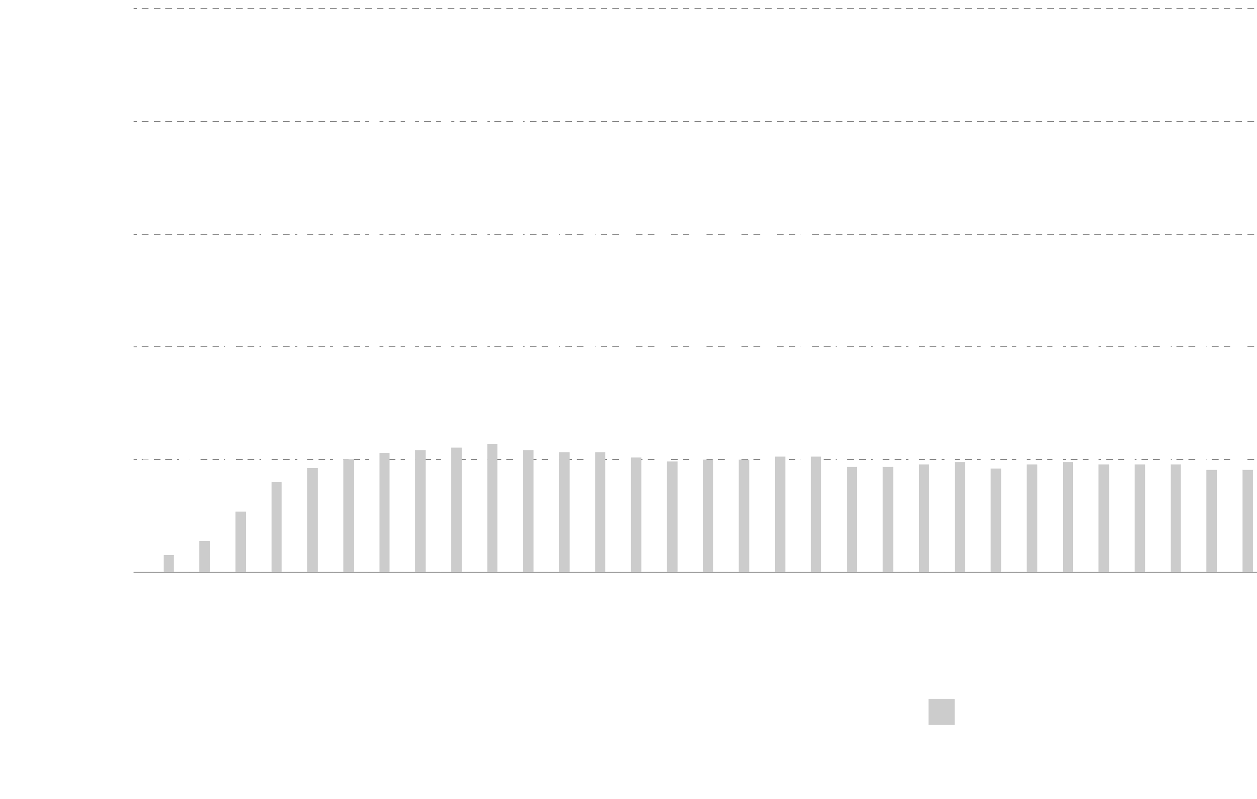
Changes in the number of old businesses closing, suspending or dissolving
Average green tea consumption per person
HOW
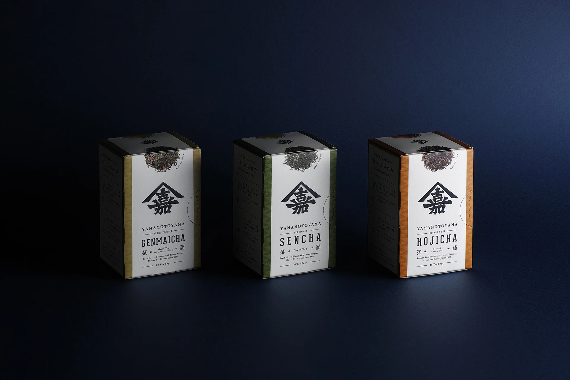
Going back to its origins, designed Edo of 330 years ago.
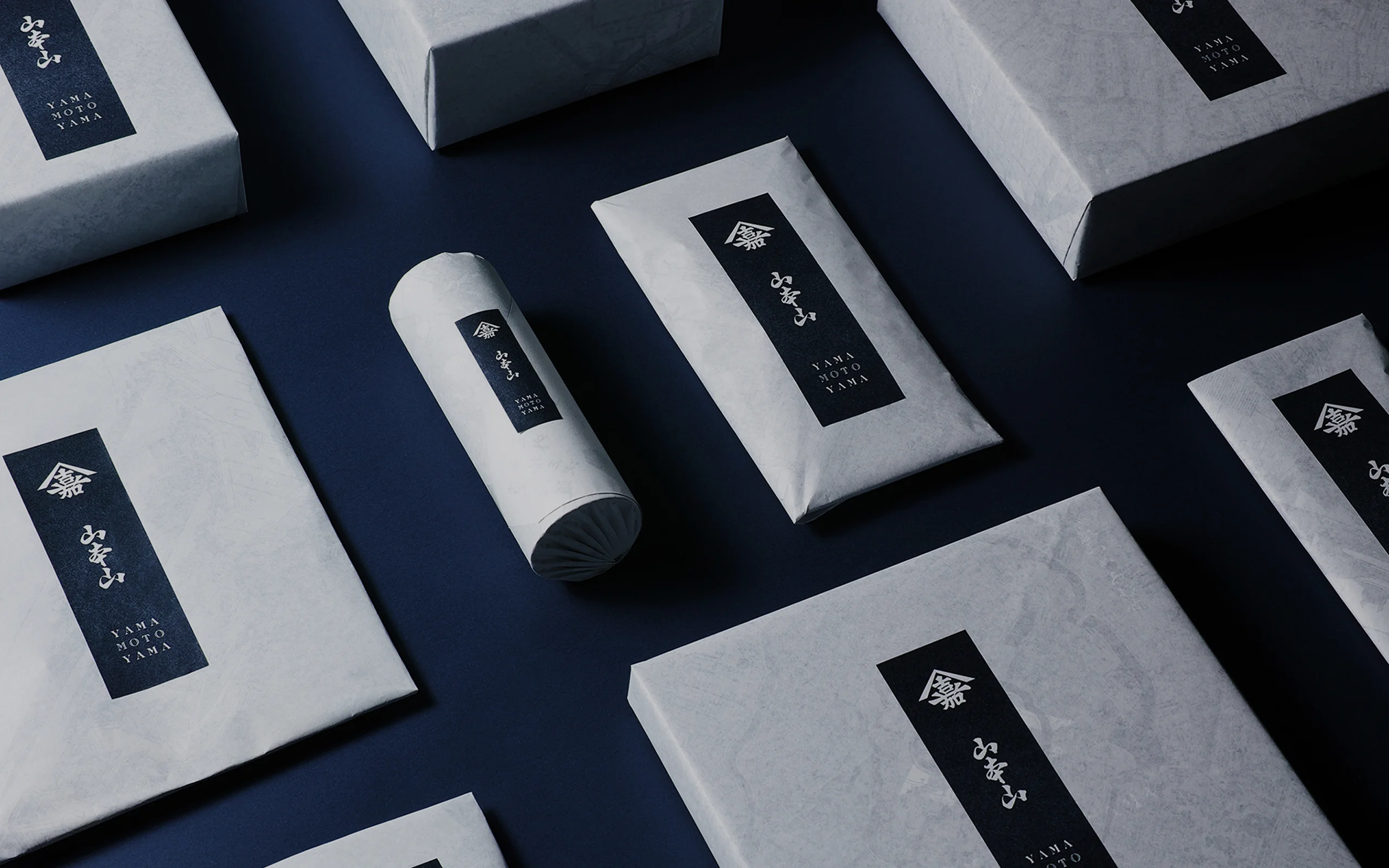
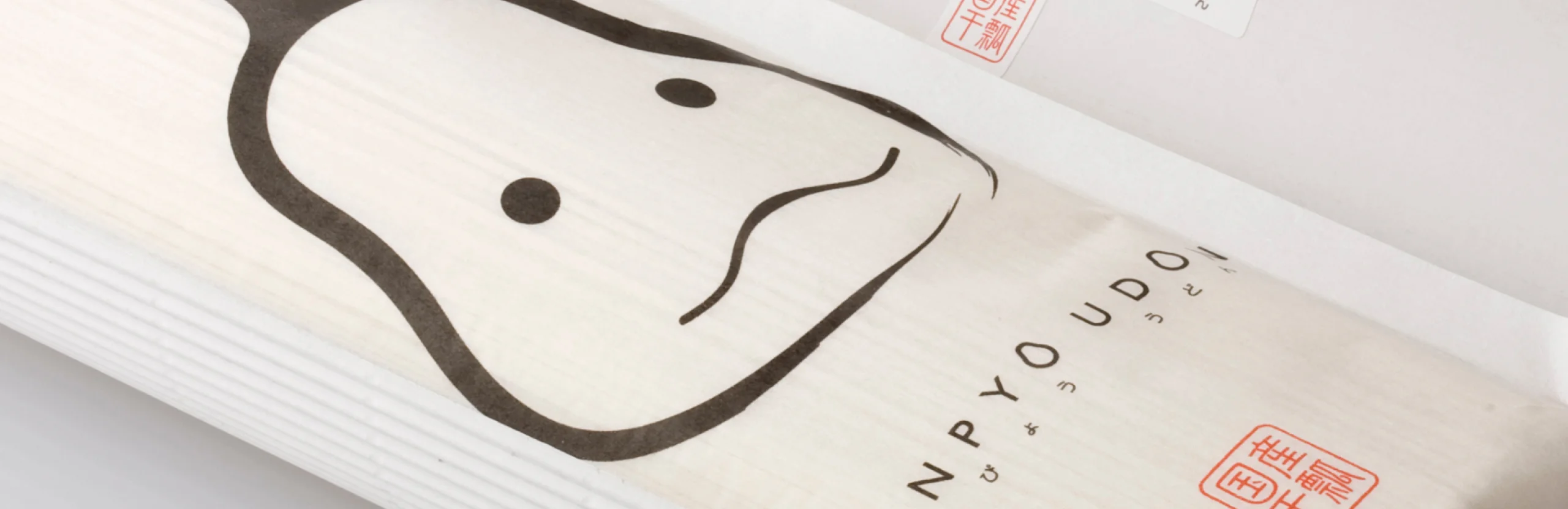
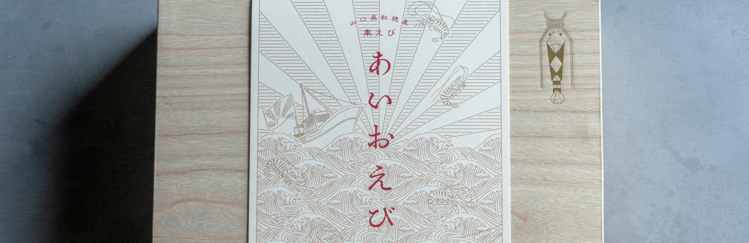
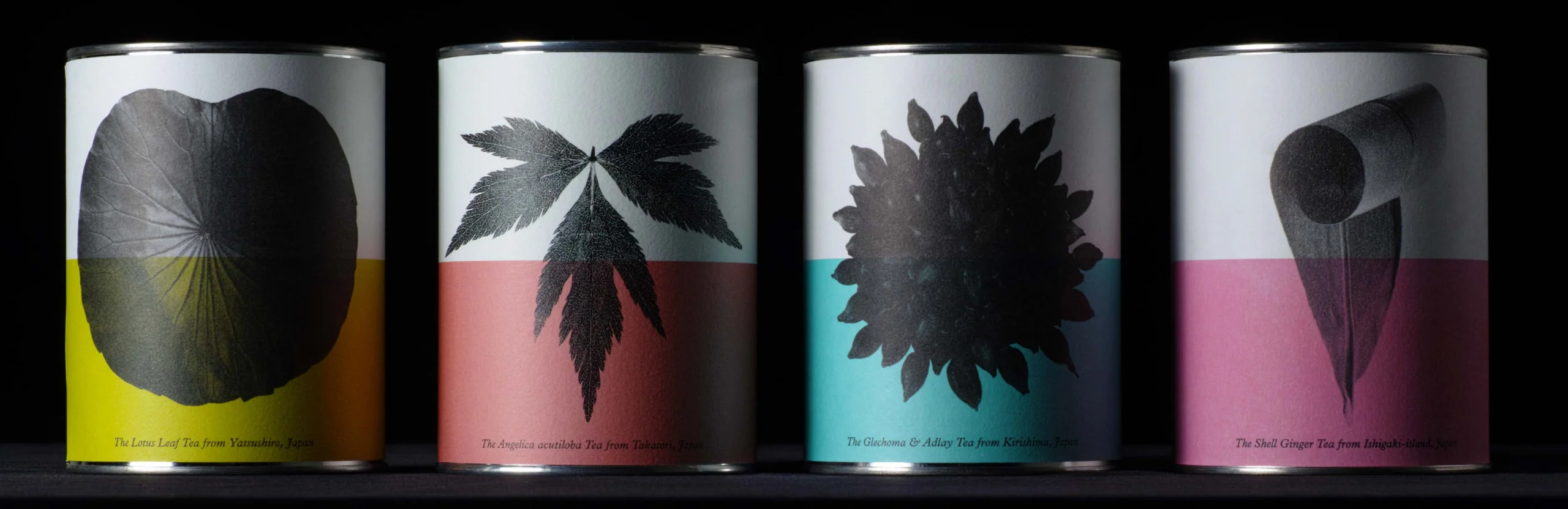
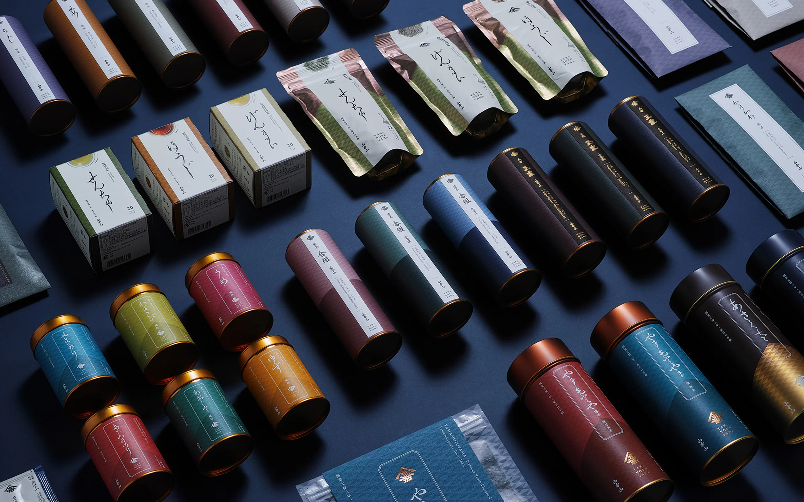
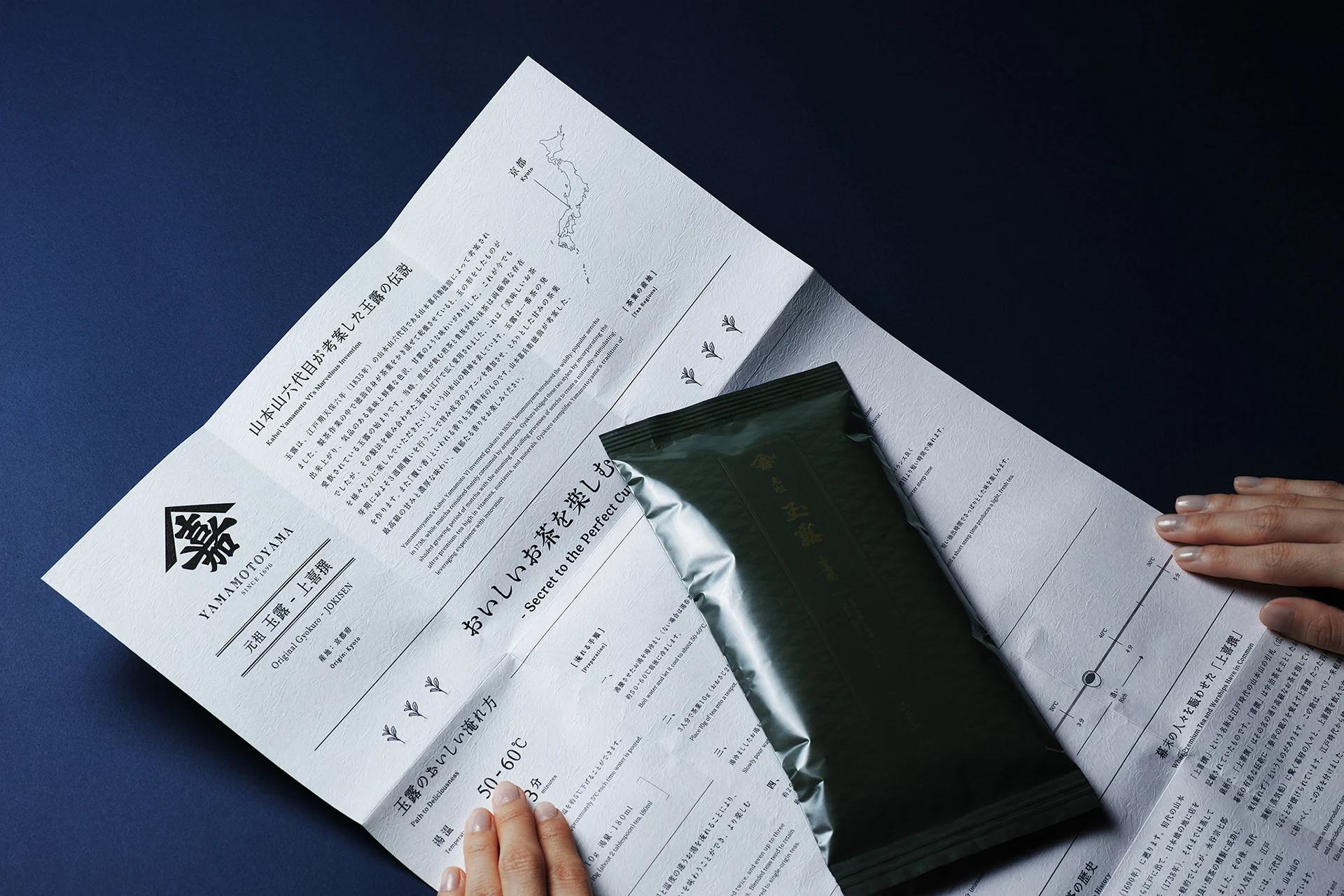
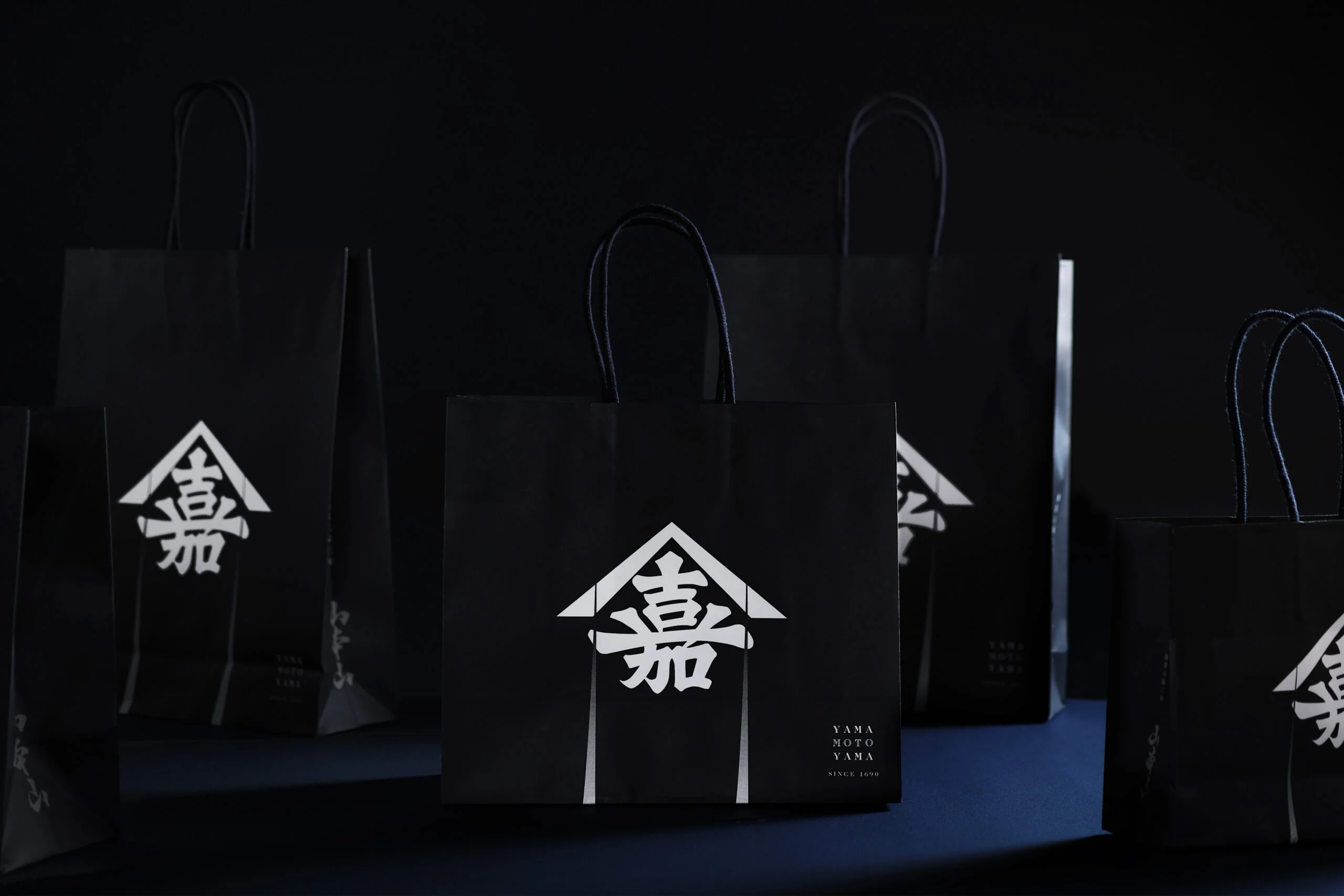
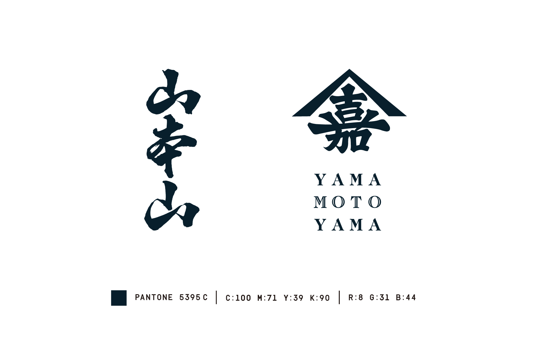
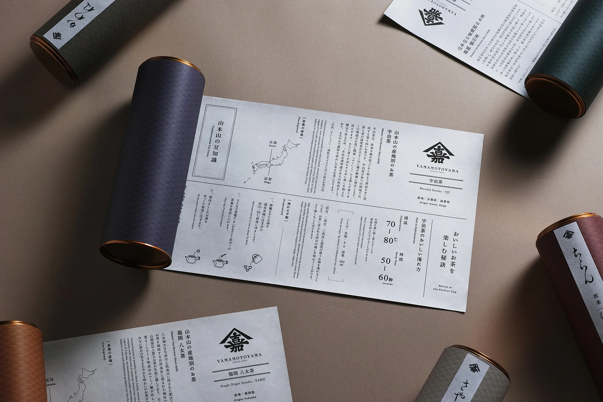
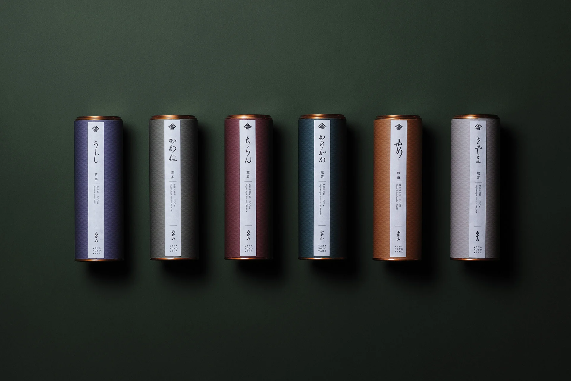
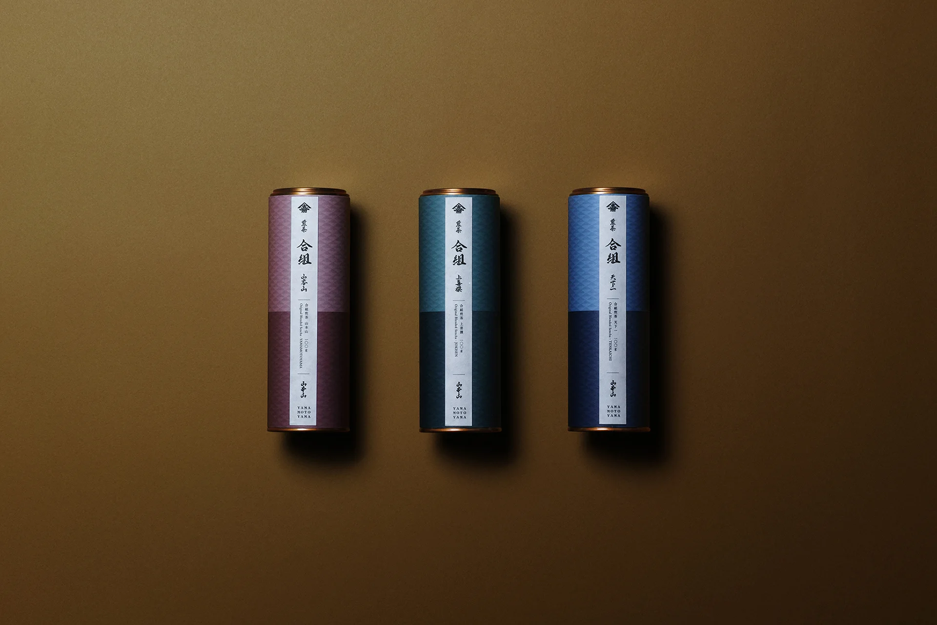
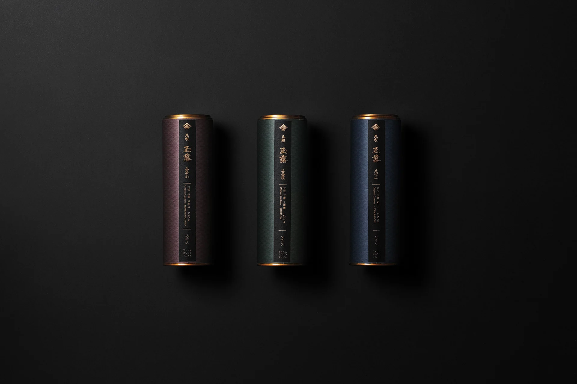
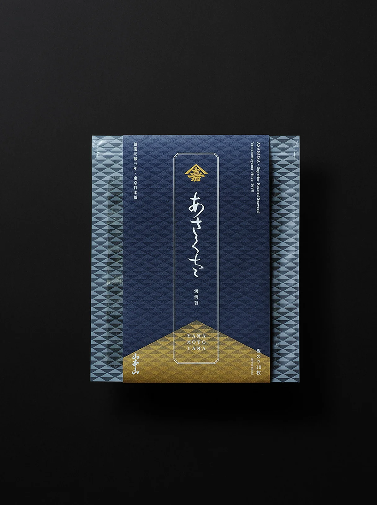
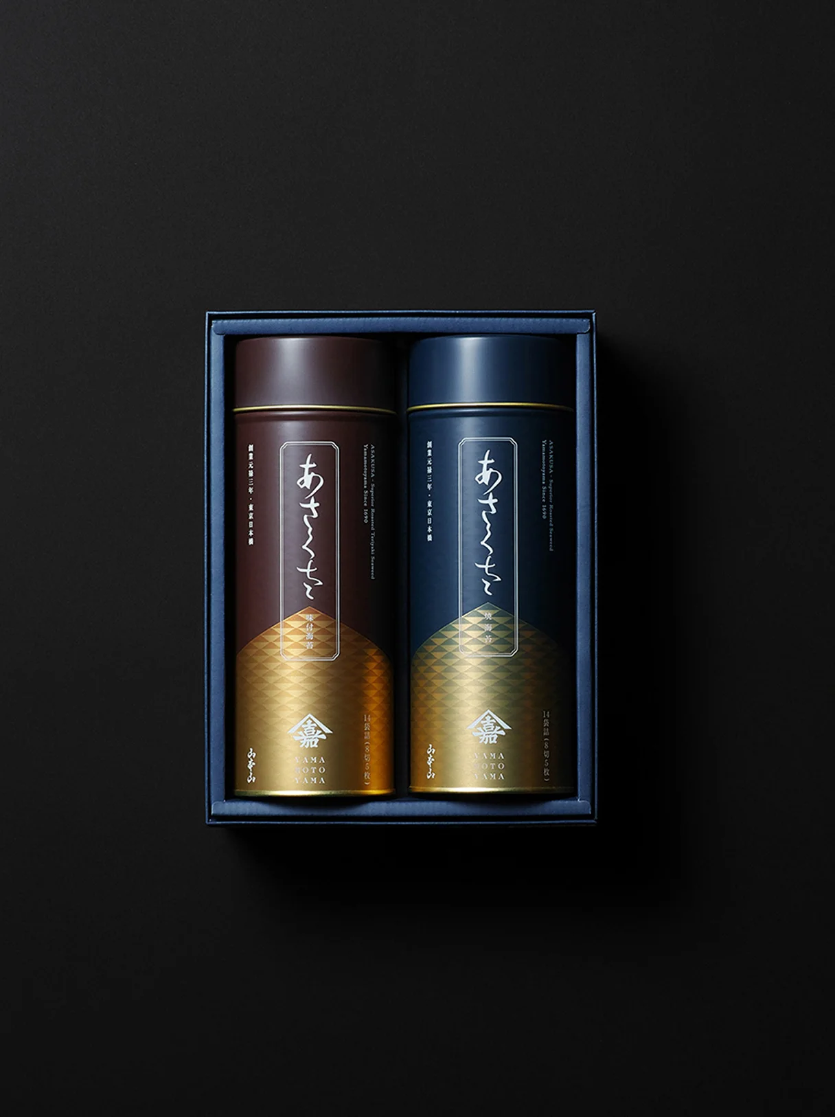
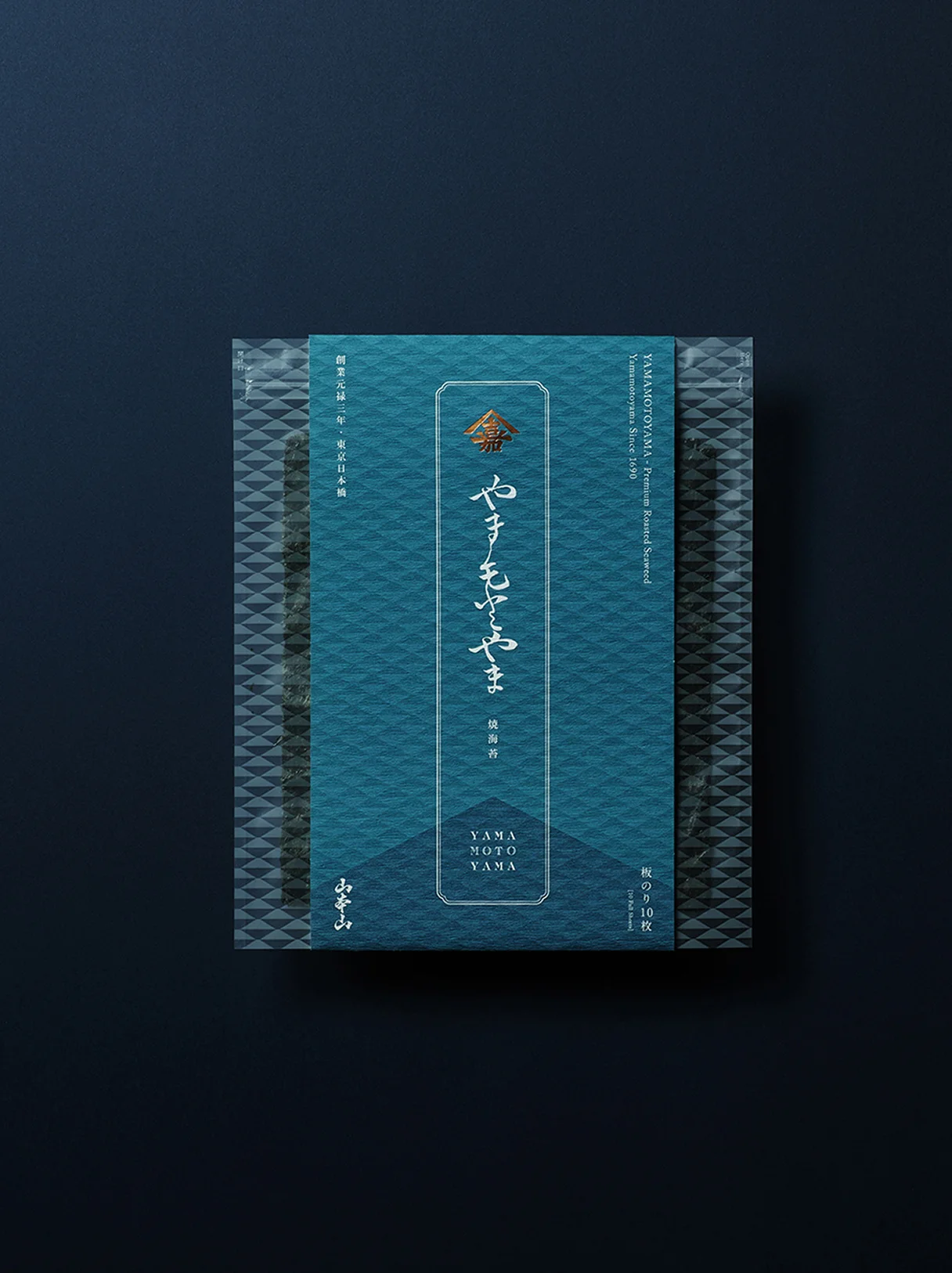
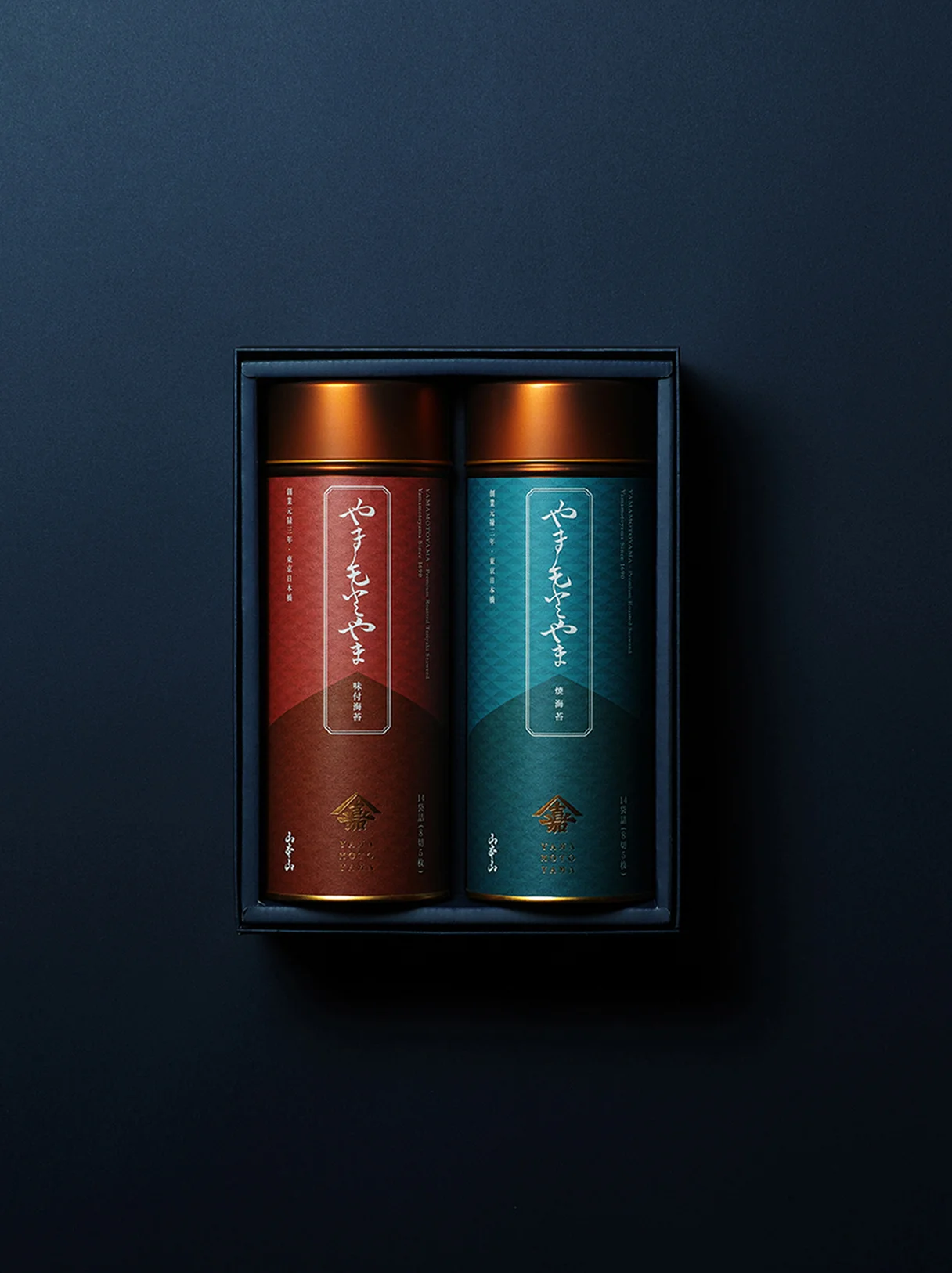
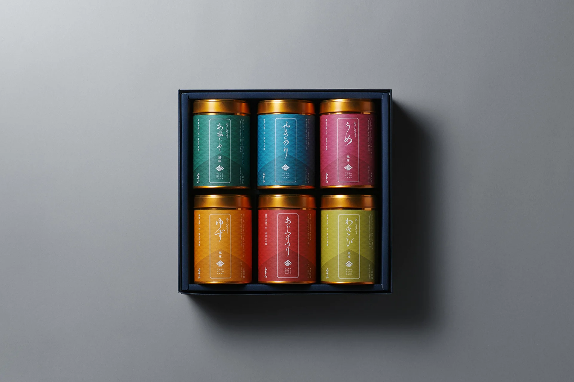
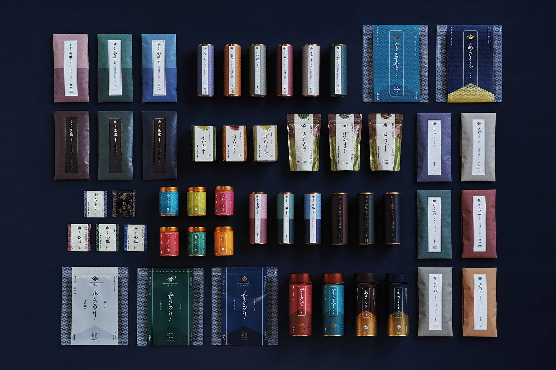
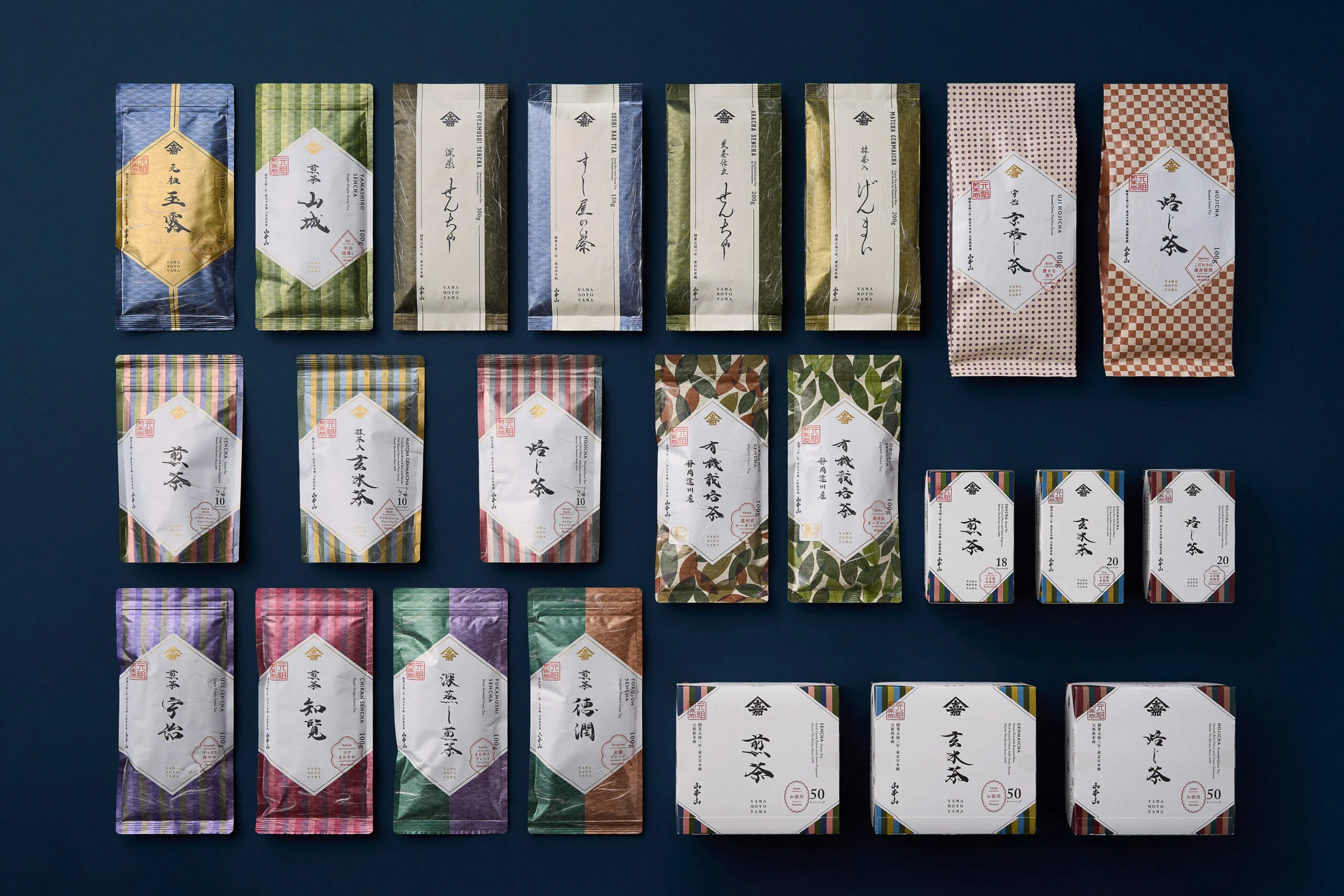
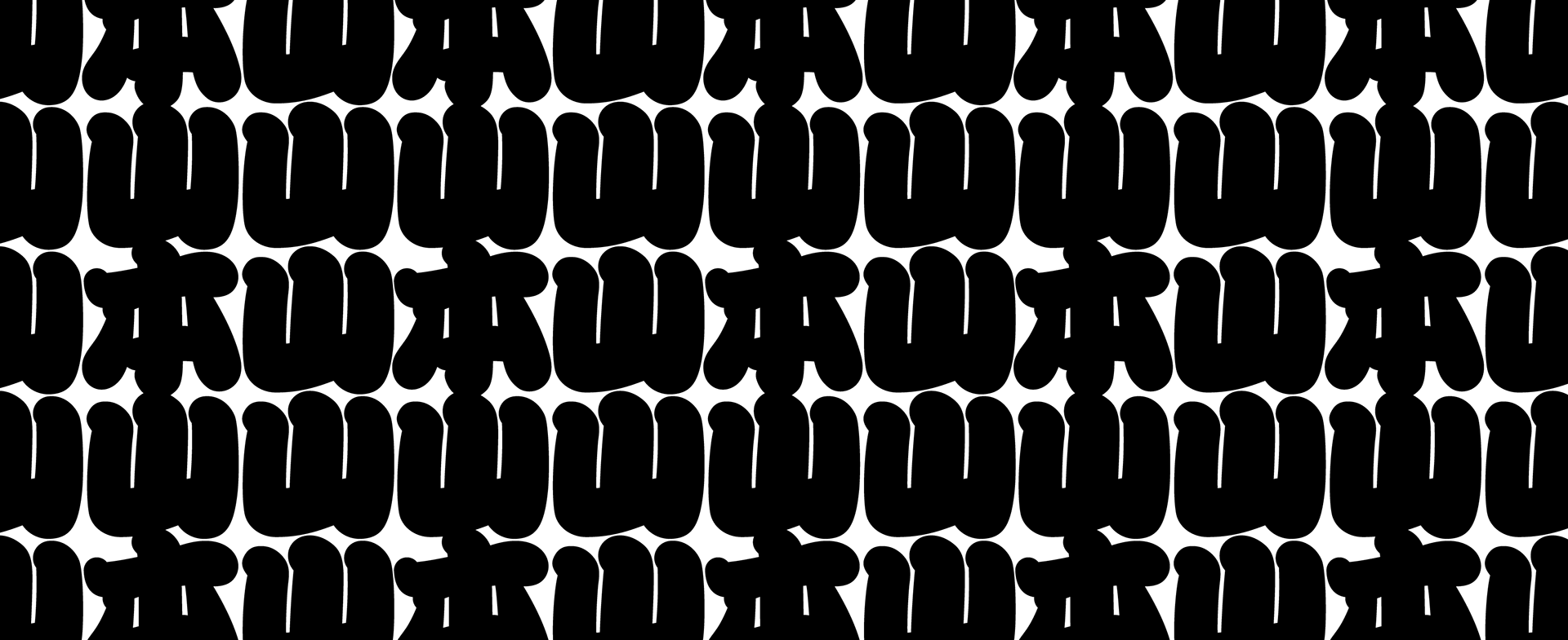
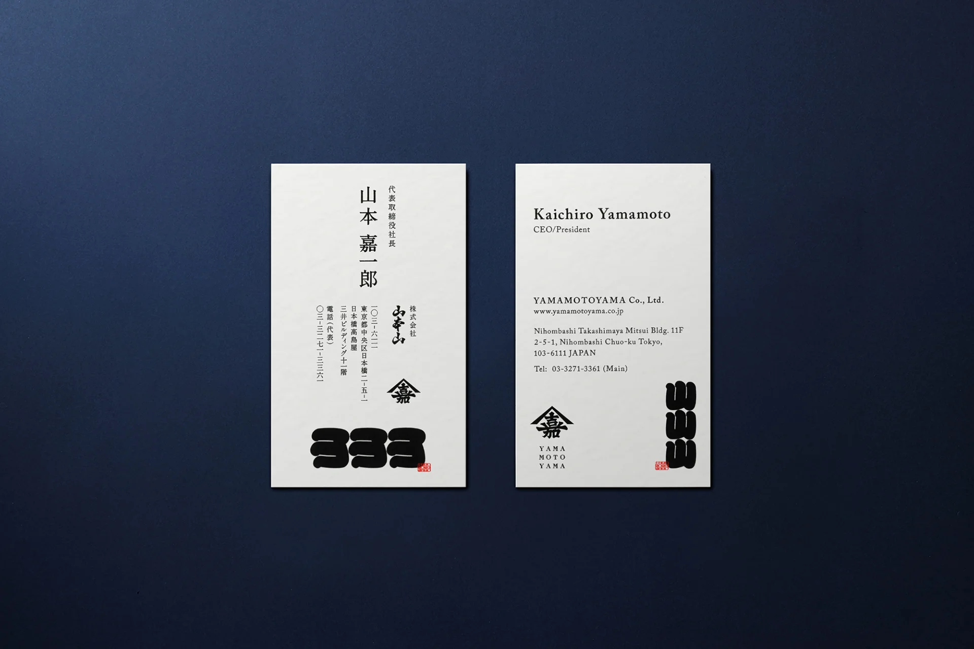
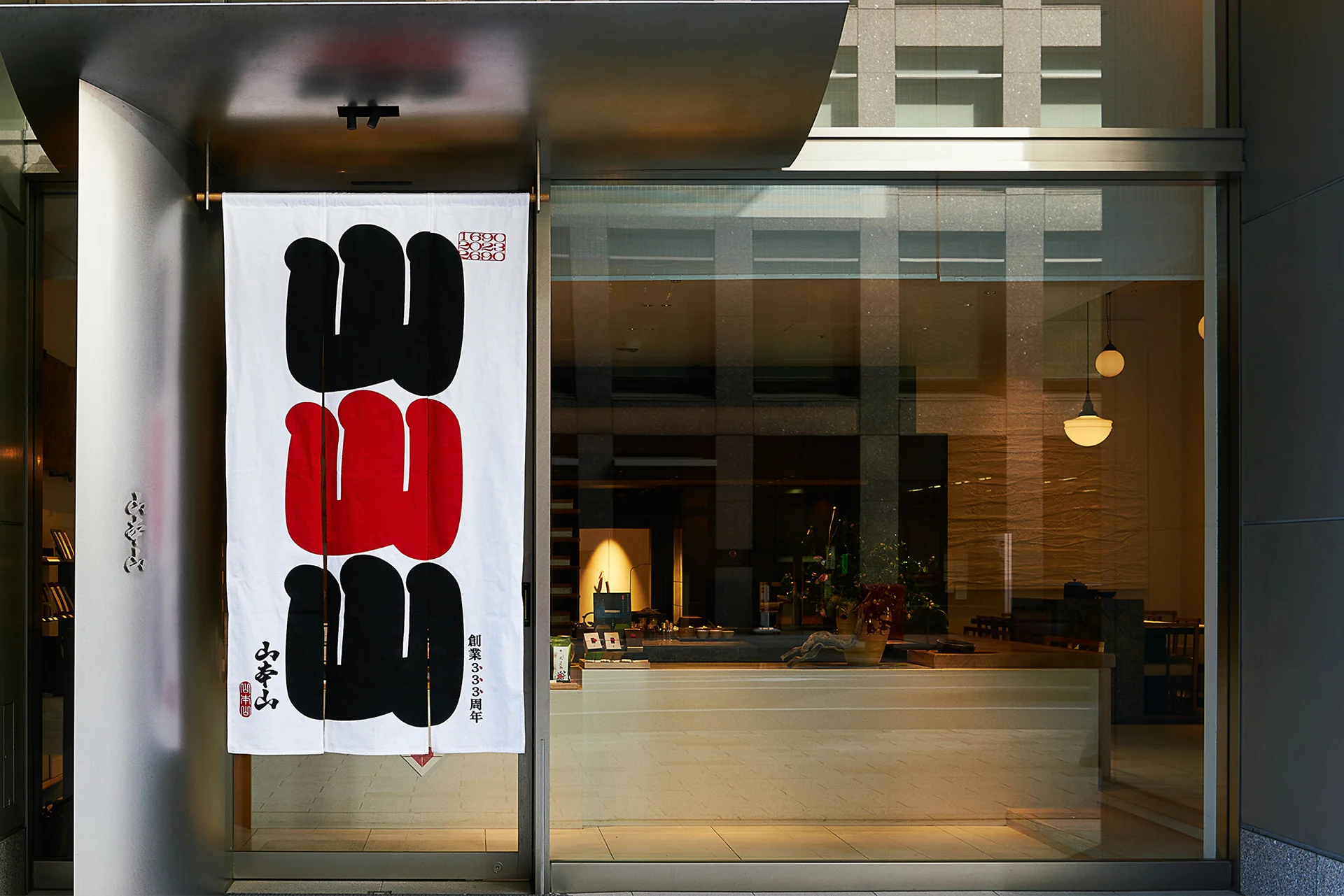
In re-branding YAMAMOTOYAMA, to clarify the position of a long-established company that began in the Edo period, we set our aim to “return to the origin of Edo.” By revitalizing the crest of “Yamaka” (山嘉) that was used previously for articles and advertisements of the era when “Yamamoto Kahei shōten” store was founded, we combined this with the alphabetical typeface that was simultaneously popular around 1690. We were able to design a brand logo that reproduced the aesthetics and atmosphere of the Edo period. Furthermore, even in existing products, we incorporated the original small pattern of Edo writing style, quoting the structure of traditional colors and structure of scrolls, redesigning the packaging into a contemporary and elegant style, retaining the charm of the long-established store. In rebranding the history of a long-established company from Edo and the traditional aesthetics of Yamamotoyama, we arranged new products and existing products on the sales floor without the sense of incongruity. We were able to gradually make a shift towards a new brand, avoiding any risks of replacement.
CLIENT VOICE
Sensing the Yamamoto spirit, expressing “Yamamotoyama.”
Since our rebranding, Mr. Tachikawa and I have shared many meals together. Over dishes enjoyed in common and conversations that often stray far from business, he sometimes probes deeply into things I usually approach more instinctively. Through those exchanges, I feel he has truly grasped my sensibilities and values.
The designs born from this process always surpass my imagination. Yet rather than feeling distant, they spark an exhilarating sense of expansion—as if the conversation itself is carried further by the design.
Our company’s 333-year journey has been one of constant new challenges. Looking ahead to the next 333 years, we intend to accelerate that spirit of challenge even more. Together with NOSIGNER, I hope we can continue to walk side by side, creating new kinds of value that will bring delight to our customers.
Yamamotoyama Co., Ltd.
Kahe Yamamoto
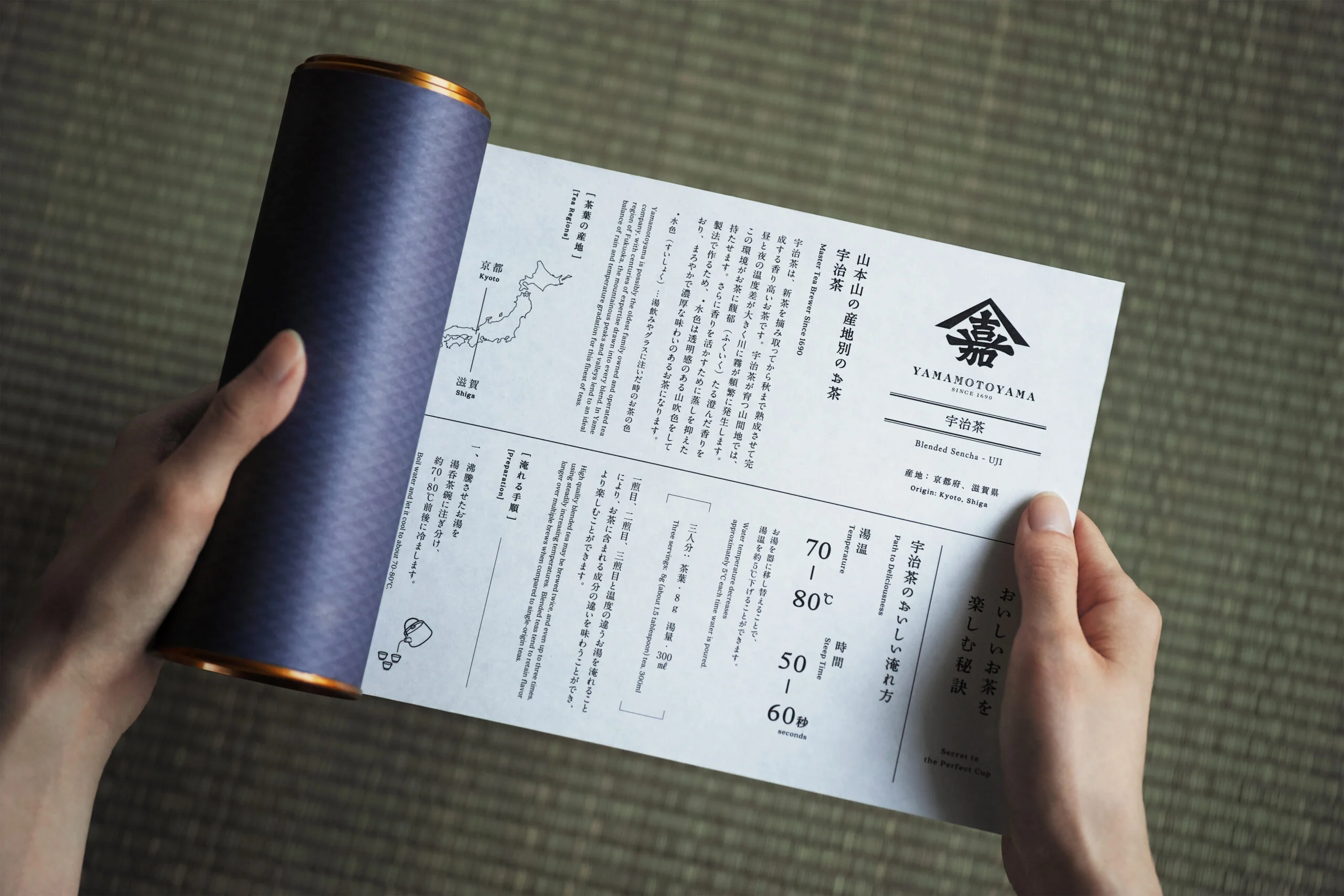

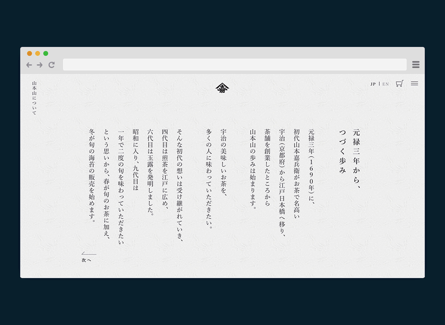
YAMAMOTOYAMA is a well-established brand representing Japan that has been in existence for over 330 years. When designing the website, we wanted to convey the aesthetic sense of Edo in a more contemporary manner. We incorporated a vertical typography style and place dJapanese paper as a texture for the background. Learning from the elements of books of the Edo period, we aimed to create a long-established, modern, timeless web design.
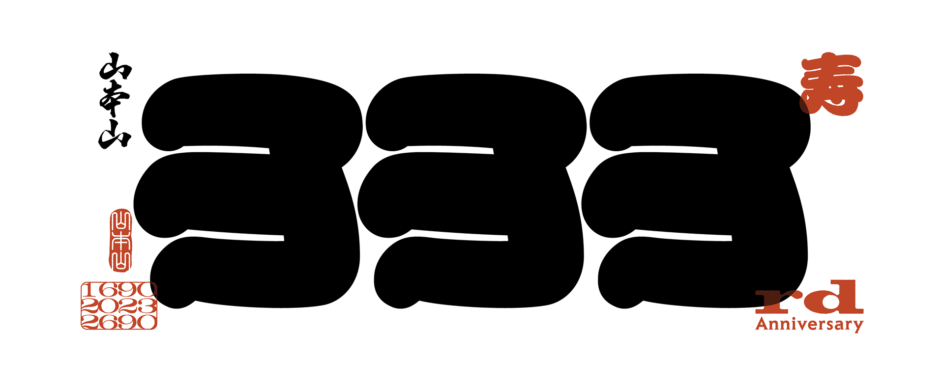
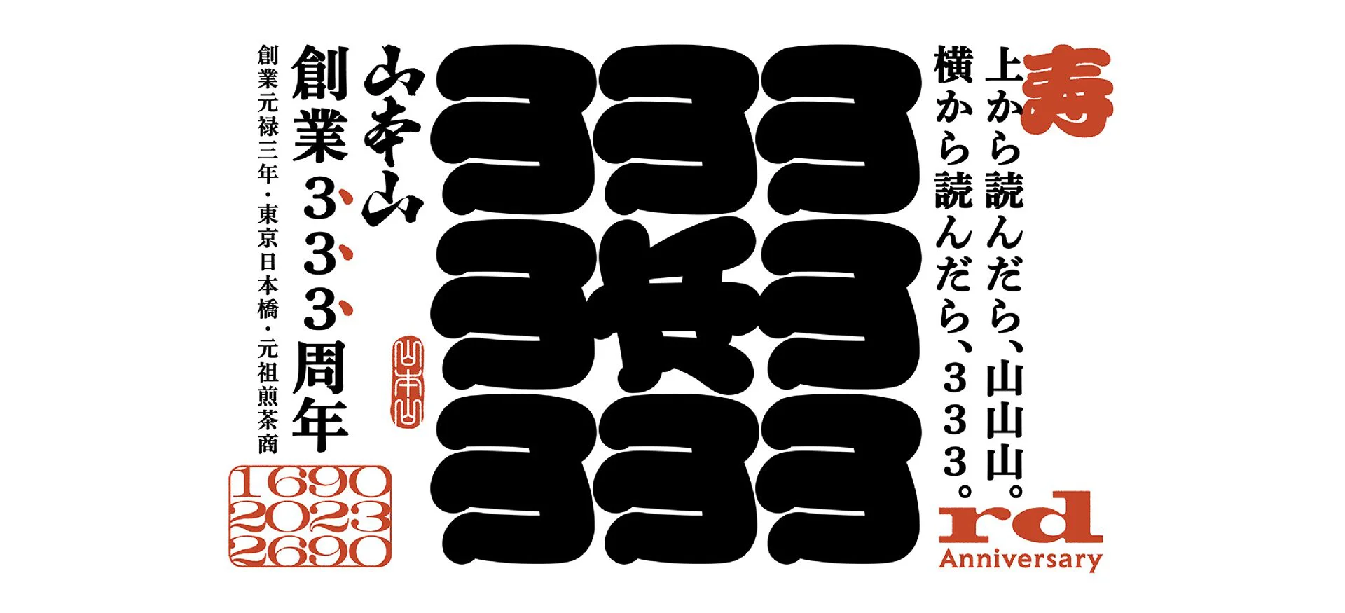
In the logo commemorating the 333rd anniversary of the company’s founding, the character for “mountain” is arranged in a modern interpretation of an Edo period design character. The phonetic reading of the character for “mountain” is “san”, and when the character is rotated 90 degrees, it becomes and reads as the number “3”. The logo is a play on the words “When read from the top, it’s yama-yama-yama, when read from the side, it’s 333.” It is also a tribute to the company’s former commercial tagline, “Read from the top, Yamamotoyama; when read from the bottom, Yamamotoyama”.
WILL
Combining tradition and innovation, connected Edo culture, and taste to the next generation.
While working close to Edo aesthetics, tools and packages with bilingual signage, increased purchases by foreigners and the younger generation. Currently, a new line “YMY” has launched, where products such as Uji Matcha popcorn and Seaweed soup have made it possible to create a new brand experience, as we work on developing the brand to new customers. YAMAMOTOYAMA will continue to respect traditions of the Edo period, introducing a breath of fresh air into the products without fearing change, to connect the Edo culture and tastes to the next generation.

INFORMATION
- What
- YAMAMOTOYAMA
- When
- 2017
- Where
- Tokyo, Japan
- Client
- Scope
- Re-branding / Branding Strategy / Logo / CI Guideline / Packaging / Promotional items / Pamphlet / Photograph
- Award
- Red Dot Award: Brands & Communication Design(2019)
- GERMAN DESIGN AWARD: Special mention(2020)
- Platinum A’ Design Award in Packaging Design Category(2021)
- Design Rush Best Design Awards: The Best Coffee & Tea Packaging Designs(2022)
- Tokyo TDC Annual Awards(2024)
CREDIT
- Art Direction
- NOSIGNER (Eisuke Tachikawa)
- Graphic Design
- NOSIGNER (Eisuke Tachikawa, Ryota Mizusako, Nozomi Aoyama)
- Photo
- Kunihiko Sato