PROJECT
MIDORI XS
Packaging reimagined as brand concept media drives 1.7x sales increase.
HOW
Redefining stationery products which are the smallest.
Stationery maker MIDORI’s Color Stationery is a long-established series of stationery products sold for over 25 years since 1994. In recent years, sales got sluggish. We then took charge of the branding in tandem with the revamping of the series.
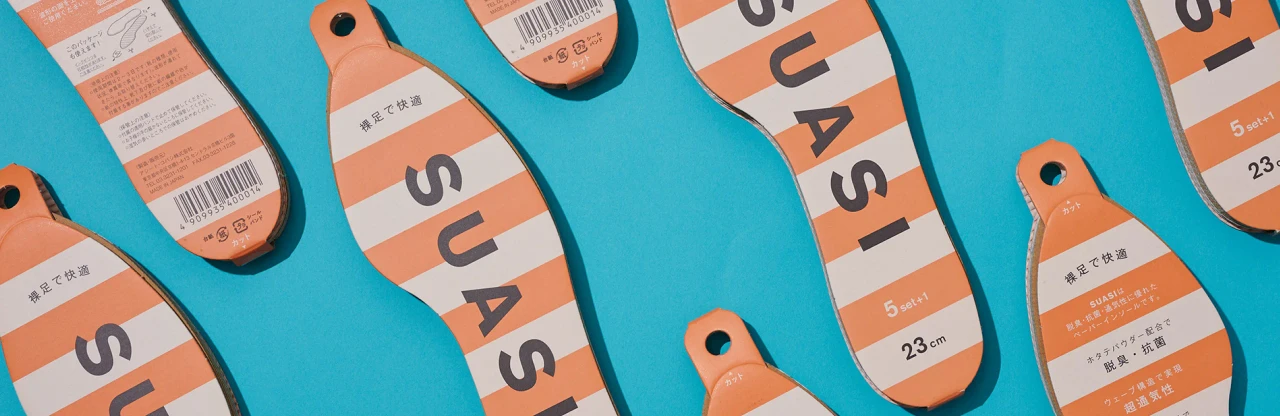
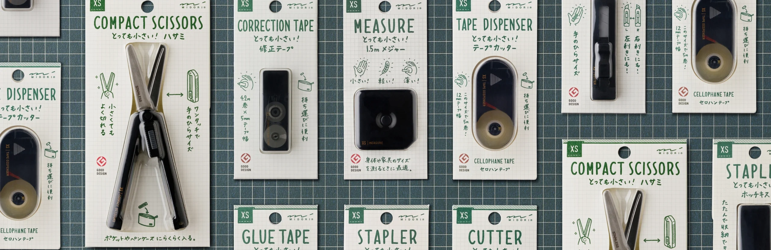
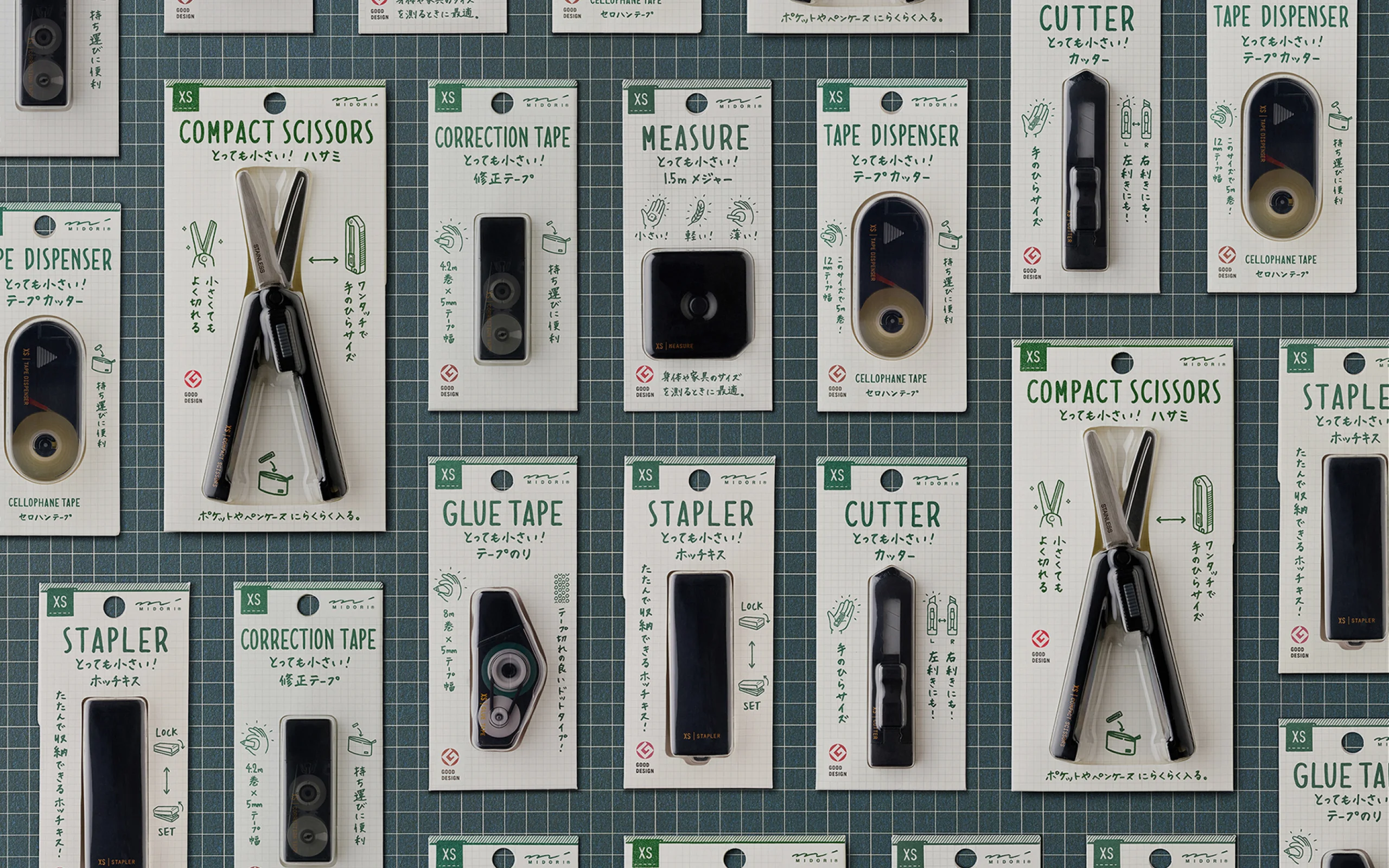
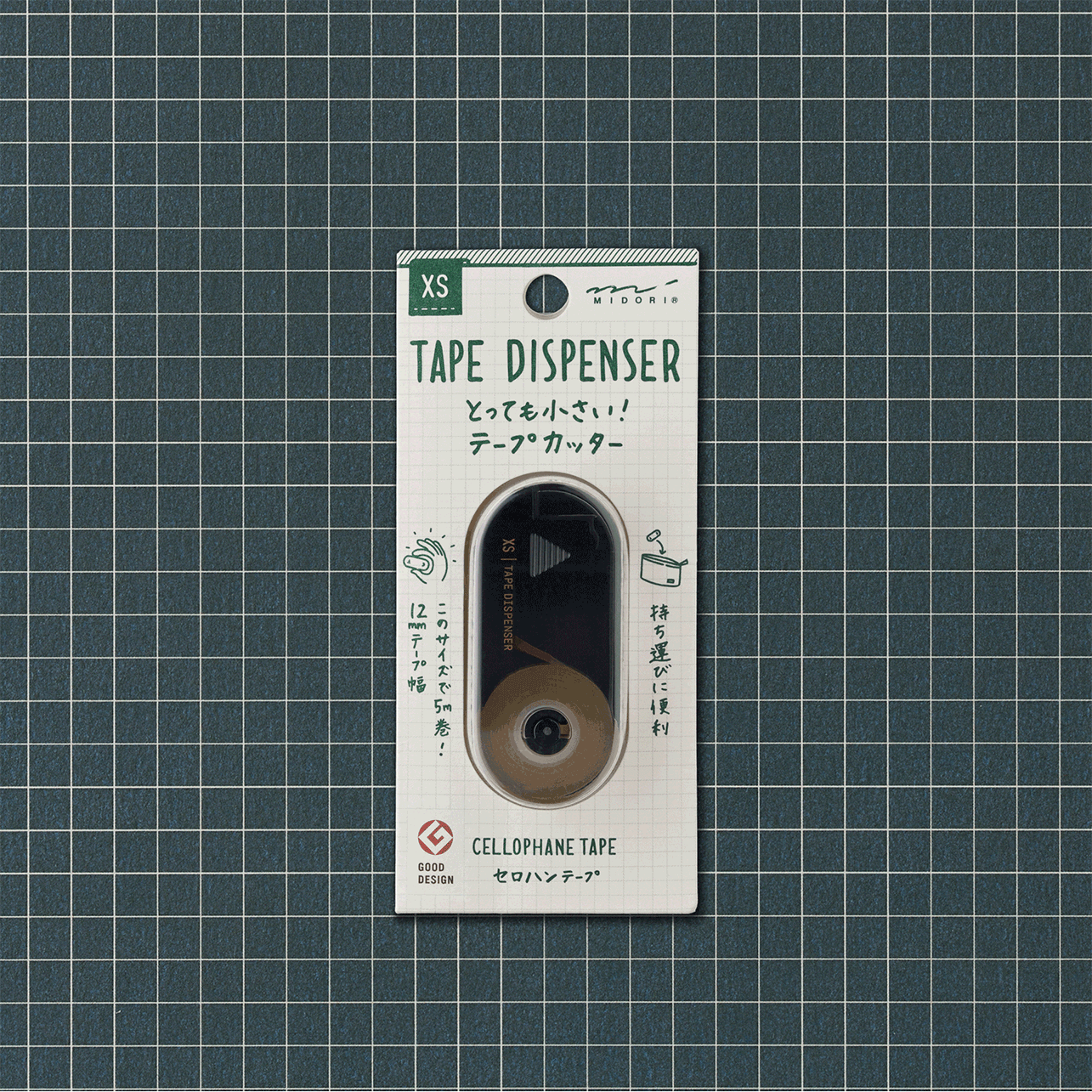
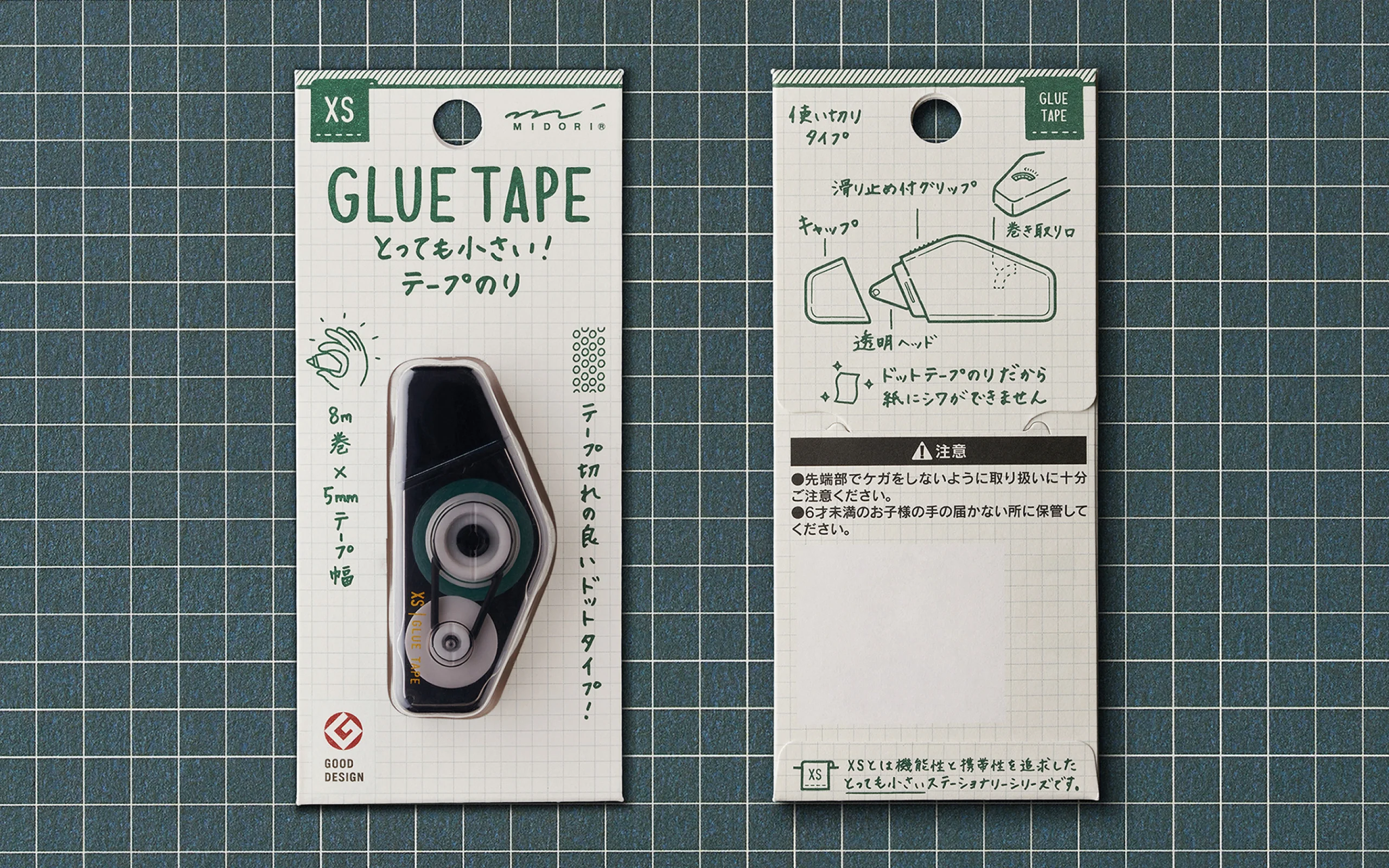
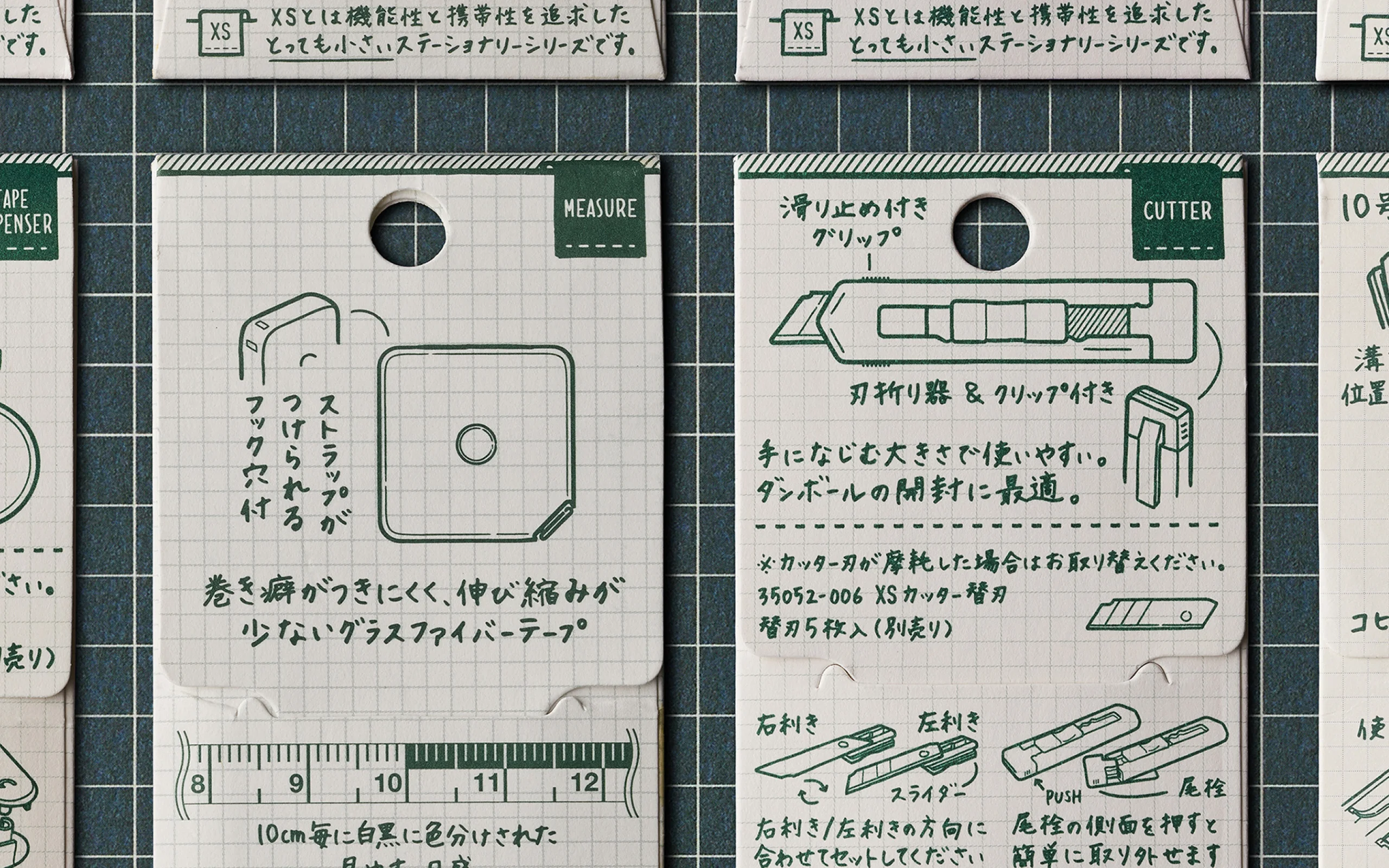
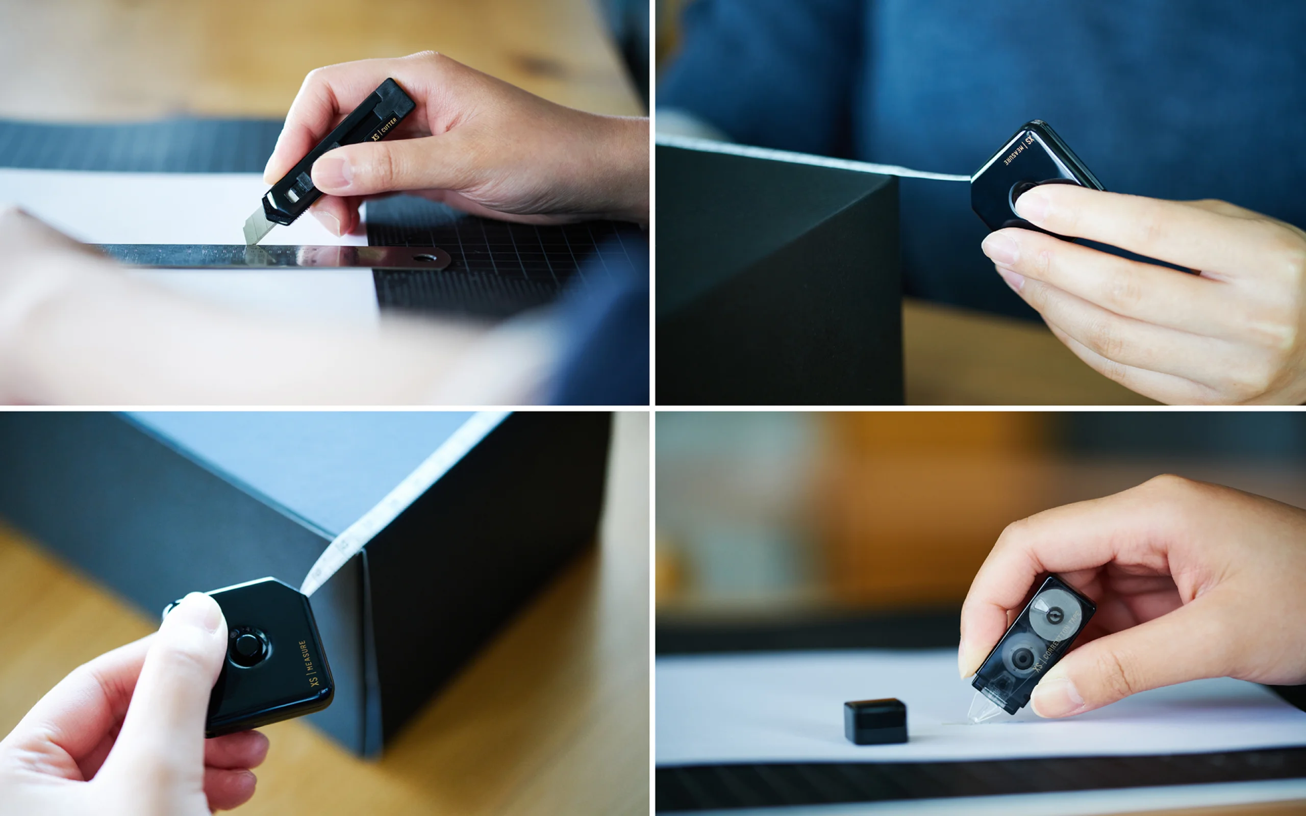
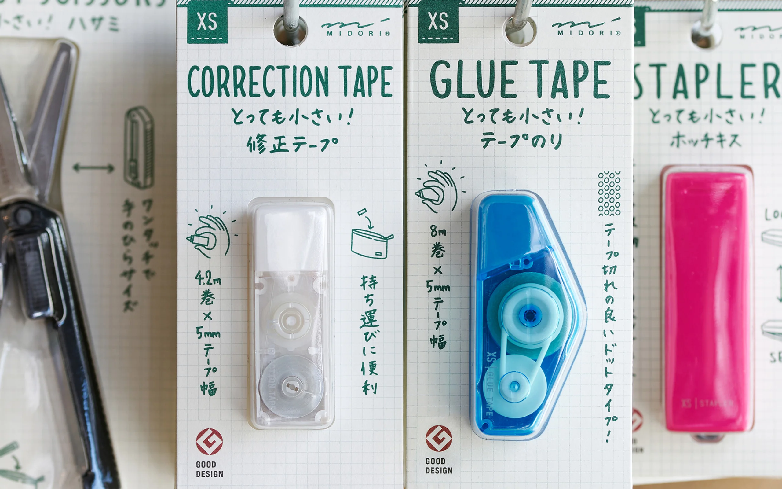
Hitherto, the main emphasis in the PR for Color Stationery products was the wide variety of colors they came in. However, it became apparent that the products’ true appeal lay in being the world’s smallest stationery products. They were compact, lightweight, or collapsible. We, therefore, proposed a PR strategy heavily emphasizing the products as being the world’s smallest of their kind, making them very handy for users. The brand name was also changed to “XS” to indicate “Extra Small.”
Even on the packaging, the text and illustrations emphasize the product’s compact size and easy storage. The typography’s handwritten style exudes the personable warmth of handwriting on paper. It reminds us that paper stationery and appointment books have been MIDORI’s staple products since its founding. It also brightens up the store’s stationery section. Also, the use of plastic has been reduced by half by using paper instead of blister packs for some of the packaging.
Since the product designs are still based on the Color Stationery series, the same molds are still used to make the products. By changing only the logo and colors, the products look simple and refined. The brand has been redefined to indicate a good design and function to serve the product’s purpose.
WHY
Is the constant stream of new products the only solution?
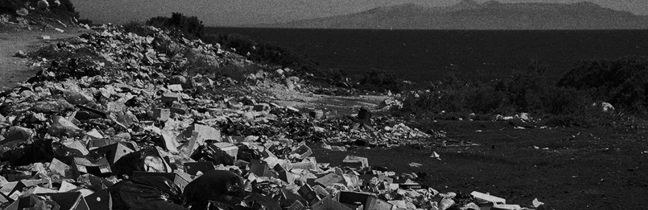
Today, the market is flooded with products while consumer needs keep changing at a dizzying pace. Companies and brands are forced to constantly develop, update, and sell their products to maintain their market presence and appeal. However, the development of new products and the updating of existing products require the creation of new product molds and the disposal of outdated products. This becomes a great burden on the environment. With product manufacturing seen as having a problematic impact on the global environment, can the practice of encouraging consumption with a constant stream of new products be sustainable?
Life cycle of hit products:
Product life cycles are becoming shorter

WILL
Design to extend the product’s life cycle.
Despite the higher pricing, the revamped XS brand increased sales by 1.7-fold compared to its former brand. It has become popular enough to be stocked at convenience stores nationwide.
This rebranding revived a long-established brand suffering from lagging sales. It became a project proving that good communication design can have a greater effect than new product announcements.
As market competition intensifies, the life cycle of a product from its introduction to its withdrawal is steadily becoming shorter. Amid this trend, instead of the repetitive scrap-and-build cycle for products, hidden strengths in the existing product should be uncovered and the product redefined to extend the product’s life cycle. This will in turn reduce the impact on the environment. Such an approach is needed in many realms. By proving the power of communication design for other products, we believe our role is to instill methods to have sustainable brands and manufacturing.
INFORMATION
- What
- MIDORI XS
- When
- 2016
- Where
- Japan
- Client
- Scope
- Branding / Packaging / Illustration / Photograph
- Award
- Red Dot Award (2022)
- iF Design Award (2022)
- 日本文具大賞 (2020)
CREDIT
- Art Direction
- NOSIGNER (Eisuke Tachikawa)
- Graphic Design
- NOSIGNER (Eisuke Tachikawa, Andraditya D.R., Ryota Mizusako)
- Illustration
- NOSIGNER (Andraditya D.R., Ryota Mizusako)
- Photograph
- NOSIGNER (Yuichi Hisatsugu)