what:
warew​​​​​​​
百合の花の画像

why:
To carry the wisdom about medicinal herbs from ancient Japan.

日本古来から伝わる薬草の知恵をつなぐには。

In Japan, plants have been used since ancient times for things such as treatment of diseases, prevention of diseases and also maintenance and improvement of health. They play a role in supporting a healthy lifestyle for the people today, in the form of herbal medicines. From the viewpoint of beauty and aging care, this has caught attention worldwide. We questioned what kind of design was necessary today to deliver Japan's unique sense of beauty aesthetic. We utilized the power of domestic plants for a superior skincare product to women all over the world.


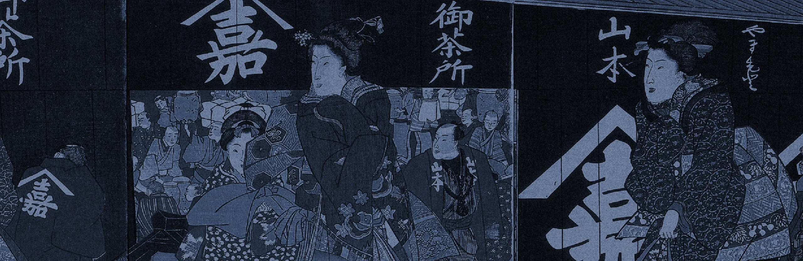
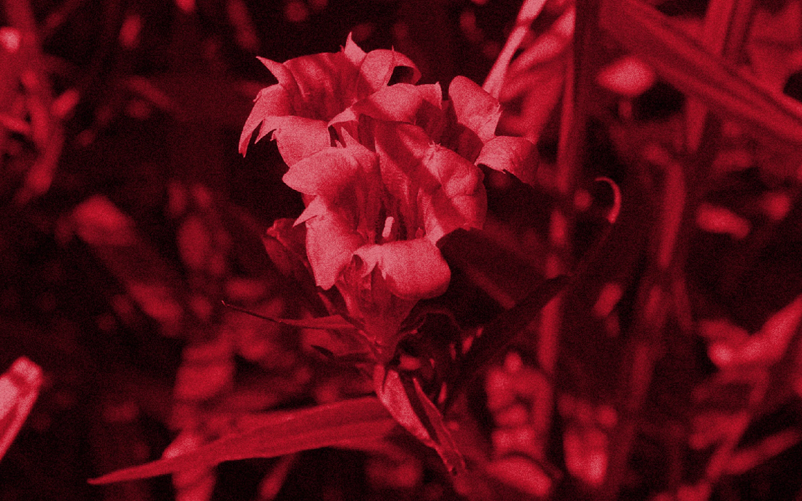
日本では古来より植物が、疾患の治療、病気の予防、健康の維持・向上などの目的で活用されてきました。これらは、薬草を原料とした生薬、漢方薬などの形で現代人の健康な生活を支える役割を担うとともに、美容やエンジングケアという観点からも世界的に注目を集めています。世界中の女性たちに向け、国産植物の力を活用した機能的で優れたスキンケア用品を、日本ならではの美意識とともに届けるためには、どのようなデザインが必要になるのでしょうか?


「warew」の化粧品パッケージが並んでいる
白い空間に「warew」の化粧品パッケージが並んでいる

how:
Cosmetics that fit the aesthetics of shrines and "Shiromuku."

神社と白無垢の美意識を化粧品に。

We were in charge of branding the skincare brand "warew" (和流), which means "Japanese style." We aimed to make a new standard in Japan, focusing on the formalities of the natural ingredients and its domestic origin. As a brand for women who masters in Japanese beauty, we chose a transparent white and a deep vermillion as their brand color. We were inspired by "shiromuku" (a traditional pure white) and its roots of "shrines," that is a symbol of Japanese women's beauty. The symbol expresses the essence of the "Hinomaru" (circle of the sun in the Japanese flag) is made to look like a hand mirror that is a tool symbolizing women's beauty. The glass bottles were inspired by the standing posture of Japanese women, with the band wrapped at the center. By using this band, we produced natural and elegant skincare, where we aimed to makes you feel beautiful from within, which connects to the philosophy of warew.


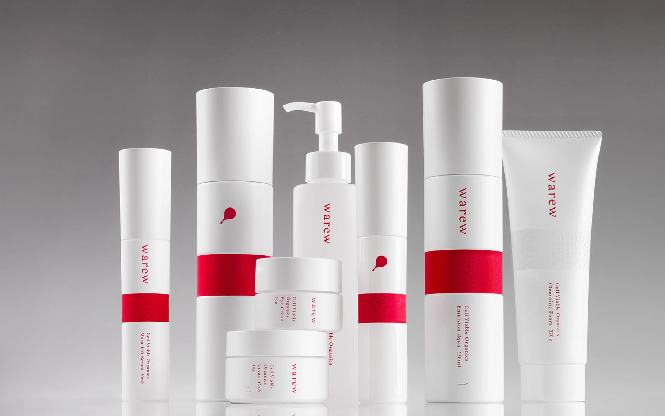
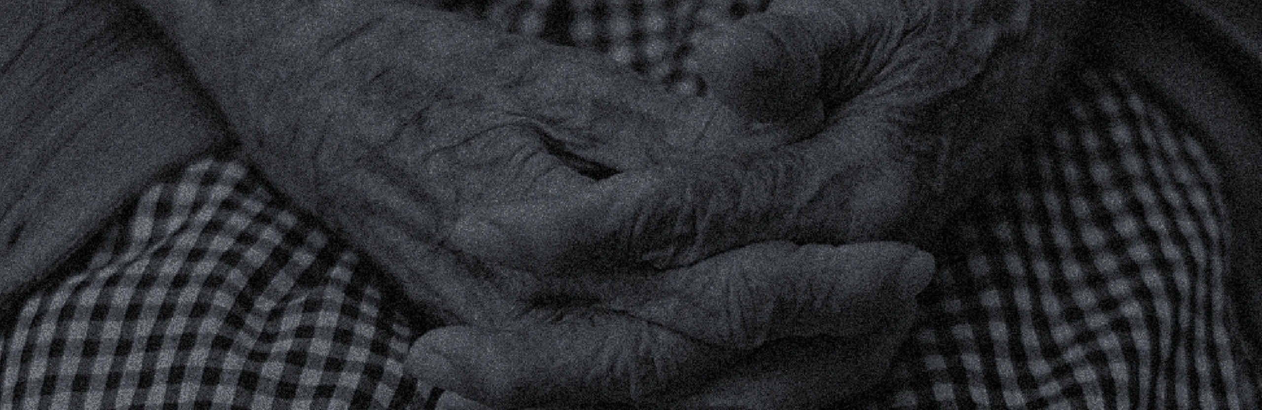
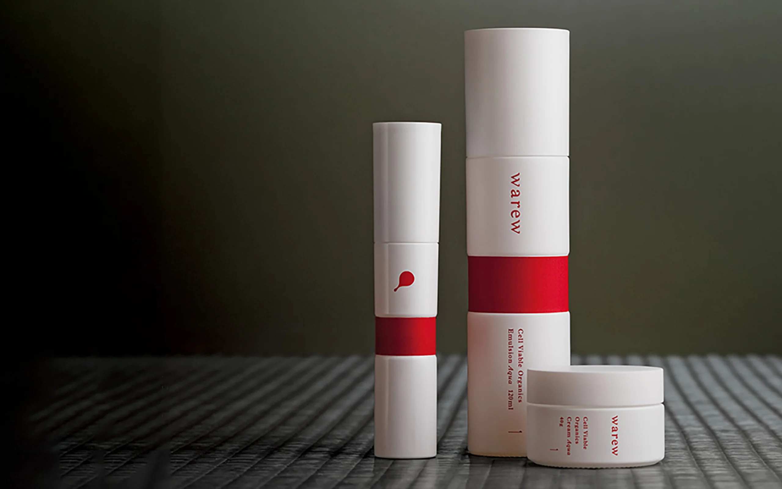
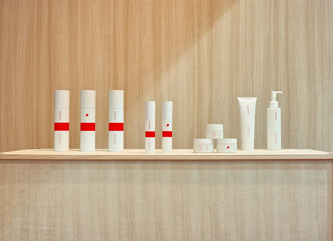
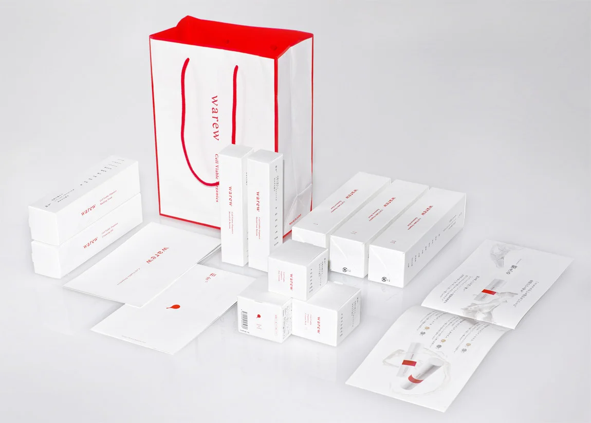
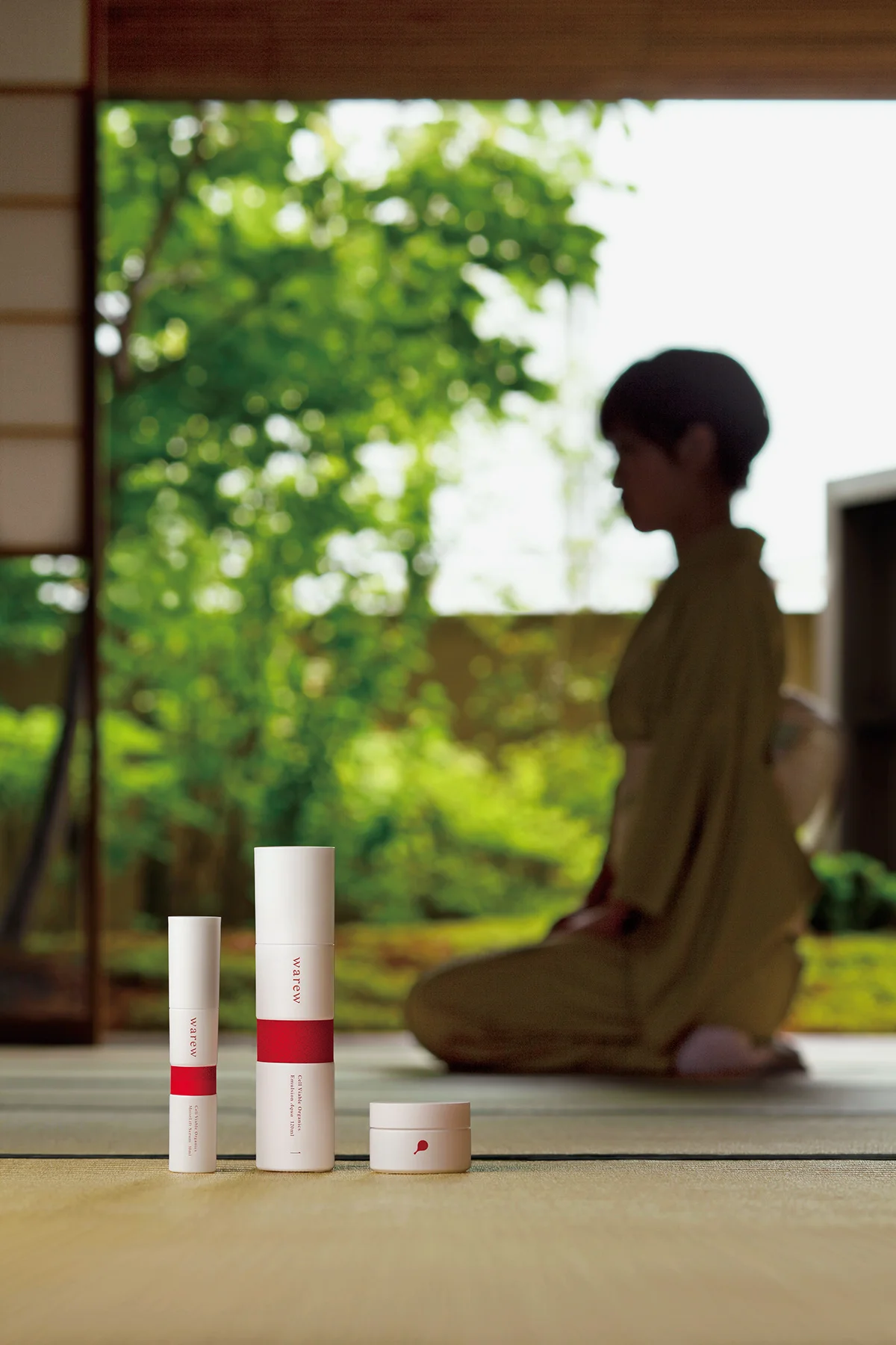
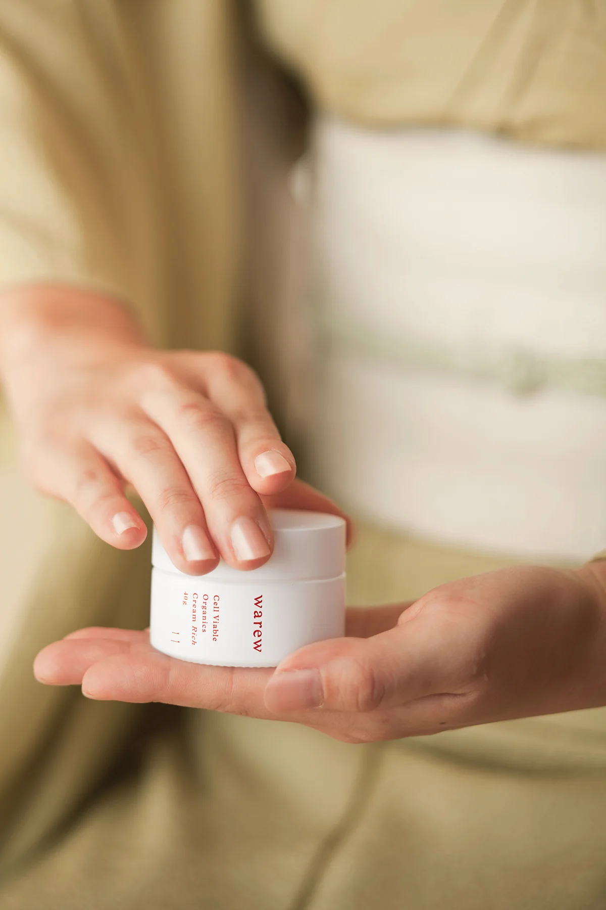
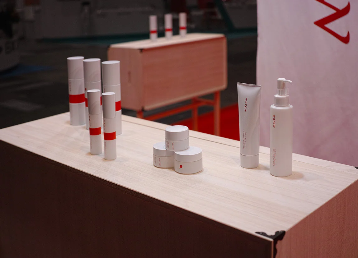
国産と天然由来の成分にこだわり、日本の新しいスタンダードを目指すスキンケアブランドwarew(=和流)のブランディングを行いました。日本の美を極める女性のブランドとして、日本女性の美の象徴である「白無垢」と、そのルーツとも言える「神社」からインスピレーションを得て、透き通るような純白と深い朱色をブランドカラーに据えています。また、日の丸からエッセンスを抽出したさまを表現したシンボルマークは、女性の美を象徴する道具である「手鏡」にも見える造形になっています。日本女性の立ち姿に着想を得たガラス素材のボトルは、帯がプロダクトの重心の位置にあしらわれています。この帯を持って扱うことで自然と気品のある所作でスキンケアができ、warewのブランド哲学にもつながる、型を通じて内面から美しくなるデザインになっています。​​​​​​​


グレー背景に「warew」の化粧品パッケージが並んでいる
特設ディスプレイ空間に「warew」

will:
Recognized as one of the world's best package design in cosmetics.

化粧品部門で世界一のパッケージデザインとして評価される。

The package design of warew expresses the unique sense of Japanese beauty aesthetics found in the invisible spirituality of "wabi sabi," referring to its deep and rich simplicity. We were granted the Gold Award for PENTAWARDS in 2014, gaining a top position in cosmetic packaging. The brand continues to develop, with other brands are formed simultaneously. Warew continues to grow with derivative brands, where we assumed horizontal development of the brand from the beginning.


質素であることに豊かさや奥深さを感じ、目には見えない精神性にまで美しさを見出す日本特有の美意識「わび・さび」の思想を表現したwarewのパッケージデザインは、世界的なコンペティション「PENTAWARDS 2014」でGOLD AWARD」を受賞し、化粧品パッケージにおける世界一の座を獲得しました。また、当初からブランドの横展開を想定して デザインを行っていたwarewからは派生ブランドも誕生するなど、現在もブランドは発展を続けています。
Awards:
JPDA: Bronze (2015)
PENTAWARDS: GOLD (2014)

特設ディスプレイ空間に「warew」

what:
warew
who:
Art Direction
NOSIGNER (Eisuke Tachikawa, Takeshi Kawano)
Graphic Design
NOSIGNER (Eisuke Tachikawa, Takeshi Kawano)
Photo
Masaharu Hatta (products, hands, and woman dressed in a kimono), 
Takeshi Kawano (packages, exhibition space)
Client

when:
2013
Back to Top