PROJECT
{tabel}
Transformed medicinal herbs from Japan into a tea brand at the heart of herbal culture.
WHY
The wisdom of ancient medicinal herbs is disappearing.
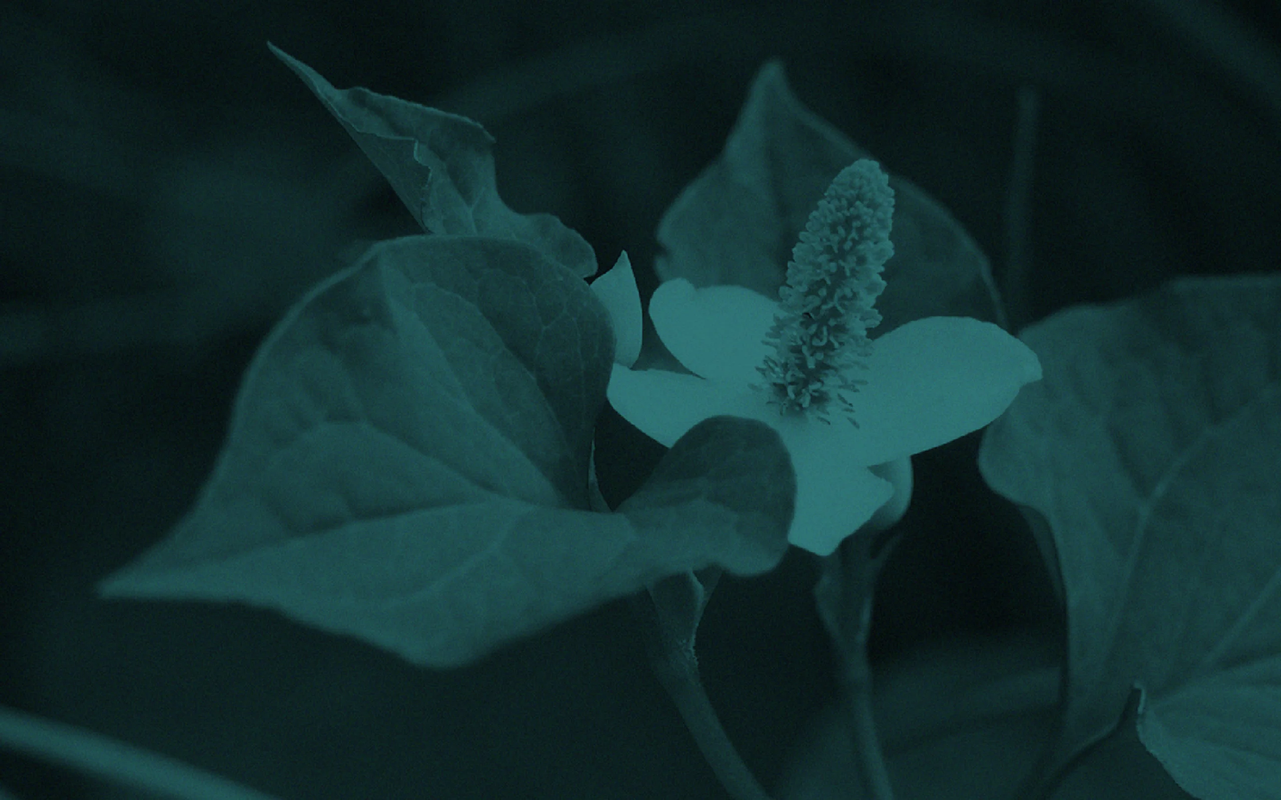
Japan is known to have more than 300 kinds of medicinal herbs from over a thousand years ago. Japanese people have been using this as a treatment for diseases, prevention for sickness, and maintenance of health by taking these herbs. The efficiency of herbal medicines is systematized by Chinese herbal medical science, Herbology, and Japanese herbal medical science. In recent years, a movement to review traditional medication such as oriental medical science has accelerated, which resulted in greater attention to herbal medicines that spread worldwide. However, in modern Japan, the effectiveness of medications is not specified by laws and regulations. The opportunity to use the word “herb” is slowly diminishing, and despite a large number of herb farmers, there is a vast distance between the herbs, their producers, and consumers. We, therefore, questioned whether herbal culture, the wisdom of living that has been passed down in Japan since ancient times, was going to disappear from our modern life.
HOW
Creating medicinal herbs easy to incorporate into modern society.

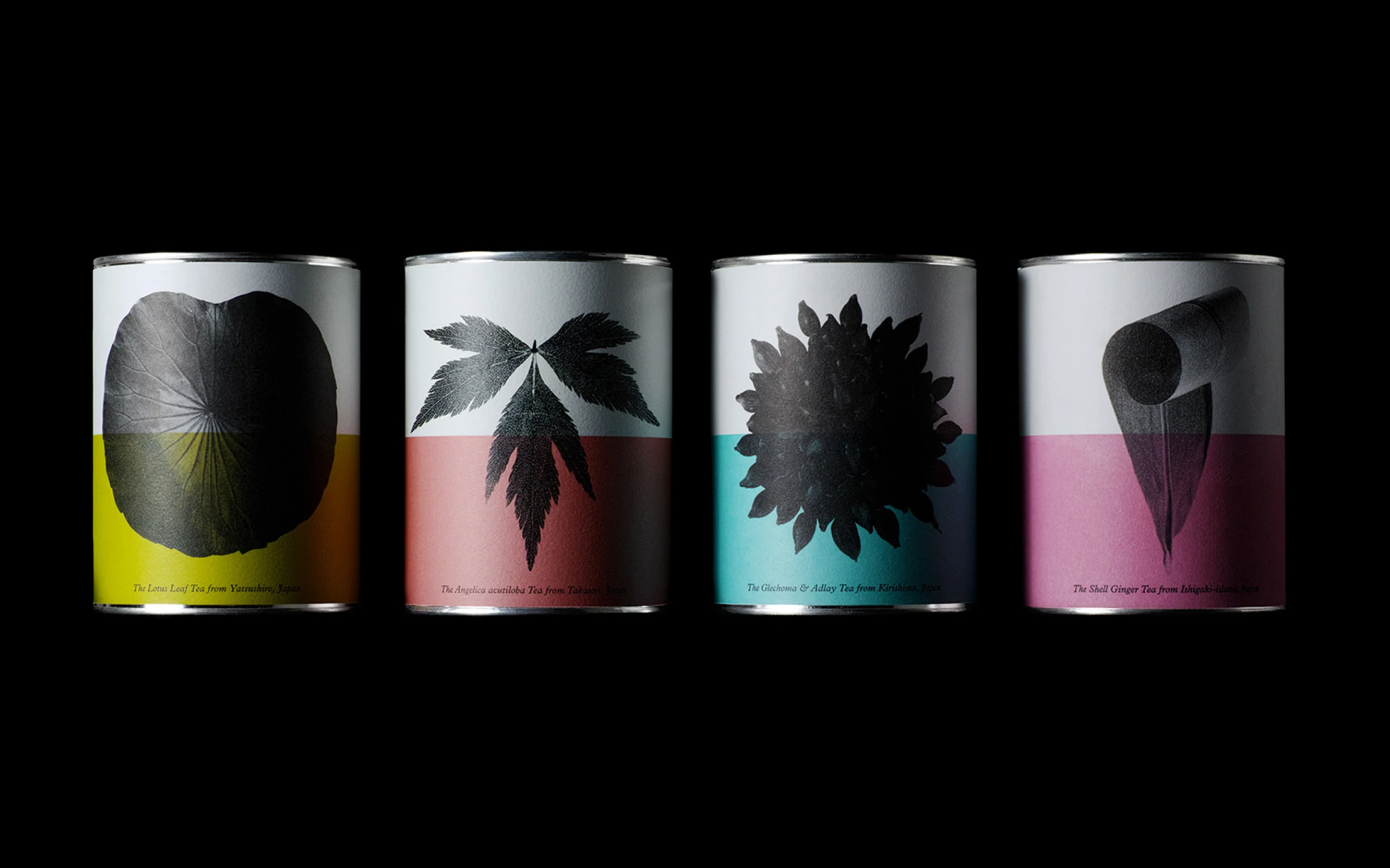
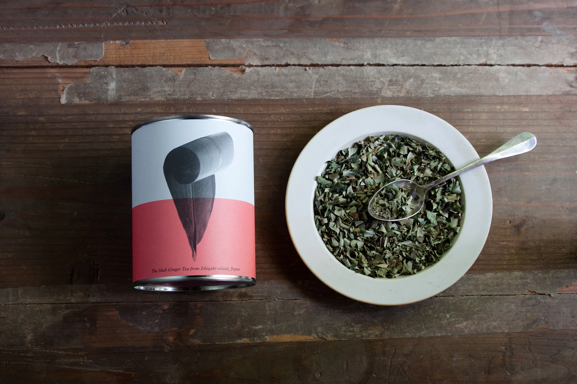
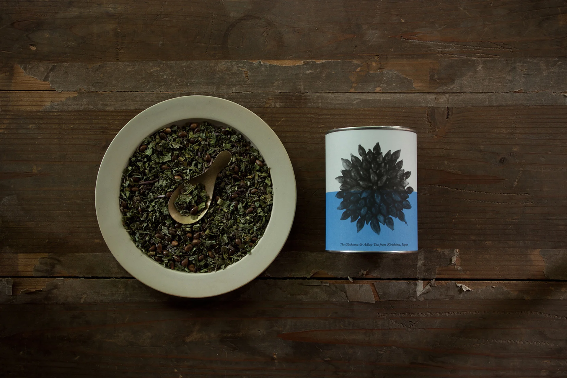
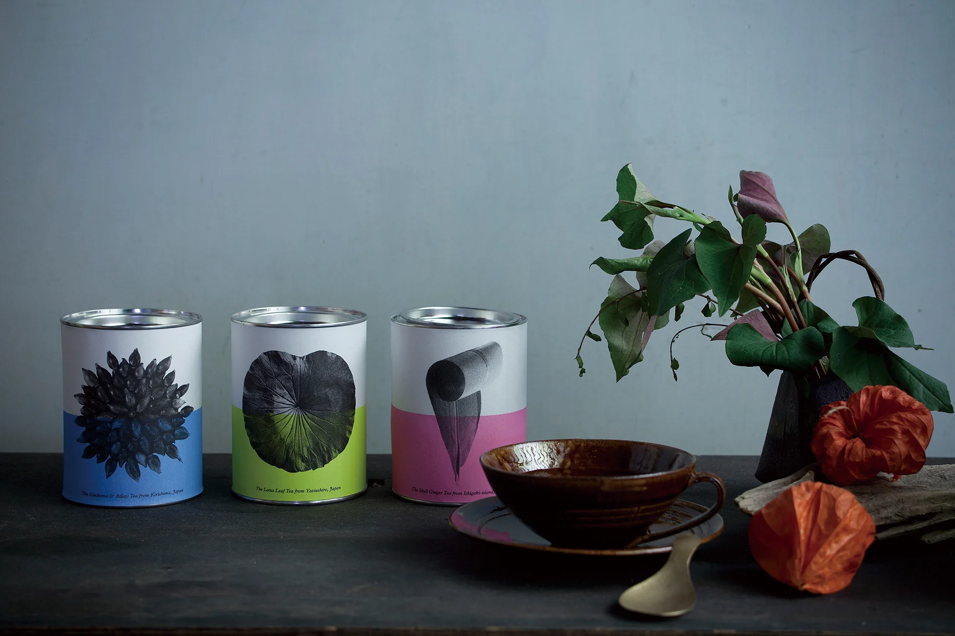
We branded and designed the packaging for traditional tea brand {tabel}, using historical medicinal plants of Japan. {tabel}, derived from the words “supplying” and “obtaining” (in Japanese: TABu 給ぶ, ELu得る) power from plants. It is a brand that connects raw materials such as traditional herbs grown in various parts of Japan, together with local producers of wild grass tea. {tabel} is a brand connecting the nation with its consumers. The package is designed to reminisce timeless plant specimens to convey the power of herbs, of its wisdom of traditional life within modern lifestyles. Teas such as “Kirishima’s Hatomugi tea,” “Kakidoshi tea” and “traditional Japanese lotus leaf tea from Yatsushiro” continuously include the production and plant name to share the wisdom of living, to help understand where and how it is made.
By paying tribute to Karl Blossfeldt, a photographer well-known for capturing the natural beauty in plants, photographer Lyie Nitta who also represents the brand, photographed the medicinal herbs like a specimen pictorial book, expressing the brand concept of “health learning”, “ancient herbs” and “organic”. In addition, by using “Plantain”–a typeface that holds a classic skeleton, it expresses a plant specimen appearance.
WILL
A leader in modern herbal culture.
{tabel} has been granted numerous business contests and design awards, that has attracted a lot of attention from the media. It had resulted in the expansion of sales channels right across the country. Photographer Lyie Nitta has been actively holding workshops in various places, now recognized as the center of herbal culture. Furthermore, we are contributing to the creation of new industries and jobs in the region, collaborating with local governments. The spread of herbal culture will also lead to the spread of medicines to prevent diseases in Japan, where the possibilities are currently immeasurable. We hope this brand will grow to contribute to solving future social problems.
INFORMATION
- What
- {tabel}
- When
- 2015
- Where
- Yokohama, Japan
- Client
- Scope
- Branding / Logo / Packaging / Photograph / Naming / Promotion Strategy Support
- Award
- PENTAWARDS2016
- JPDA Award: Grand Prize2017
- German Design Award: Honorable Mention2017
CREDIT
- Art Direction
- NOSIGNER (Eisuke Tachikawa)
- Graphic Design
- NOSIGNER (Eisuke Tachikawa)
- Photo
- NOSIGNER (Lyie Nitta)


